This blog will be updated during the weekend.
TAKEAWAY: It is all about fonts in the blog this weekend. We introduce you to Ideal Sans, the new creation from Hoefler & Frere-Jones. ALSO: Some favorite fonts among the Type Directors’ Club award winners
Here’s a sans with distinction
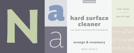


I test drive Ideal Sans at http://www.typography.com
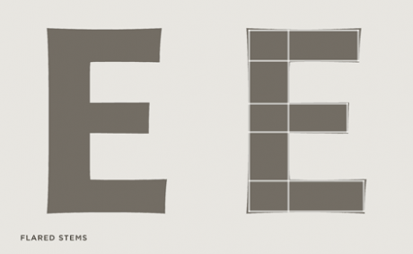
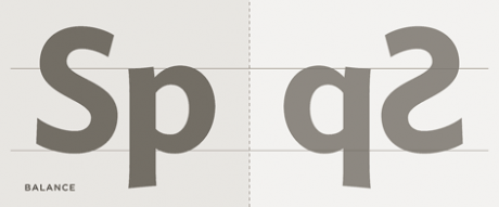
It was about two weeks ago that we were in touch with Jonathan Hoefler, of Hoefler & Frere-Jones: it is not unusual for us at Garcia Media to talk to him and his team often, as we seek fonts to test on projects worldwide.
This time, however, Jonathan alerted me to “a great new sans that we are introducing in a few days, maybe you should wait to see it.“
Indeed, we did, and we are quite satisfied with this new addition to their foundry. Described by its creators as “a handmade typeface for a machine-made age,“ Ideal Sans lives up to its name: I find that it offers an elegance that eludes so many sans serif fonts. There is little industrial about Ideal Sans, and it is one of those rare sans serif fonts that can be used for headlines in every section of a newspaper or magazine. Play it big and bold and it would do well in the sports section. Take a look at the “a” in the thin, and you will see that it can appear playful in a feature page, or magazine. But what sells it to me is the letter “g”, and I can’t wait to use Ideal Sans soon for an upcoming project.
For those designers who fantasize about an entire sans serif newspaper or magazine, with NO serifs anywhere, here is Ideal Sans, perfect for that task.
Type Directors’ Club awards for best fonts
The Type Directors Club has awarded prizes in its annual competition. Here I highlight some of the winners that caught are eye as potentially useful in a variety of projects, serving different purposes.
Palatino Sans Arabic
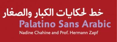
Typeface Designer: Nadine Chahine, Bad Homburg, Germany
Foundry: Linotype GmbH
URLs: http://www.fonts.com, ITCFonts.com, and Linotype.com
Language:Arabic
We congratulate Nadine Chahine, who has been our colleague in the An Nahar (Lebanon) project, where she created the beautiful font Gebran2005, now in use, making the An Nahar pages look so distinctive.
What the judges said:
The Palatino® Sans Arabic typeface family is a collaboration between Lebanese designer Nadine Chahine and Prof. Hermann Zapf. The design is based on classical Naskh structures and proportions, and with a hint of Thuluth. The forms, though, are treated as if written with a pen, rather than a reed. This results in curves that are soft, round, and friendly. It is designed for use in print, and brings into Arabic the informal and friendly appearance of Palatino Sans. The counters are wide open to allow for better readability in small sizes as well as to maintain an open and friendly appearance. Because of its classical reference, Palatino Sans Arabic is also well suited for setting spoken Arabic as well as children’s books.
Shift
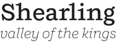
Typeface Designer: Jeremy Mickel, Providence, Rhode Island
Foundry: Mickel Design
Members of Typeface Family/System: Extralight, Extralight Italic, Light, Light Italic, Book, Book Italic, Medium, Medium Italic, Bold, Bold Italic, Black, and Black Italic
Here is an elegant serif that I can see used for headers, perhaps for text; it reminds me of classic fonts and it would be ideal for anyone designing a book. I can see it as a serif that will look splendid on the page as well as the screen.
What the judges said:
Shift is inspired by American slab-serifs from the late 19th century. In its lighter weights, it takes on the personality of a typewriter face, with flared terminals and prominent serifs. In the heavier weights, it acts as a titling Egyptian, with thin spaces between characters and small counters. Designed as a display face, it also works well for text.
Eames Century Modern
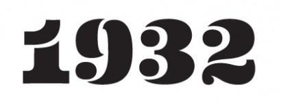
Typeface Designer: Erik van Blokland, The Hague
Foundry: House Industries, Yorklyn, Delaware
Members of Typeface Family/System: Regular, Regular Italic, Book, Book Italic, Light, Light Italic, Thin, Thin Italic, Medium, Medium Italic, Bold, Bold Italic, Extra Bold, Extra Bold Italic, Black, Black Italic, Stencil, and Stencil Cameo
How can you not fall in love with these numbers, and those dots that look like eyes staring at you? I can see those numbers big for multi section newspapers (print or digital) where numbers are the main identifiers.
What the judges said:
Charles and Ray Eames did not design a typeface and this project was not about creating fonts that they would have drawn had they felt the need or inspiration to do so. It was about creating a tool that had the same universal appeal as monuments to the Eames aesthetic, many of which have been so ingrained in our visual landscape that we barely notice them. Eames Century Modern is crafted in the same vein; its dignified legibility effectively transmits the message without overpowering the medium while devilishly intoxicating details in words, letters, serifs, spaces, stems and tapers find their way into the subconscious of even the most casual observer. Much like waiting in a departure lounge on Eames system airport seating; you don’t know why you’re comfortable, you just are.
Aero
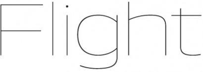
This font truly flies into peaceful skies. I can see it used for the logo of a magazine. I can imagine it in a rather minimalist design where this font, ample dose of white space, and pastel colors would create a peaceful environment on the page or screen.
Typeface Designer: Chester Jenkins and Jeremy Mickel, Brooklyn, New York, and Providence, Rhode Island
Foundry: Village Type and Design
Members of Typeface Family/System: Fine, Fine Italic, Thin, Thin Italic, Extralight, Extralight Italic, Light, Light Italic, Book, Book Italic, Medium, Medium Italic, Bold, Bold Italic, Heavy, Heavy Italic, Super, and Super Italic
What the judges said:
Aero takes inspiration from Roger Excoffon’s landmark design Antique Olive, particularly the heavy “Nord” weight. Instead of revisiting the original, Aero was drawn from memories of Antique Olive: its high-waist and reversed contrast. And that wonderful scooped lowercase i. The result is a contemporary reflection of a 60s-era classic, with the volume turned up and applied to a wider weight range.
Supra Sans

Typeface Designer: Hannes von Döhren, Berlin
Foundry: HVD Fonts
Members of Typeface Family/System: Light, Light Italic, Light Oblique, Regular, Regular Italic, Regular Oblique, Medium, Medium Italic, Medium Oblique, Bold, Bold Italic, Bold Oblique, Heavy, Heavy Italic, Heavy Oblique, Black, Black Italic, Black Oblique, Condensed Light, Condensed Light Italic, Condensed Light Oblique, Condensed Regular, Condensed Regular Italic, Condensed Regular Oblique, Condensed Medium, Condensed Medium Italic, Condensed Medium Oblique, Condensed Bold, Condensed Bold Italic, Condensed Bold Oblique, Condensed Heavy, Condensed Heavy Italic, Condensed Heavy Oblique, Condensed Black, Condensed Black Italic, Condensed Black Oblique
Although we usually have an ample selection of serif fonts, it is more difficult to find a sans that is sturdy, interesting to look at and with personality.Supra Sans achieves it all.
What the judges said:
Supra Sans™ is an extended family of 36 fonts designed by Hannes von Döhren. It contains two widths, six weights, and three styles, including the curvy, feminine Italic as well as the more conventional Oblique. Although it is inspired by the utilitarian clarity of Swiss type design, subtle curves and fine detailing impart a more playful character to the whole Supria Sans family.
TheMarioBlog post #767
Wanted: Tablet Editor
TAKEAWAY: The job ad comes as a surprise. The description of the job even a greater surprise: the US newspaper, Star Tribune, of Minneapolis, is looking for a tablet editor. ALSO: New book on editing/design for a multimedia world.
Tablet editor wanted: must be master storyteller

The surprise comes because I am told repeatedly that US newspapers are NOT quite so interested in tablet editions, not yet anyway.
So how happy I was to see this advertisement. It is also appropriate that I spent most of my morning Wednesday here in Beirut, at An Nahar, working exclusively on what will be the newspaper’s first iPad edition, supposedly the first for an Arabic language daily. Part of our morning workshop was to create a profile for the person who will be editor of the iPad edition.
In my thinking, the editor should be someone who is well versed in storytelling, but who also understands digital platforms, and who will come prepared to make good story choices that are specific to the tablet edition, while reviewing the content of the printed daily and online editions for stories with possibilities. This job is definitely NOT simply that of a copy processor.
Whoever assumes the duties of tablet editor must be aware that the tablet edition is NOT print nor online. It has its unique characteristics and demands. Remember: you are designing for the brain, the eyes and the finger.
The expectations of the user go beyond a simple linear experience.
And, I added, this person must be visually oriented, and should be paired off with a good photo/video editor.
The job in Minneapolis
Here are segments of that Minneapolis Star Tribune ad:
The Star Tribune is looking for a sophisticated editor with excellent news judgment, experience in creating and launching news projects, and an intrinsic knowledge of the web to join our news staff as we launch a Tablet newspaper. We’re looking for someone who is entrepreneurial by nature, and who is comfortable and confident making decisions on his or her own. This person will work with the executive editor and the digital team to set the final guidelines for our Tablet newspaper, and will lead the day-to-day decision making about what content to create and display in the Tablet newspaper. He or she will also coordinate with content specialists across departments on decisions regarding local news, business, sports, features, etc.
Words I like in the profile the Star Tribune execs have drafted: sophisticated, intrinsic knowledge of the web (which I would change to digital), comfortable in making decisions.
Here is where the real profile emerges, in my view:
Must have 10 years of journalism experience, preferably with five in a leadership role. Must have demonstrated experience conceiving and creating new content and new projects, and working across digital platforms. Must have ability to work collaboratively with reporters, editors, copy editors, photographers and digital producers.
For those interested in applying:
http://www.startribunecompany.com/jobs
Finally, unless a newspaper wants to simply do an e-reader edition, the hiring of a dedicated tablet edition editor is the key to success here. I am delighted to see the Star Tribune getting ready to hire theirs.
Links of interest today:
- UK: Telegraph Goes With Apple Subs For Newspaper-Like iPad Edition
http://paidcontent.co.uk/article/419-telegraph-goes-with-apple-subs-for-newspaper-like-ipad-edition/
- USA: Orange County Register showing way to iPad
http://www.newsandtech.com/news/article_84ddc8dc-75b4-11e0-896a-001cc4c03286.html
- USA: Big News Day Drives Single-Copy Sales, Newspaper Web Traffic
http://www.naa.org/Resources/Articles/Circulation-Single-Copy-Sales-Osama/Circulation-Single-Copy-Sales-Osama.aspx
-News Corp Has Lost $10 Million On The Daily This Year
http://paidcontent.co.uk/article/419-news-corp-has-lost-10-million-on-the-daily-this-year/
- Why Rush for an iPad App? Fortune’s New Web App Starts With Your Browser
http://adage.com/article/mediaworks/fortune-builds-app-browser-ipad-app-store/227362/
New textbook: Editing and News Design by Rob Layton
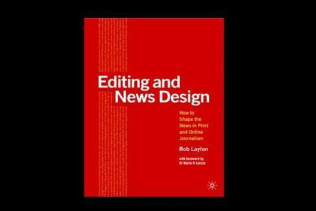
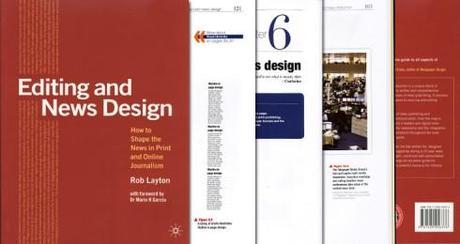
Academics looking for a solid editing textbook that embraces the multi media newsroom, take a look at Rob Layton’s Editing and News Design, published by Palgrave Macmillan, a book that includes such chapters as Typography for Print/Screen, Digital News Production and Advanced News Design.
Layton, who teaches at Australlia’s Bond University, has created a book that has its solid foundations in storytelling but never detours too far from the idea that today we write/edit/design for various platforms. The book is recent enough that it also includes tablet information.
I had the honor of writing the introduction at Rob’s request. As I followed manuscript preparation, I knew that Rob was on to something robust here. As a former university professor, I know that this is the type of rich textbook that both the teacher and students can benefit from. I described Rob Layton’s book as “the guide to early 21st century multi-platform storytelling. His passion for the craft and how he engages you as you get his message give this book added value, becoming a reminder that passion is the lesson for which there is rarely a chapter, but which is an essential ingredient for successful careers, productive lives and, of course, personal happiness.“
The success of the book has been such that Rob reports he is already busy preparing a second edition.
In the author’s own words:
“When I began teaching editing and design courses at universities in Australia, I could not find any textbooks that adequately covered what I was doing each day as a working journalist. I began to write resources for my students that became the catalyst for this book. My intention was to write in the manner that I had been trained –as a senior newsroom editor/educator explaining in simple terms the processes of news publishing to the next generation of news presenters. I’m delighted the book has been well received in both industry and academia. It has been adopted as an in-house reference at a number of News Limited newsrooms, and become required reading at some of Australia’s most prestigious universities, including the University of New South Wales. Of course, the book would not have been possible without the help and guidance of many people, not the least of whom was Dr Mario R Garcia. I thank you.”
Sir Harold Evans, the legendary former editor of the Times of London, has also praised Rob’s book:
“Rob Layton has written a lucid and concise guide to all aspects of design and editing. Valuable at all levels.”
Those who wish to contact Rob for more information can do so here:
This is a link to a sample of the book on Issuu:
http://bit.ly/l23z4n
TheMarioBlog post #766
Telling the Bin Laden story thru informational graphics
TAKEAWAY: We have seen the photos, and we know that Bin Laden compound as if we had vacationed there a month. But it is those informational graphics that show us how the military action by the US Navy Seals took place. Our guest artist today is Jeff Goertzen, of The Denver Post, and he details the process of getting his big graphic ready for publication. ALSO: How Dubai’s Gulf News approached the story with informational graphics AND: Bild’s pop up moments show us how and where Bin Laden was captured
Of special related interest today:
- USA: The death of Osama bin Laden: New York Times interactive gauges public opinion
http://blogs.journalism.co.uk/editors/2011/05/03/the-death-of-osama-bin-laden-new-york-times-interactive-gauges-public-opinion/
Photos offer the initial shock, info graphics help to explain story
The photos are all in, including the now famous fake one showing a Bin Laden burned to a crisp (ouch!). As the story reaches its second and third day, it is informational graphics that begin to answer many of the questions we all have about how this military action took place.
I asked Jeff Goertzen, of the Denver Post, to share with us the meticulous (and perhaps painful) process he followed as he prepared this infographic on deadline:
Sketch in the makings
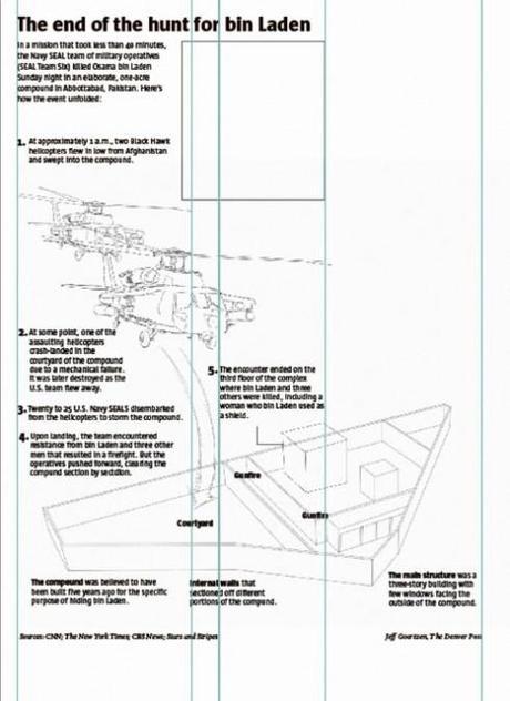
Before corrections
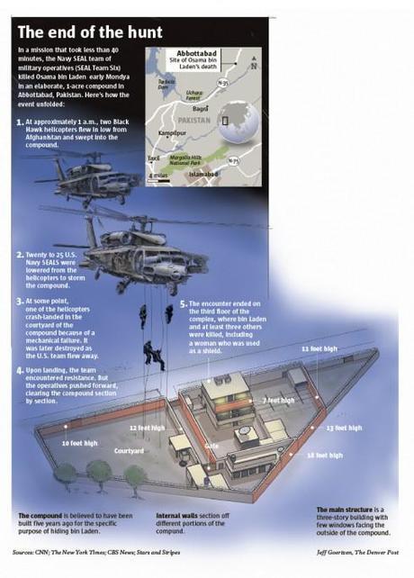
Final version
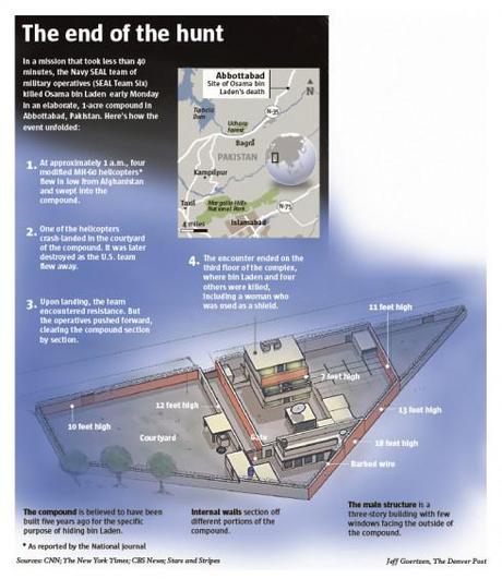
Here are the two versions of the assault on the compound that I worked on Tuesday. The first graphic illustrates Two Black Hawk helicopters descending on the compound with Navy SEALS repelling. Early reports from virtually every news source indicated that the U.S. sent in two Black Hawk helicopters. As for how the Navy SEALS exited the aircraft was uncertain. Some sources said they repelled, others were more vague and just said they exited. Toward the end of the evening, because we were unable to confirm the correct helicopters used in the assault, the helicopters were also removed from the graphic. In the end, they were modified MH-60 Black Hawk helicopters. So the original version was correct.
Speaking as an editor, decisions like this are sometimes no brainers. We don’t take chances with the visual representation of our graphics if we are not absolutely sure about the facts. If we illustrate the wrong aircraft, we look foolish the next day. Speaking as a graphics artist, eliminating visual details, such as the helicopters, is extremely difficult, because it takes away from the visual impact of the graphic. Lesson learned? …. Better safe than sorry.
Update from Jeff Goertzen on his graphics here
One of the greatest frustrations about creating breaking news graphics is the challenge of getting accurate information on deadline. The graphic I illustrated of the raid on Osama bin Laden’s compound was a classic example of how information and facts change during the day, making it difficult decide what you should and shouldn’t illustrate.
By noon, I made this rough layout of the graphic and wrote the text with the information I had at the time. It shows two Black Hawk helicopters with an arrow indicating where they landed in the courtyard. The text says there were 20-25 Navy SEALS involved in the operation.
(Image 1)By 3 p.m. I had the first version of the finished graphic illustrating the two helicopters with Navy SEALS repelling towards the courtyard of the compound. This was visual information I had seen on one of the networks. At this point, reports from virtually every news source indicated that the U.S. sent in two Black Hawk helicopters. As for how the Navy SEALS exited the aircraft now was uncertain. Some sources said they repelled, others were more vague and just said they disembarked. So this part of the illustration would have to be eliminated.
(Image2)By 7 p.m. some reports were indicating that there were four modified M60 Black Hawk helicopters and other sources were mentioning the presence of a Chinook. And the actual number of operatives that stormed the compound were uncertain as well.
By 9:30 p.m. the editors decided to eliminate the helicopters and images of the Navy SEALS altogether. We also made no reference to the number of operatives.
(Image 3)
How others covered the same event
Jeff Goertzen sends us how other newspapers covered the very same incident here:
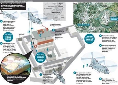
The Independent, London
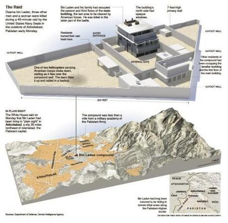
The New York Times
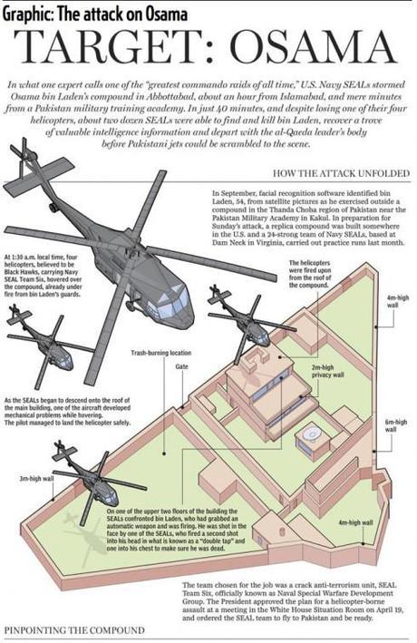
National Post, Canada
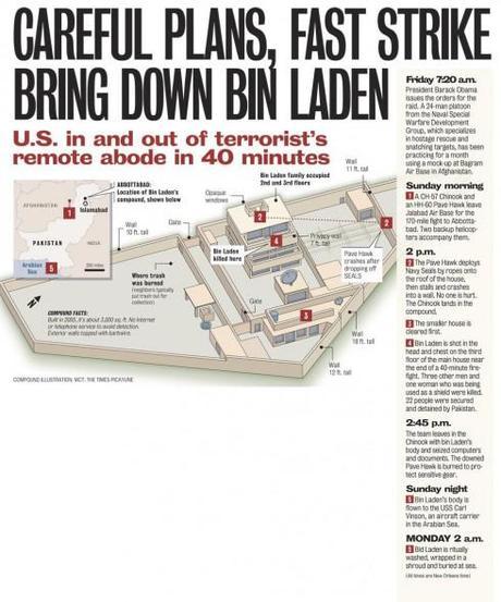
The Times Picayune, New Orleans, USA
In Dubai: The Gulf News and explanatory graphics
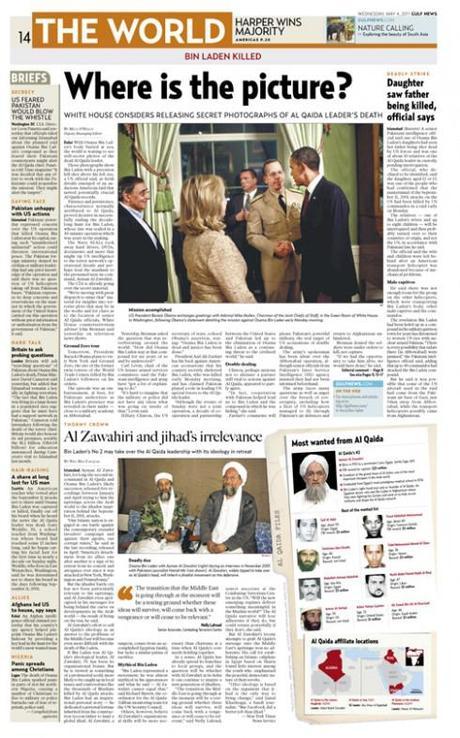
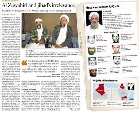
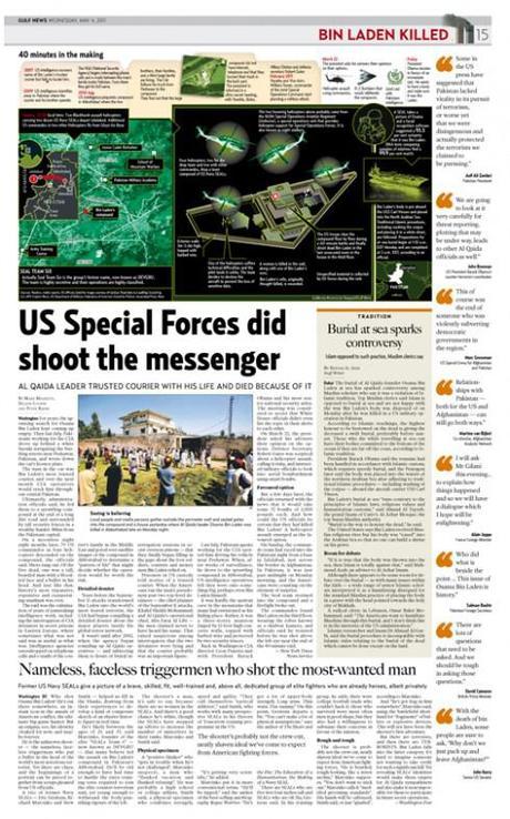
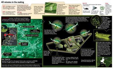 <="">
<="">
Miguel Gomez, design director of Dubai’s Gulf News, shares these graphics with us and offers this commentary to help us appreciate them:
For these graphics we used the concept of the “file”, to give the impression that this was an action planned for a long time; in addition, for the second graphic we decided to go with a “night vision” concept, to give readers an idea of the conditions the US Navy Seals operated in during the raid of the Bin Laden compound and the firefight that followed leading to his capture and killing
Note: The Gulf News graphics were executed by Guillermo Munro, Dwynn Trazzo and Luis Vazquez .
The Bild app’s pop up moments and the Bin Laden story

And here are two videos from Germany’s Bild and how they pointed users to the location of Bin Laden’s capture, emphasizing the how and where:
On this pop up moment, Bild offers us an inventory of terrorists: who is still wanted? Who is next? Who is dead? Who is in prison?
…..and finally, sand art telling the story in India
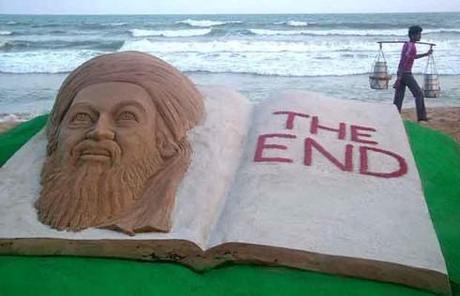
Indian sand artist Sudarshan Patnaik creates a sand sculpture to give the story its proper closure!
The sand sculpture of Al Qaeda leader Osama bin Laden is on a beach in Puri in the eastern Indian state of Orissa.
Bin Laden death: some pages that caught our eye
TAKEAWAY: It’s all one hear on TV news channels these days: the post mortem of the Osama Bin Laden killing by a brave elite team of US Navy Seals. Reviewing the front pages of US newspapers yields some interesting poster-like approaches to the story of the decade. We also show you other interesting front pages we are receiving from around the world. To be updated throughout the day.
Gulf News, Dubai, UAE
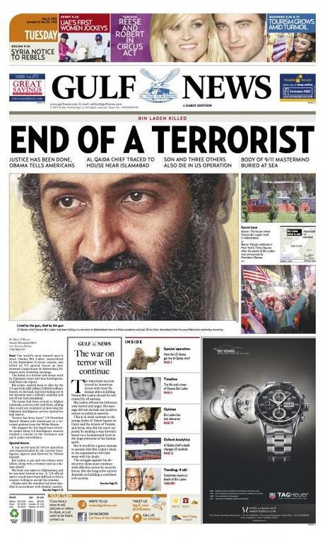
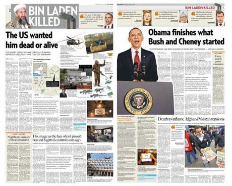
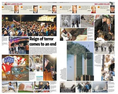
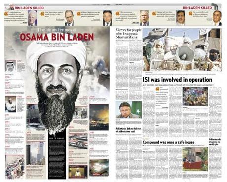
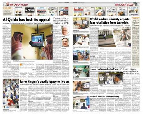
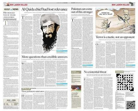
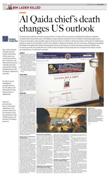
We receive a set of pages from Miguel Gomez, design director, Gulf News of Dubai. His team has done a remarkable job preparing a 12-page package, including a retrospective of Bin Laden’s “life and crimes”, analysis of the news and what it means for the US and the world, reactions from around the world, and an interesting balcony treatment of how front pages from around the world reported the news. Some well detailed, informative graphics also appeared, depicting the military action that led to Bin Laden’s killing.
Il Secolo XIX (Genoa, Italy)
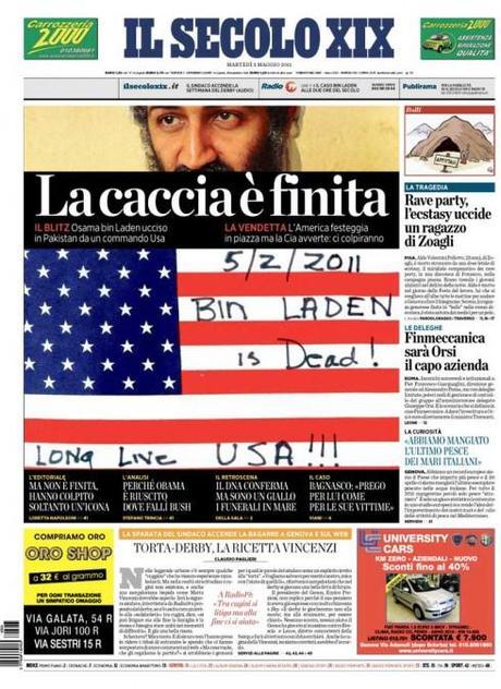
Massimo Gentile, design director of Il Secolo XIX, sends us his front page of today, again, using the now well known mini poster concept, with this explanation:
“It was difficult for us to do this one, since this happened many hours before our paper would come out. The headline says: The Hunt is Over. We decided to go with close up of Bin Laden’s eyes, and the American flag with the lettering on it. So we did the best we could for this front page.“
Hail those poster-styled front pages
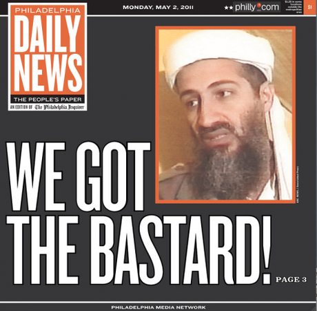
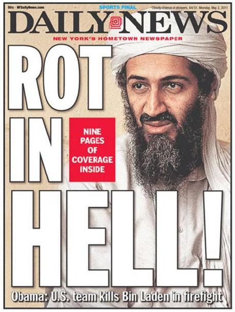
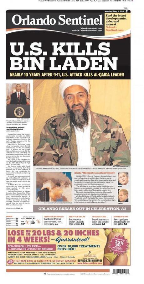
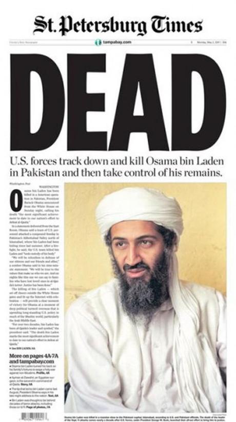
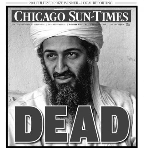
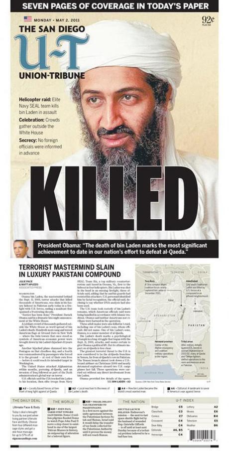
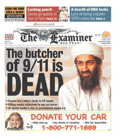
The poster look for Page One is very much alive. Some of the best treatments of the Bin Laden story show the big headline, the large photo and the impact of the poster. Indeed, I am surprised that the headlines are short, to the point, and, in most cases, telling the obvious. But during times like these, newspaper editors prefer to go back to the iconic look of newspapers of another era, when the big headlines REALLY revealed exclusives and surprised the readers. In a sense, I like the retro approach many of these samples provide.
Will be updating the blog during the day to show other examples, including info graphics of how the attack took place.
Stay tuned and come back for more.
As seen on CNN….
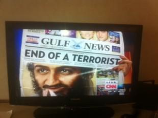
Television commentators, too, seem to have a fascination with how newspapers cover the Bin Laden story. This morning a CNN reporter held up a copy of the Gulf News, of the UAE, as seen here.
Of special interest today
- USA: Coming soon to a theater near you: The New York Times
http://www.niemanlab.org/2011/05/coming-soon-to-a-theater-near-you-the-new-york-times/
- USA: At the NYT, no paywall exemption for Bin Laden
http://www.niemanlab.org/2011/05/at-the-nyt-no-paywall-exemption-for-bin-laden/?utm_source=feedburner&utm_medium=feed&utm_campaign=Feed%3A+NiemanJournalismLab+%28Nieman+Journalism+Lab%29
- USA: Bin Laden death spurs sales of papers
http://www.newsandtech.com/whats_new/article_de2e86ba-74ec-11e0-ba23-001cc4c002e0.html
TheMarioBlog post #765
WoodWing Xperience seminar May 24-25 in Amsterdam

I am honored to be one of three keynote speakers at the upcoming WoodWing Xperience seminar in Amsterdam May 24-25
I did a previous keynote for a WoodWing Tour function in London in 2010.
For those interested in attending, here is more information:
May 24-25, 2011, Amsterdam, Netherlands
http://xperience.woodwing.com
Death of Bin Laden: a perspective from Lebanon (follow frequent live coverage today)
TAKEAWAY: Waking up in Beirut to the news of Osama Bin Laden’s death. Already discussing it with art director at An Nahar, the Arabic language daily, and it will be interesting to follow up the rest of the day with the Lebanese perspective of this monumentally important development in the fight against terrorism. Stay tuned. ALSO: The Royal Wedding, part 2: a kiss pop up moment and a textbook case of good packaging for coverage of the event
Final page one for Tuesday
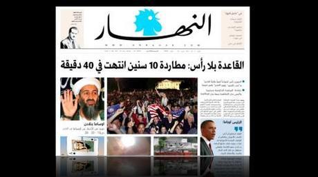
Top portion of An Nahar front page for Tuesday, May 3
It was a long and busy day, but the top of Page One is now done with the Bin Laden package.
The Mondrian managed to package enough images to tell the story at a glance, and the headline over the package reads: Al Qaeda is headless: Ten year chase ends in 40 minutes
The story thru an illustration
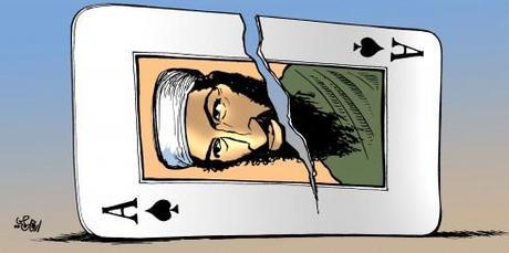
The Bin Laden story as seen by An Nahar illustrator Armand Homsi
First thing art director Ziad Kassis and I discussed over morning coffee today was to consider an illustration for Page One of An Nahar.
Remember, it is 24 hours between the time the news broke about the killing of Bin Laden, and when the printed edition of An Nahar will reach readers. We are already saturated with so many images of the event that we had a briefing with that talented illustrator, Armand Homsi, and told him that his illustration could go on Page One——maybe. Armand does illustrations for the supplements, and they are all top of the line quality.
Here is what he has produced, absolutely direct, elegant and worthy of Page One. But the editors have decided that the illustration would soften the impact of the news and to go with the Mondrian photo approach (see below).
However, Ziad and I have just decided to use the illustration, smaller, as part of the Mondrian grouping, then display it big inside, to do it justice.
The Mondrian-style front page takes shape
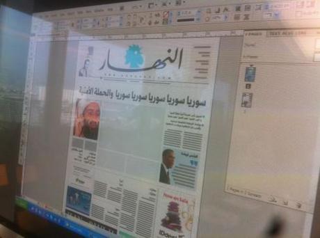
First sketch of the front page on the screen as we discuss the content/design with the editors
Good page one meeting and our idea of a Mondrian concept—-creating a collage of images on Page One to tell the Bin Laden story shapes up.
And, alas, the talented An Nahar illustrator, Armand Homsi, produces an illustration that will be played big inside, but we must incorporate it into the Mondrian.
The editor in chief of An Nahar, Mr. Francois Akl, offers me a fascinating perspective when I ask him what the Osama Bin Laden death means to the average Lebanese:
“For us this is a purely American story, in a sense. Of course, we are interested in this, but we have too many problems in this country, so this is NOT for us the same it is for American readers. The average Lebanese person feels indifferent about this. They did not like Bin Laden, and, depending on where in the country you may be, some like Bin Laden, so you see, the story for us is quite different for what it is for you Americans.“
And Editor Akl agreed that one of the photos in the Mondrian must be Americans celebrating outside the White House, a place where there has been little celebrations lately.
Discussions of our An Nahar front page for tomorrow
Right now, in mid afternoon here in Beirut, the art director, Ziad Kassis, and I, play with a variety of options before the 6 pm meeting in about two and a half hours, which is a more decisive step towards the planning of tomorrow’s front page.
Remember, we launched a new design of this Lebanese newspaper only three weeks ago, and the front page has followed a consistent style for the obvious reasons.
Tomorrow, however, we may drop the promos that appeared top left altogether, or we may make the promos part of the fabric of the page one illustration, since they may be part of the Bin Laden coverage.
Meanwhile, we have the talented illustrator from An Nahar working on an illustration collage, but we know that the still conservative editors here may feel that an illustration is too soft a treatment for such an important newsy story.
At almost 5 pm, this is where we are with the design of Page One. I am suggesting that we create a Mondrian effect to incorporate various images of the Bin Laden story into one large block, which will probably be six columns, in case the illustration does not fly.
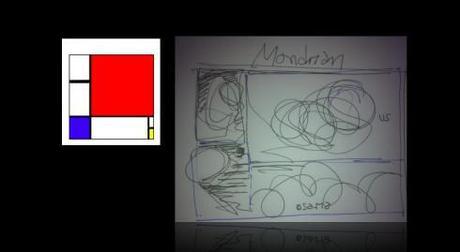
Here is my sketch, inspired by Mondrian structure, for a group of images in tomorrow’s front page.
Stay tuned.
Citizen journalists to the rescue
It has happened again, this An IT consultant, living in Abbottabad, who unknowingly tweeted details of the US-led operation as it happened. Sohaib Athar wrote that a helicopter was hovering overhead shortly before the assault began and said that it might not be a Pakistani aircraft. His first posting was at around 1am local time.
He wrote: “Helicopter hovering above Abbottabad at 1AM (is a rare event).“
Soon after, he reported the sound of an explosion, now known to have been US forces blowing-up their damaged helicopter.
“A huge window shaking bang here in Abbottabad Cantt. I hope its not the start of something nasty  ”
”
Remember in 2009, when the event that came to be known Miracle on the Hudson occurred: the landing of US Airways flight 1149 jet into the Hudson River? The first reports of that incident came from citizens who were watching it happen from the windows of their offices in New York City.
It reminds us how difficult it is becoming for the official media to get there first.
And the crowds chanted….
Woke up at 7 am, turned on CNN and could not believe my eyes and ears: Osama Bin Laden dead announced the network’s Wolf Spitzer as a crowd gathered outside the White House around 1 in the morning, US flags everywhere, same thing in the reports from New York City’s Ground Zero, a symbolic gathering for those who came, as one firefighter put it “to honor my fellow firefighters who died here, now they know justice has been done.“
Outside my balcony in Beirut, total silence, a day off for workers who celebrate the May 1 International Workers Day festivity.
Then a meeting now with Ziad Kassis, the art director of An Nahar, to plan the front page of the newspaper. “Big news, indeed, “ he tells me, “and we will go 8 columns across with it tomorrow.“
The iPad already played a role here, as one of the guys celebrating outside the White House raised his iPad to show a screen that read: Obama1, Osama 0.
It should be interesting to contemplate this development from the Middle East. I promise more reports as the day progresses. Come back and check with me from time to time.
The making of page one: An Nahar
Like editors and designers worldwide, we are now working on the possible visual scenarios for Page One of An Nahar tomorrow.
Twenty four hours will have passed from the time the world found out Osama Bin Laden is dead. In one of our discussions, we are leaning towards a good illustration capturing the highlights of the man’s life and death, but the editor is not sure a soft illustration will do justice to the newsy event; we are also planning a photo collage of the most momentous events in Bin Laden’s life. All options are on the table.
As this is an Arabic language daily, I wanted to step gingerly into the discussion, but was reassured by two editors that the people of Lebanon are as happy to see “this man we hated” no longer with us.
Will continue to report on our front page concept as the day advances.
TheMarioBlog post #764

