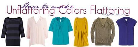
 When I started my style consulting business in 2002 I took an intensive two day course to learn how to analyze colors using the seasonal draping method. This method is the well known approach where people are categorized into the fall, winter, summer and spring seasons. I went into this course already having a pretty knowledgeable understanding of color theory. When I was a fashion designer I would spend countless hours a week inside a device called a light box looking at lab dips, which are fabric swatches dyed to match color standards sent to a factory or fabric mill. We would do these lab dips before dying yards of fabric for production. It would be my job to look at the swatches and figure out how to get the lab dips as close as possible to the color standard. It often took several tries. To give the factories or fabric mills proper direction I would tell them to do things like add percentages of color, lightness, darkness, and more. All these years later I can look at a color and tell you exactly what colors are used to make it.
As a stylist who is trained to analyze colors on clients, plus my keen eye for color, I have seen how and why some colors look really good on a person and others horrible. Unfortunately, teaching someone how to analyze their own colors through a blog is pretty impossible. However, I can give you some pointers on how to choose and wear your best colors, how to correct any bad colors you may own and how to make unflattering colors look flattering.
Despite the fact that most women don’t know much about colors, like what makes them warm, cool, clear, bright, soft or muted, I have found that most women often choose the right colors for themselves even if they don’t know why or are consciously doing it. Just like we know when our butts look big in a pair of pants we also know when a color makes us look washed out, drowned out, sallow or gray.
Below are some common color issues that many women struggle with and my tips on how to work around these issues. As you will see the solutions are actually quite simple. All you have to do is add a flattering color to an unflattering one through your accessories, accents and pop pieces. These tips are great for pieces in colors that you love but know aren’t the best shades for you, for accidental purchases in the wrong colors or just times when you want to wear a color in the best way possible for you.
How to make unflattering colors flattering
Problem #1- When a color is too washed out and light
When a color is too washed out and light it usually in a pastel shade, has very little saturation and looks like the color has been faded with white paint. The white added to color is what gives it its washy, pastel effect. The more white, the lighter and whiter the color becomes.
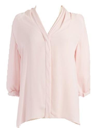
While these soft, washy colors can be pretty to look at, sadly, very few women look good in them. Unless a woman has very soft, light coloring these colors can wash a woman out, make her look peaked, gray or just ill looking. When this happens the color just doesn’t have enough saturation or depth.
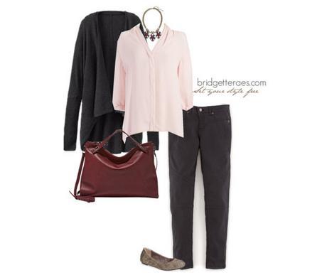
This outfit is an example of how to fix a color that is too light, you anchor it. I use this term all the time with my clients when they have pieces that are too pale for their coloring. Anchoring a color means to pair a lighter color with a darker color to bring the shade down. Here, for example, I am using this grey Athleta cardigan to anchor this light pink Elie Tahari top. The deep gray anchors the very lofty pink. In addition to this I added a necklace in a richer burgundy shade to darken the combination. When a color is too light, anchor it with richer colors.
Problem #2- When a color is too dark or saturated
Dark colors have a tremendous amount of saturation in them. They are usually clear, heavy, somber and stark looking. Obviously, black would be the darkest color on the spectrum but there are dark and saturated hues of every shade that exists.
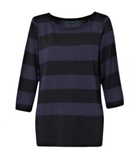
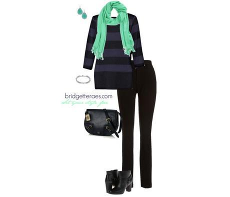
The solution is quite simple. The color just needs to be lifted and energized a bit. The best way to do this is to pair it with a brighter, more vibrant shade that isn’t so heavy. In this outfit, for example, I added a mint scarf to this French Connection striped tunic and used mint Stella & Dot earrings.
Warm colors and cool colors
Before I get into the next two color problems, I want to go a little more in-depth about warm and cool colors, as this often needs a lot more explanation. First, most people don’t even understand the difference between warm and cool colors despite the fact that they understand that warm colors are yellow based and cool colors are blue based. For these people, even if you put warm and cool colors in front of them, they can’t see the difference let alone identify if their undertones are warm or cool. It’s a tricky thing to diagnose and the first step in seasonal color analysis.
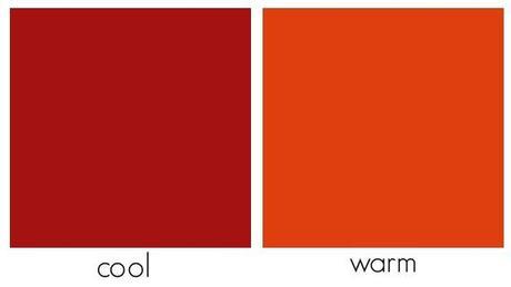
Alternatively, you can look at metal shades and figure out whether warm or cool colors look best near your face. Typically, people who look better in yellow golds have warm undertones, meaning their skin tone looks warm, glowing and healthy in this shade. People with cool undertones look better shades of silver and they look bright, rested, alive and vibrant. In cool tones, people with warm undertones often look grey, washed out and flat. People with cool undertones often look sallow, jaundice and muddy when gold is draped across their face.
It should also be stated, however, there are many people who are hybrids, people who look fine in both warm and cool colors. If this is you, don’t over think it or assume something is wrong. It just means that you can wear both and to choose colors based on personal preference.
Problem #3- Colors that are too cool
As stated earlier, colors that are cool are blue based, but cool colors are not exclusively blue in shade. Generally speaking, most blue based colors are jewel tones, like cobalt, bright purple, emerald green (a green that has a lot of blue in it), cool reds, and even soft blue based pastels.
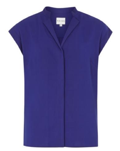
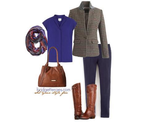
Of course there are ways to work around wearing a blue based coloring if it isn’t flattering on you. The answer is to warm up the color. For example, here I paired this cobalt top from Reiss with warmer shades through the printed scarf that has warm accents and the cognac color found in this J. Crew blazer. By adding warmer colors a balance is created between the warm and the cool shades.
Problem #4- Colors that are too warm
Warm colors have a yellow base. Warm colors aren’t exclusively in the autumn palette of rust, mustard, browns, camel and olive. Warm colors are peach, coral, shades of green, like kelly and grassy greens, orange and warm reds. Warm colors can be very bright and vibrant and they can also be very muted.
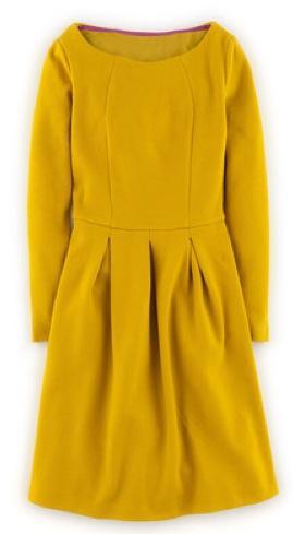
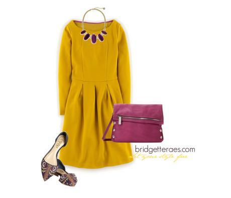
Warm based colors on people with cool undertones look better when these shades are paired with blue based colors. For example, here this yellow Boden dress is paired with a purple necklace to create balance. If you have an orange top that makes you look sallow, try it with navy, or try adding some bright pink accents to a green dress.
Problem #5- When a color is too bright
Bright colors have a lot of energy, even if they are light colors. These shades are clear, vibrant and loud. When someone has softer or more muted coloring these colors can jump off a person and drown them out. When I drape vibrant colors on someone with softer coloring the color overwhelms them. Bright colors include cobalt, emerald green, bright orange, magenta, and more. Bright colors can be warm and cool. The qualities of the bright colors have more to do with clearness and vibrancy than they do warmth or coolness.
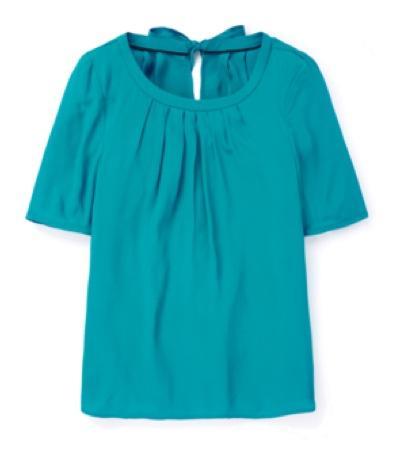
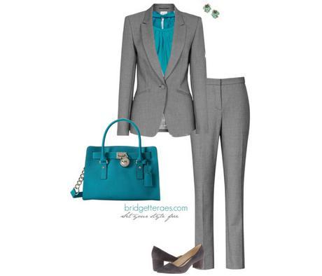
Despite all this information about bright colors, it doesn’t mean that they are off limits for everyone. When a color is too bright and clear on someone all I do is pair the color with softer colors, like soft pinks, grey, heathered shades and muted colors. A balance gets created between the two tones. As you can see in this outfit, the bright blue turquoise top from Boden is brought down in vibrancy with the softer jacket from Reiss. Lastly, I added earrings in softer colors that tonally works with the top and strikes an even greater balance.
Problem #6- When a color is too muted
Muted colors have a gray cast to them. Pastels can fall into the muted category because they have been softened with white, but muted colors are also gold, olive, taupe, khaki, rust, mustard, for example. But truly and color can be muted because all it takes is toning down a shade to make it less clear and bright. Muted colors look a bit muddy.
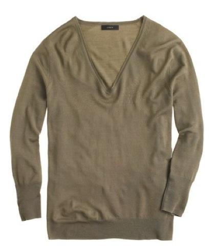
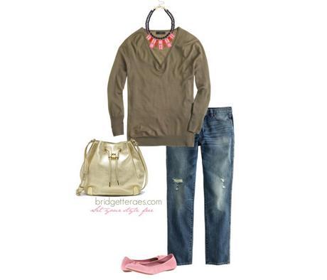
If a color is too muted all you have to do is pair it with some energetic brights. Take a look at the previous outfit. The muted gray is balanced with the bright turquoise. And in this outfit, the bright red in the necklace adds some life to this somber olive J. Crew sweater. If you love this color and other muted shades, but this color doesn’t love you, just add some clear brights through your jewelry, scarves or layering pieces to brighten up the outfit.
How to determine your season
Like I said earlier, being able to tell someone who to decide what season they are through a blog post is virtually impossible. It took me two days to learn how to do it and explaining how to analyze yourself in this post would be about as difficult as teaching you how to tie your show in this format. However, below you will find the characteristics of each season. By looking at the color problems above and figuring out which ones you may struggle with, you may be able to hone in on what season you might be.
Spring- The colors of spring are clear and vibrant, with a crisp quality to them. The spring palette perfectly represents all the lively colors of the spring season. These colors have a warmer yellow base and give off a pleasant radiance.
Qualities of spring colors: Warm based, clear, vibrant and light
Summer- The colors of summer are soft and muted with a pastel quality to them. These colors havea cooler cool blue base and give off a subtle soft energy.
Qualities of summer colors- Cool based, soft, muted and light
The difference in lightness between spring and summer is to imagine a color being lightened with white paint- that would be summer, and a color lightened or diluted with water- that would be spring. The color is light but still clear.
Autumn- The colors of autumn are warm and earthy, with a rich depth to them. The autumn palette perfectly represents all the harmonious colors of any clear autumn day. These colors have a warmer yellow base and give off a rugged outdoorsy feel.
Qualities of autumn colors- Warm based, earthy, muted and rich
Winter- The colors of winter are clear, crisp, bright and bold. These colors have a cooler icier base to them and give off a lot of power.
Qualities of winter colors- Cool based, bright, clear and deep
It’s rare to meet someone who is only one season. A lot of people are primarily one season and can borrow from another. If you look at the qualities of each season it makes sense as all the seasons have similar qualities. For example, summer and winter are both blue based and autumn and spring both yellow based. Further to that, autumn and summer are both muted palettes and winter and spring are both palettes with clear colors.
This is why people typically need to be individually analyzed and it can be too difficult to read a book or blog post on the topic to diagnose yourself. However, these tips should start to point you in the right direction. In my 13 years of working with women and their style 99% of the time my clients are already choosing their best colors which means there is a strong possibility that you are as well. The colors we are usually drawn to and the colors we most often wear are typically our best shades. Instinctively we know what’s best. So trust that you are making the right color choices. If you’re not, or you have some unflattering colors your closet, my hope is that with these tips you’ll be able to fix them.

