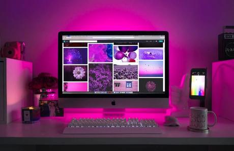
Whether you’re trying to break into the world of influencing, running a blog, or even getting started with an online business, making your site attractive, communicative, and more effective at grabbing attention can be vital. As much as your content might be what seals the deal and keeps visitors around, it’s the visuals that will first get their eyes on you. Here, we’re going to look at how you can nail the visual element of your website.

Work your brand throughout your website
Every inch of your website can be designed and reconfigured to fit your brand. When it comes to things like blogs run on CMS site builders, sometimes it can be as easy as simply finding the right theme. Otherwise, you might want to look at the possibility of working with a website designer to make sure that your site accurately reflects your style. This goes as much into things like your choice of font and typography, not just the background color, heading decorations, and other details.
Invest in high-quality imagery
A good photo or image can be excellent for immediately capturing the attention of the website’s visitors, and quickly communicating to them precisely what the website is about. To that end, if you’re not able to take excellent photos yourself, then you should take the time to find rare stock photos that your visitors aren’t as likely to see around the web on a regular basis. Make sure that you choose imagery that fits both your brand and the format of the website and you might even want to be ready to pay for the premium images if those are the ones that best fit your branding.
Your site’s layout matters too
It’s not just the content, both written and visual, that matters when it comes to your website. How it’s all laid out plays a big role in how visually appealing it is, as well. If everything is super close in and cluttered, then the eye is going to have trouble finding any particular detail to start out with and might just look elsewhere. Similarly, you want important user elements such as navigation to be easy to find and pick apart for the sake of making your site usable, as well.
Keep up with the trends
Aside from ensuring that your branding flows into every inch of the site and making good use of great photos, you should also think about the trends which influence which branding styles and types of photography you use. Keep up with web design trends on a regular basis, taking a look over your site at least once a year if not more often to make sure that it’s not starting to look a little dated. By staying on the cutting edge of what’s hot, visually, you can make sure that your site always looks modern and fresh.
With the tips above, hopefully, you find it a lot easier to keep visitors coming to your site, and grabbing their attention long enough for your content to start doing the work.
Also Read
Here’s Why Every Founder Needs a Premium Domain Names for Their Business
How to increase traffic fast for Your Beauty Blog
**SP**
