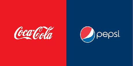


Some of us have been familiar with logos and their colours for years. If they were to change, what impact would this have and how would we view the company as a result?
In a recent experiment, Brazilian graphic designer Paula Rupolo swapped the color schemes of competing brands’ logos, revealing much about the power of designers’ Pantone choices in determining identity. “Colors are the first thing you notice in a logo, what gets fastest to our brains,” she says. “Then you read a logo’s shape, icons, or typography.”
“These are all big and famous brands,” Rupolo says. “They basically own the colors of their logos. When you switch to a competitor’s colors, your brain notices there’s something that doesn’t fit, that makes you go, ‘What’s going on here?’ and that’s interesting and a bit curious.”Interestingly people preferred the “after” effect was when she switched Yahoo’s to Google’s color scheme, though the company’s color purple is a particularly divisive one–and it’s hard to hate on a rainbow of primary colors. “Google’s colors are very iconic, perhaps more than its typography,” says Rupolo.
The associations between colors and emotions can be both universal and highly personal. Blue, at its most basic, signifies clear-sky calm and trust; green connotes reliable, natural; and red has associations with passion, danger, and urgency, for example. But, as every design student learns, there are always exceptions. In western cultures, white means peace and honesty, whereas in eastern cultures, it’s associated with the masculine yang of yin and yang.
“All in all, the logos don’t look better swapped than the originals,” Rupolo says of the project’s results. “If you take the Visa x Mastercard example, you’ll notice that red doesn’t go with credit card credibility at all, but it’s acceptable when in a smaller percentage of the total color predominance.”
Different rules apply to soft drinks, however. “Of course,” Rupolo adds, “when you get to own a color as much as Coca-Cola does, you don’t need much more around it.”
The European rebranding of McDonald’s, however, has embraced a new color scheme: green and yellow. “McDonald’s change was a successful case in my opinion, basically because they decided to get greener and healthier, and luckily, the direct complementary color of their brand was exactly what they needed.”
