Now I'm cheating a little because our den is probably the room that I've shared most on the blog. This is mostly because before we started our kitchen and bathroom remodel, it was the room that we did the most work on. We started our den renovation back in March of 2012 (just a few short months after I started this blog) so I know a lot of you weren't following along then. To get you up to speed here's a photo recap of what the room looked like when we moved in.
Dated red brick fireplace
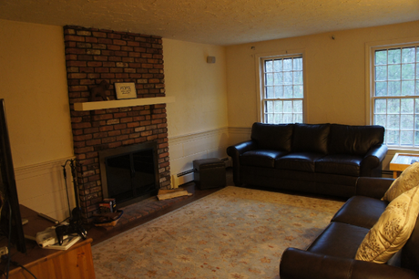
Textured plaster walls (and ceiling!) and interesting wainscoting
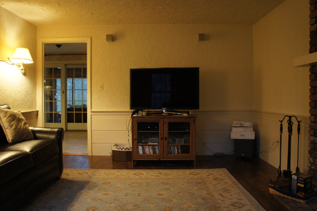
Dated brass wall sconces
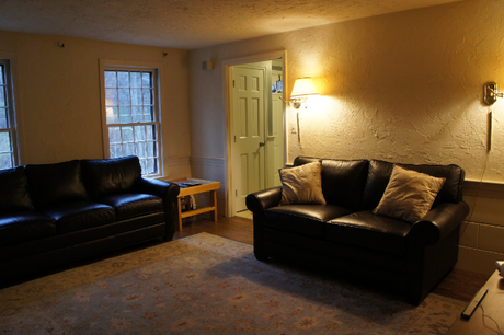
Less than a year living in the house and we knew that we had to do something about this room...and that it required outside help. We called in the contractors and began demo.
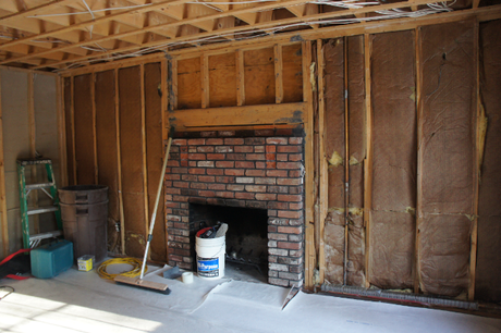
And we were ecstatic with the finished results.
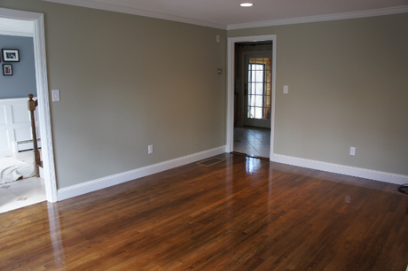
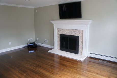
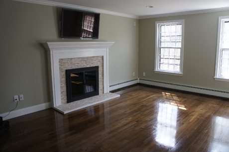
And we lived with this room for almost a year before I conjured up new plans. A wall had to go.
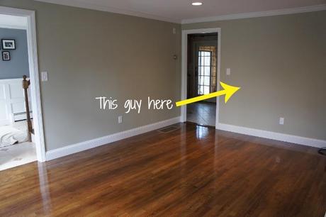
So while the contractors were here working on our kitchen, bath and hallway, we had them take down this wall. And here's where we're at today:
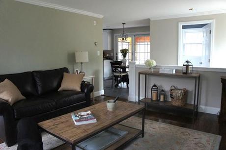
Striper photo bombed almost every photo. Pretend it's a game, "where's Striper?". It's actually pretty hard since she blends in with the leather sofas.
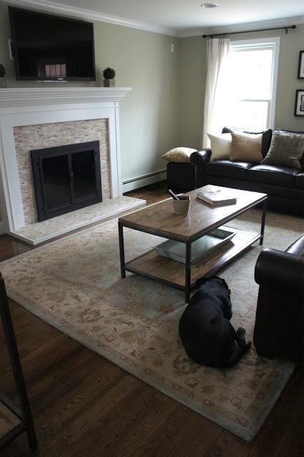
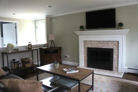
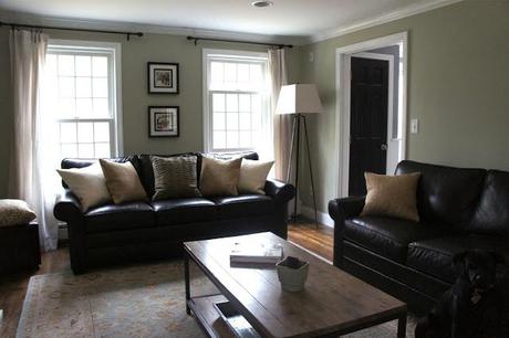
I'll be honest, even after the renovations, this room has never felt quite right to me. I've rearranged the furniture countless times (both for aesthetics and comfort - it's placed in the "comfort" position now - best tv viewing angle) but things always feel a little "off." We bought the leather sofas before I even knew I wanted to be a decorator. That was back in my financial planning days, before I ever thought about doing an actual floor plan. The other day I told you about Jake's "whatever you want, honey" attitude when it comes to decorating our house. Well, there is one thing that he did have an opinion on and it was a very strong opinion. He wanted dark leather sofas for the den. I caved. We went to Ethan Allen and spent a good portion of his bonus on these two bad boys so I'm afraid they'll be lifers. They're not my favorite by any means, but they are a great piece of furniture. I'm trying to figure out ways to decorate around them because slipcovered PB sofas would be my ideal in here. Although, the leather definitely works better with a black dog that sheds 1000 hairs per minute. But I'm on a tangent. The point I'm trying to make is that if I could do it again, I probably wouldn't pick the same furniture, but it's what we got.
There are a few things that I definitely want/need to do that I think will help make this room feel a little more cohesive.
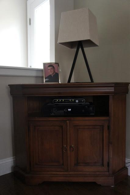
1. Paint this corner cabinet white. I bought it for its dimensions and ability to hide the tangle of tv and cable cords behind it. The color wasn't right when I bought it and I knew it. It came in off-white so now I'm kicking myself I didn't just buy that color instead. #liveandlearn.
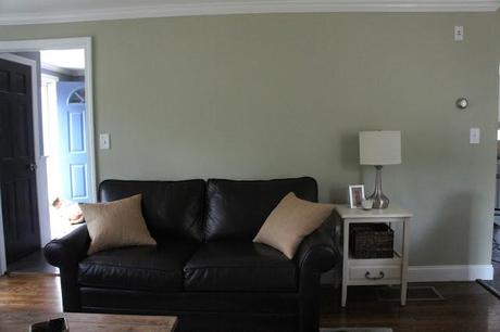
2. DIY a large world map for this space above the couch. This project has been on my to-do list for quite some time so I just need to do it. Jake and I travel a lot so I thought it'd be fun to pin on a map the places we've been and want to go. I like the idea of having it in the den (a place where our friends and family congregate) because it's a cool conversation piece. PS: that side table was totally serving as a nightstand in the guest bedroom just before I took this photo. I told you I can't get this room right!
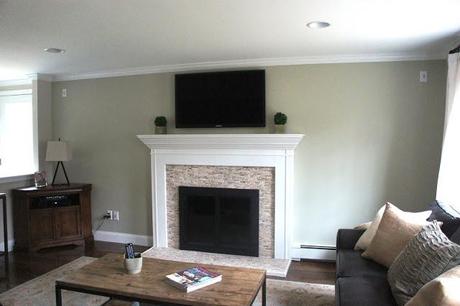
3. Flank the fireplace with something whether it be bookshelves, pictures, or mirrors. Originally I wanted to do built-ins, but nixed the idea after I realized we'd have to move the baseboard heater to the right. Also, the fireplace isn't centered on that wall which is an added challenge. We also have to contend with all of the outlets for our entertainment center that are along the left side. I've bought and returned pictures and mirrors that I thought would look nice, but everything just looks a little odd. My next dream is to add windows on either side. I think they would balance the fireplace beautifully and I wouldn't complain about more natural light. The only (big) issue is cost. Installing new windows would be expensive. Jake might also have an opinion about that.
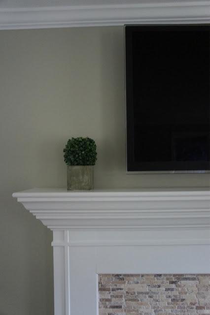
4. Replace these little boxwoods flanking the TV with something a little larger/taller. They look so small up there. :)
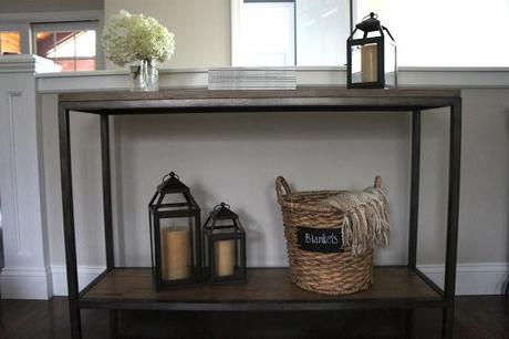
5. Work on a vignette for this table. I threw one together in about 10 minutes so I could take pictures, but it's not cutting the cake.
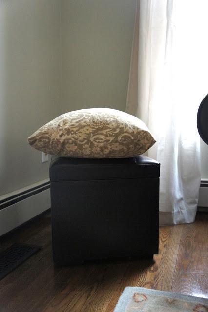
6. Replace or rehab this Target pleather ottoman. It's seen better days and I'm overdosing on leather.
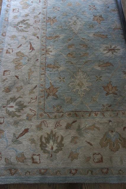
7. Swap out this persian style PB rug for something a little more modern. I'd love to go with a large scale graphic print. I don't think this will be happening anytime soon because (as you know), wool rugs from PB are expensive and this one was no exception. Again, I bought it in my financial planning days when I was just happy that I could finally afford something from PB. I didn't give much thought to the overall design of the room at the time. I do love the colors in this rug though and it hides stains beautifully. With 2 dogs, this has been tested. I also love it a little more now that it finally stopped shedding.
So there you have it - week 1 of my house tour. If you have any suggestions for this room, I'd love to hear them! I find it so much easier helping people decorate their homes than I do decorating my own. There's something about being in the same space every day that makes me never satisfied with how things look. Do you guys suffer from that same problem? Hope y'all have a great weekend!

