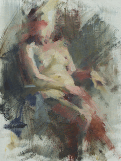
Kat
14 x 11 -ish
As a consequence of being off balance, I find I'm painting slowly, carefully, and analytically. The pleasure of "the zone" is absent (hopefully only temporarily), but it feels like an education.
This week's model was one of my favourites because of her delicate, fair skin. It reflects whatever light there is and shows the most subtle warm and cool tints. I've been experimenting with different palettes having found that my usual chromatic palette is too powerful in this space. This week I worked with yellow ochre, cad red light, cobalt blue, raw umber and white - both flake white hue and titanium. (In a misguided moment, I began to put some of the chair arm on the left into the picture with what looks like ultramarine and cad red light, but I stopped myself after a couple of marks. It was throwing off the whole color space.) With the exception of the red, these are mild, weak colours, and they seem to be just the ticket for the lighting conditions. At least they work for this model.
The only problem with the palette is the lack of a dark pigment other than raw umber. While it's excellent for darkening other colours, it is quite neutral and rather uninteresting. I'm still mulling over potential darkening pigments that have a bit more character to them. Perhaps I'll try a darker value red next time, Venetian maybe. Black is also an option, but it has a tendency to kill colours that it's added to and I know it could easily overwhelm the delicacy of the other pigments. The dark transparency of a low chroma green (sap?) might be useful... I think it's time to make some color charts. I'll try something new next week and hope to learn something new as well.
Happy painting!

