
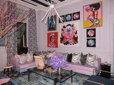
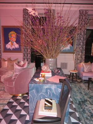
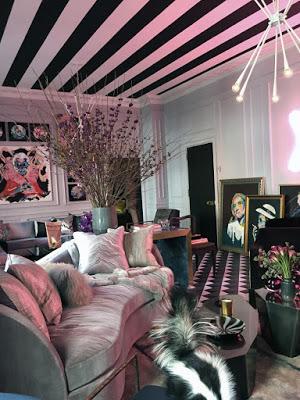
Antonino Buzzetta's Mother's Day room, awash in pink, is a reminder that CANCER SUCKS! The XOXO neon art was a jumping off point, inspired by Antonino's love for his mom (that's beautiful.) Street artist Bradley Theodore's funky portraits of strong women adorned most of the walls, and the strength of pattern throughout was a perfect counterpoint in this feminine room. Bradley USA custom made all the furniture for the room. Anthony said, "Cancer is ugly!" One way he feels he can help is by making a pretty room in an effort to raise money to hopefully eradicate it in our lifetime.
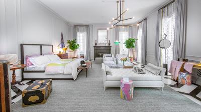
The Home for the Holidays bedroom by international designer Paris Forino is a restful artist's respite. Like a delicious intermezzo between two very bold rooms, it had an ethereal, rich flavor. Art from Neuhaus Gallery and fabrics by one of my favorites, Jim Thompson, made this room feel like an homage to a world traveler reveling in treasures found from around the globe.
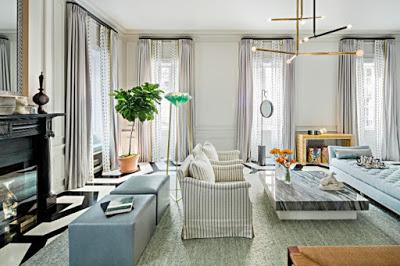
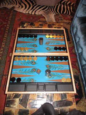
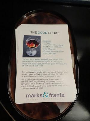
A happy accident in the way of the wrong wallpaper being delivered to Marks & Frantz's room totally made the space eclectic and visually exciting. The duo known for fashion forward, whimsical spaces noticed a trend recently. Their clients have been requesting games be incorporated into their spaces; thus Game Night was born. This beautiful, richly layered, multi tasking room was designed for fun and games. The scotch tasting was a nice touch.
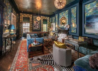
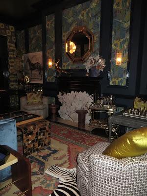
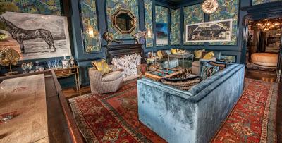
Julia Buckingham has been a busy girl! She just rolled out a collection for Global Views (see story here) and she has been promoting it in lots of fun filled ways. Her room at Holiday House,
Holi Festival of Colors, signifies the coming of Spring in India and Nepal. Happy colors and pattern embody her spirit and achieve her main objective of bringing that spirit into the design of the room. Julia was working with a woman who was battling cancer during the project. This woman said she wanted to keep going with the decorating because it brought her joy during a difficult time. NEVER underestimate the power of a beautifully designed environment!
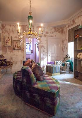
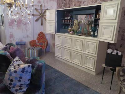
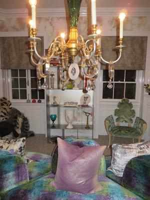
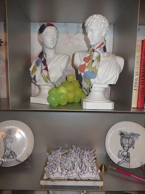
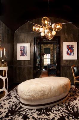
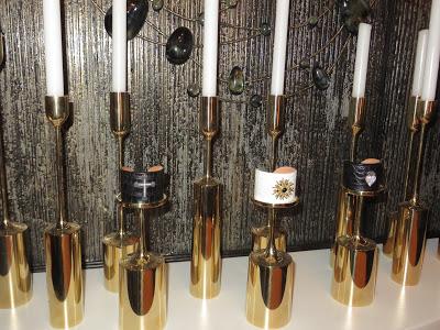
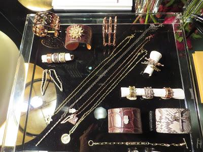
I loved the way Katie Scott merged her 2 passions, that of interiors and jewelry design. This Houston designer made the most out of a few small spaces! The ladies lounge or private space, celebrating a Golden Anniversary was infused with dark colors, metallics, and jewel like accessories with sex appeal. I just followed the fabulous lighting. A percentage of her jewelry sales will be donated to BCRF.
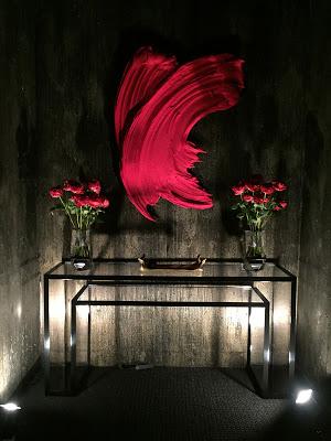
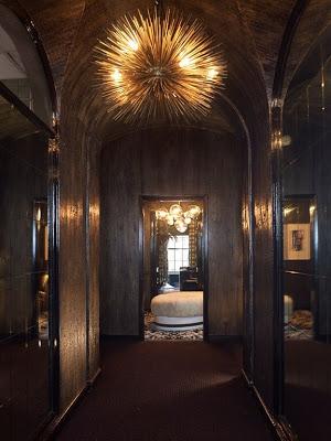
Speaking of jewel like spaces ~ Rio Hamilton's graphic Charging Station yielded high drama in a small space! The obvious focal point of the room was the oversized painting by artist Andrea Selby, depicting a woman who beat cancer, passed her 5 year mark, and is celebrating at her favorite cafe in Paris. Not to be overshadowed is the (almost) priceless turn of the century frame where each side is made out of a single piece of elaborately carved wood by Lowy.
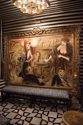
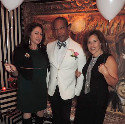
It became the unofficial hot spot for a photo op as demonstrated by Tamara, Rio and myself.
We're not done yet. Stay tuned, there's more....

