One of my magazine clients is Connecticut Green Guide. It focuses on environmental issues. The last time out, they needed an illustration for an article which contained good news and bad news.
The good news: air quality in Connecticut improved in 2014 for the second straight year.
The bad news: there was still a lot of pollution, thanks to New York City traffic. City smog drifts eastward into Connecticut, polluting the air. Its impact can be particularly severe during a summer heat wave.
Did Connecticut figure out a way to solve their NYC smog problem? Nope. They got lucky. They had cooler than average summers the past two years. Last summer was particularly cool. That was true for all six New England states.
Here’s the illustration. Note the “solar-powered fans.” Is there such a thing? I don’t know. The editor suggested I put them in to emphasize Connecticut’s commitment to green technology.
The illustration contains an amusing error. It’s sitting there in plain sight, but it’s not easy to see– can you spot it?


Here’s a detail image. Note: the error is not visible in this detail image.


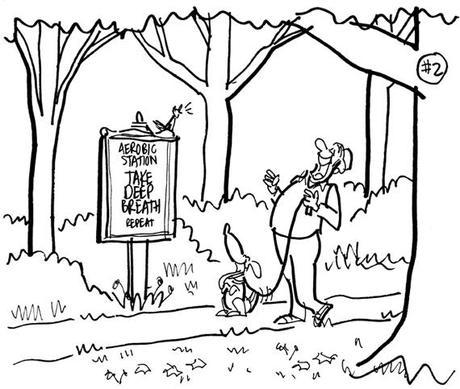
I always give my clients several ideas to choose from. This 3-panel sketch shows a kite that’s finally able to “fly high,” thanks to cleaner air.


Many cities now have fitness trails where walkers and runners can stop at stations and do various exercises. I thought it might be amusing to have a station where all you had to do was take a deep breath. Something that requires good quality air, of course.


Here’s a cartoon map of New England. The maple leaf designates Canada to the north. You can also see part of New York State and New Jersey. The little guy in the boat got included to help balance out the illustration. Mean ol’ New York City is blowing smog in Connecticut’s face.
The three northernmost states are smiling, happy to be up where the air is clear. Well, mostly. The big guy on the right is the state of Maine. The red arrow is pointing to New Hampshire, home of yours truly.


Here’s the finished illustration again. Last chance to spot the error and win a free solar-powered toenail clipper…


Here’s the thing: every car is headed away from the city. We see exit signs for inbound traffic, but there isn’t any– not a single inbound car.
Now you might be thinking: well, there is an inbound lane– it’s just empty, that’s all. Alas, that’s supposed to be one of those concrete safety barriers– so I not only forgot to include inbound traffic, I forgot to include any inbound lanes!!
Here’s the ironic twist: What I drew as a concrete barrier looks like an empty strip of road. It tricks the eye. You see two streams of traffic, but you don’t notice they’re both going in the same direction. The exit signs don’t look funny because we expect to see signs like that on a freeway.


* * * * * * * * * * * * * * * *

How’s the air quality where you live?
Are you familiar with cases of secondhand smog?
Ever seen a one-way freeway before??
Hope you’ll leave a comment.

If you enjoyed this post, please click the Like button below.
If you’d like to share this post with others, please click Tweet or Facebook or StumbleUpon or one of the other Share buttons.
I also invite you to get updates. Just click the Get Updates button in the sidebar below the Portfolio Thumbnails, or click + Follow in the blog menu bar.

If you’d like to buy prints or greeting cards, click on any of the large preview images in the sidebar below the Get Updates button.

Other Posts You Might Enjoy:


