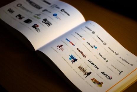
Photo credit: Filipe Varela via Flickr
The following is a guest post by Matthew Brennan. His bio is at the end of the article.
Building your brand online is crucial in today’s marketing world, and your logo is a critical part of that process. It’s the first visual that potential customers will have of your brand.
Whether you are bringing an existing logo online for the first time, or creating a logo for your website, there are certain design principles to keep in mind.
Some of these principles apply to logo design in general, but all are even more important when you’re considering an online audience.
- Keep it original – Remember, that your logo should distinguish your brand from the competition. Think about standing out in a crowded page of search results, Facebook news feed, or Twitter stream. That means having a design that truly represents your business.
- Make sure it’s professionally designed – Your logo is the first visual customers will recall as they think about your brand. Sure there are several places that you can get one for darned near free, but you’ll be happier in the long run treating it as an investment.
- Simplicity – Your web audience won’t stick around more than a few seconds to interpret your logo. It needs to convey what you do in a clear and simple manner. That means not overdoing the design, or the written message within the logo. Remember, it doesn’t have to tell the whole story, but should draw people in to the rest of your message. This is even more important online.
- Don’t overdo your fonts –If your logo is cluttered with too many fonts, it can come off as messy and disorganized. This is a problem when simple and clear win the battle for attention. This is because these attributes convey strength and establish trust.
- Don’t use stock art – Many DIY logo designers make this mistake. When you’re trying to distinguish yourself from the competition, it’s not a good idea to use generic artwork that they can access as well. Take the time to produce something original.
- Use Vector not Raster – As raster images are blown up, they become pixilated, which can become a big problem on the web. Your image should look good in a variety of sizes.
- Adoptability – Your logo should look good in a variety of sizes and places. It needs to look good with or without color. It needs to work on social networks as well as within your own platform. Now is the time to consider all of its online uses.
- Updated and modern – A major goal of your entire web presence is working to establish trust. An outdated logo is easy to spot online, and can undermine your efforts.
- Forms a personal connection – Your logo should be friendly and inviting. It should speak to your audience and highlight the personality of your business. Again, this is hugely important in the hustle and bustle of doing business online. If your logo works to establish that personal connection, you’ll be ahead of the game when it comes to winning online customers.
- Provides clarity – A good logo can give customers an idea of what you do. This can occur through the message, or some simple design element within the logo itself. Doing this effectively can make your entire online operation more efficient.
What other logo considerations would you make online?
logo design tipsMatthew Brennan is a marketing writer based in the Chicago area. He regularly writes about content marketing, blogging, and engaging with your audience. He has been published on ProBlogger, Soshable, and Business2Community. Connect with Matthew on LinkedIn, Twitter, Google+. He reviews sites like Icon ID sign solutions, providing people with quality options for their marketing needs.

This article by Cendrine Marrouat is licensed under a Creative Commons Attribution-NonCommercial-NoDerivs 3.0 Unported License.

