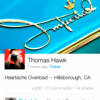
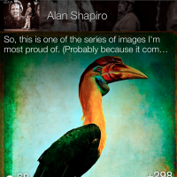
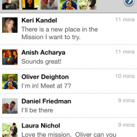
Google just updated its Google+ iPhone App, and it looks amazing. The earlier version of the App was simple and was liked by everyone in the Google+ community. The latest update would surely blow your mind.
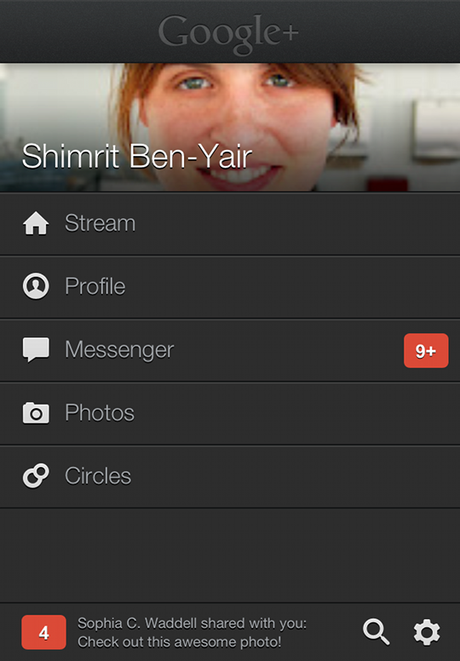
A feast for the eyes
Full-bleed photos and videos are cool. But you know what’s really cool? Content so immersive it remakes your mobile device into a rich carousel of beloved memories and breaking news. That’s the Google+ experience we aspire to, and today’s release helps us get closer:
- Whether you post photos or articles or text, we’re making ‘em look gooood
- We’re adding crisper fonts, larger profile pics and a friendlier homescreen
- We’re making the stream easier to scan, and easier on the eyes with overlays, gradients and other visual elements
A stream you can swim in
Looks alone aren’t enough—you also need an app that’s fast and fluid. Even a simple swipe gesture can inspire the same “wheeee!” as the bubble wands and ball pits we enjoy(ed) as kids. So today’s update pays special attention to fun and performance:
- Conversations fall into view as you move forward and backward in time
- Optical cues (like parallax) help the mind linger on individual posts
- Important actions like +1 now float atop the stream, making it easy to endorse all your favorites
The Apps looks like has been made ground up from scratch and has completely changed the look of Google+ on iPhone. Surely, they have talented engineers working there to make it happen but this App must have taken its time to make it look so gorgeous.
