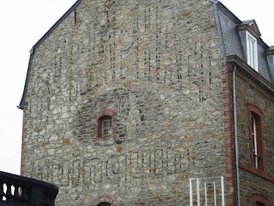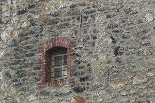
Although the sign has faded to its outlines, we can still clearly read the words 'St Raphael quinquina'. (This product is one of several French quinine-based aperitifs) The window is framed by a dark oval in which a waiter can just be seen holding a tray. As the logo featured two waiters, one a white silhouette and the other red, we can assume that a companion has faded to invisibility - although there are perhaps suggestive hints to our survivor's right. He would usually be to the left, but the window may have forced a redesign - or perhaps the traces I see are just wishful thinking. There has been ample time for fading: the rounded lines and restrained central logo tells us that this predates the 1950s, when the brand underwent a dramatic change in style.

I've talked before about how my family have gradually been converted, more or less willingly, to ghost-sign spotting. This example was found by my dad and photographed by my brother-in-law - a successful family effort!

