The bonus of being off work for the last couple of weeks is that as my energy has come back I’ve been able to tackle a couple of home improvement projects I’ve been meaning to do for goodness knows how long. Neither are revolutionary or particularly impressive (my DIY skills are, generally speaking, pretty pathetic), but both were certainly satisfying and have made nice, if subtle, changes to their respective surroundings.
An Upcycled Chest of Drawers
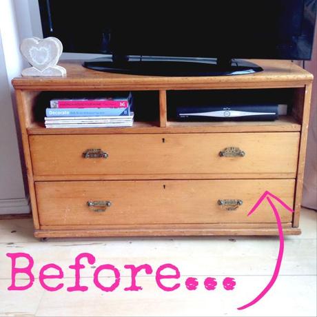
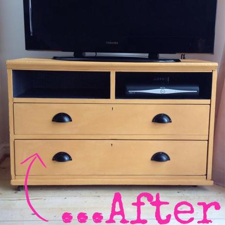
First up was this chest of drawers. An ancient hand-me-down which had been passed down when Paul and I moved in together, we had removed the top two drawers, drilled a couple of holes in the back and used it as a TV unit for the last three years. It’s function was spot-on, but the cherry wood jarred a little bit in the room and those empty drawers in particular seemed very unloved.
I have Apartment Therapy on my blogreader and really love the Before & After upcycling projects they feature, so I decided it was time to do my own. Our living room is already full of warm brights, but since getting a framed print of The Kiss by Gustav Klimt for Christmas, I wanted to draw out the gold and yellow tones from it… so a mustard chest with black iron handles was my vision. I wanted to funk the chest of drawers up a bit, making it a bit more modern whilst having some fun with colour.
Annie Sloan Chalk Paint is all the rage on t’internet. It’s fab for lazy DIY-ers like me, because there is NO prepping, NO sanding, and NO priming involved. Simply give your designated item of furniture a wipe down to get rid of dust, and then on goes the paint. (Hint- I’d read a few tutorials and as well as giving the tin a really good shake, some people recommend turning it upside down an hour before painting, as the colour pigment can tend to settle at the bottom.) There are two yellows to choose from- Arles and English Yellow- but I went for Arles which in Annie’s own words is a rich yellow ochre with a hint of orange juice.
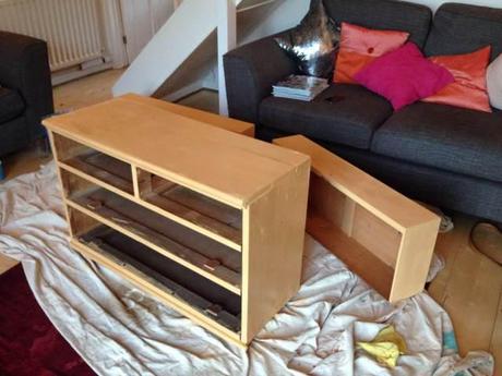
First coat on.
Hardware off I got to work, the best thing being that Annie Sloan Chalk Paint is virtually odourless so you can do it indoors. Although two coats isn’t always needed, we did a second as I wasn’t convinced by the colour and wanted it a lot stronger, before leaving to dry overnight. The next morning it was time to wax- a step which is notoriously difficult according to some online tutorials but which I found very problem-free, maybe because we used an old rag (a pair of Paul’s old boxers in fact) rather than a wax brush.
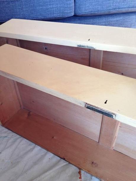
Front drawer waxed, back drawer about to be.
Annie Sloan Soft Wax in clear was the recommended product, and the trick was to use really very little. Once applied (thinly!) and worked thoroughly in to the wood, you should be able to wipe your finger on it and there be no greasy residue or mark. I think using a rag really helped with this, and as the wax initially goes on dark before drying, you can see which bits you’ve done and which still need to be done. I found the waxing very simple, and had the whole thing done in 20 minutes. (Annie recommends leaving your item of furniture to dry for 24 hours before placing anything on it though.)
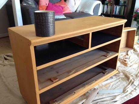
Wallpapering the drawers.
Next up was tackling those drawer holes at the top. I’d originally had visions of going bold with black and white stripes, but a) I couldn’t find the right paper, and b) I knew Paul would hate it. So instead I bought an almost snakeskin-effect black wallpaper from Homebase which went on with spray adhesive. This was a pretty fiddly job- lots of measuring, cutting up and swearing on my part- but I think the finished look is very clean and chic. All I had to do was wait for the iron handles to arrive from an eBay seller, and bobs your uncle, we had a new re-vamped TV unit.
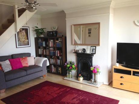
Spot the Klimt.
If I’m completely honest, I wasn’t entirely convinced by the colour at first. The images are slightly misleading as it is a bit peachier in real life, but certainly out of bright sunlight it has the more mustardy effect I was after and I LOVE the new handles. It’s brightened up our little living room in time for summer anyway and despite being a weekend project (with drying time), it was super easy.
DIY Glitter Wall Art
So my second project was something I whipped up in a morning. I had a spare white frame (size 8.5 x 11″) and was keen to fill it with something homemade and meaningful that would look good on my gallery wall. I also didn’t want to have to buy any new materials, with a whole box of crafting bits and bobs at my disposal. Glittery typography it was then.
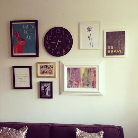
I had the mantra be brave in my head. It seemed particularly apt given my recent experience, and is generally a good philosophy to live by, I think. I certainly wouldn’t have Utterly Wow off the ground without taking what seemed like massive, scary leaps in to the unknown. Plus who doesn’t love a bit of alliteration?
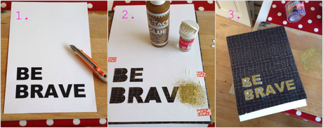
The process…
1. After a good play around on Word and finally working out how to amend the line spacing, I printed my phrase on to a piece of card I had left over from my wedding. Using a craft knife and a chopping board I then cut the letters out as neatly as I could.
2. I then laid the cut out phrase on to my black background (recognise the snakeskin-effect wall paper?) before securing together with some washi tape. Then it was a case of brushing on glue and shaking on glitter. Simples!
3. The not-so simple part was the neatening up. Once I’d gently prised off the card (which you need to do before the glue dries), the glue and the glitter had run on most of the letters. The good thing about using wallpaper though is that it’s pretty sturdy, so with the help of a damp cloth, tweezers, a cotton bud and a dry brush, I had those glittery letters whipped in to shape in no time.
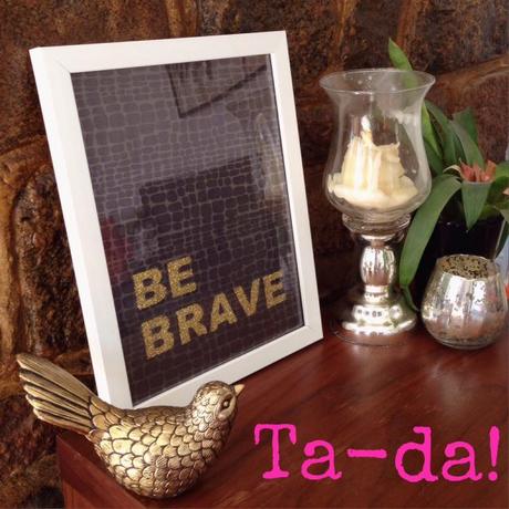
…and on The Wall.
Poor photography and glass reflection aside, I’m thrilled. For something that was so utterly simple, it has a lot of impact I think, and I love the gold, black and white together. And yes, that is my gallery wall, VERY MUCH a work in progress still but as you can see I’m going for the cross your fingers and hope for the best tactic at the moment. I’m not entirely happy with the arrangement or balance, but as we’re *hopefully* moving house in the next few months, the project is on pause right now anyway. For the moment it’s just fun to play and get creative… and I think the Be Brave piece is a rather lovely addition, wouldn’t you say?
So that’s my week of crafting. Do any of you have any DIY plans for this weekend? It’s meant to be another lovely one so whatever you have planned, be sure to have some fun in the sun- that’s an order.
It’s Friday- woohoo!
Sama xxx
