
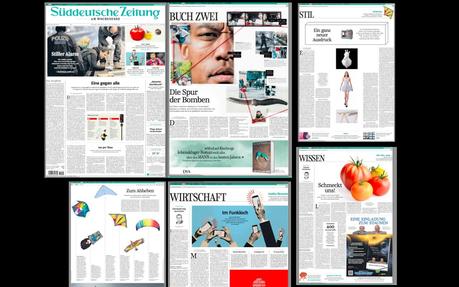

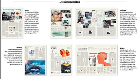
Suddeutsche Zeitung Am Wochenende opens with a fully illustrated navigator of inside offerings, with emphasis on sports, lifestyle, technology, the old weekend standbys for that much discussed lean back edition.
I first found out about this new effort from one of Germany’s highest circulation dailies two weeks ago when I had a chance with my friend and Suddeutsche managing editor, Wolfgang Krach.
He told me how hard they were preparing for what was last week’s first weekend with the new product.
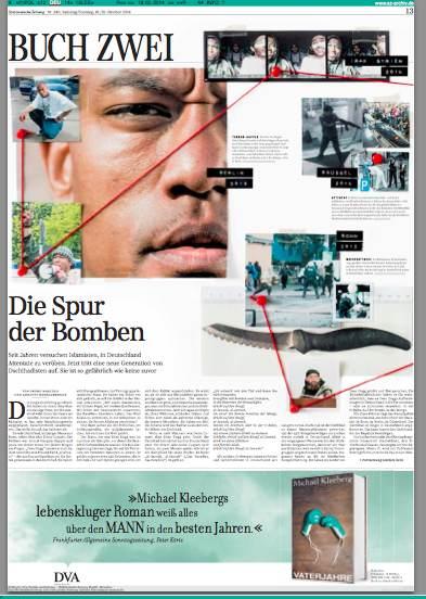
“It’s very new and fresh, and it emphasizes the print edition, with new contents and sectionalizing that emphasizes a new Book 2 full of features, health, science and style, in addition to news,” Wolfgang explained.
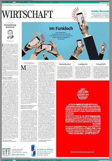
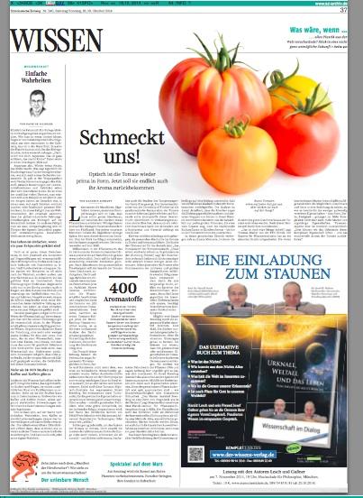
Now the new weekend edition is out: elegant in the presentation of news, the meticulous use of internal space, the precise grids that the German newspapers are known for, and an ambience of inviting pages with great illustrations and photos.
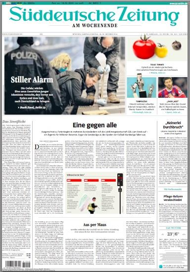
This Suddeutsche is still a very text driven product, no doubt, starting with page one, where, once you pass the visual navigator, it is a sea of type, but so elegantly presented that it is inviting. It also signals: you are in for in-depth, high quality journalism.
A conversation with the SZ's art director: Christian Tönsmann




Mario:
What was the reaction of the readers to the first edition?
Christian:
The reaction of the readers were all in all quite good. Of course there were the usual complaints you get when you change something in the paper, but the proportion of likes and dislikes was pretty good: almost a third of all emails praised the changes. Today we got the news: the sale by retail at the train stations increased seriously.
Mario:
What was the most challenging part of this project?
Christian:
The most challenging part is still to combine a daily production with a weekly production. You need new structures, a concise planning and ,most of all, you have to get this into the heads of a staff that is used to work on a day to day basis.
Mario:
What is the typography used?
Christian:
You probably remember, that we introduced a new typography system in 2012 and got rid of the crude Helvetica-Times-Excelsior- and Univers mixture. The type designers Nils Thomson and Henning Skibbe developed a complete Set for us – The SZ Serif, SZ Sans, SZ Sans Condensed and SZ Text. Now they added the SZ Serif Condensed. We use it primarily in the page header of opening pages of the sections, on the front page and in commentaries.
Mario:
Tell me about the design team involved in this project
Christian:
We are team of three. Stefan Dimitrov is working for the newspaper for almost 20 years, I joined the Suddeutsche Zeitung in 2011 after I got assigned with the last relaunch and now we are really happy that Dirk Merbach came as the third man to support us for the things come.

