This is the weekend edition of TheMarioBlog and will be updated as needed. The next blog post is Monday, July 8
TAKEAWAY: Looking for a great book for those inspiration sessions we all need before tackling a new project? Try Fully Booked: Ink on Paper. PLUS: Pages we like
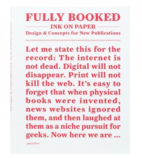
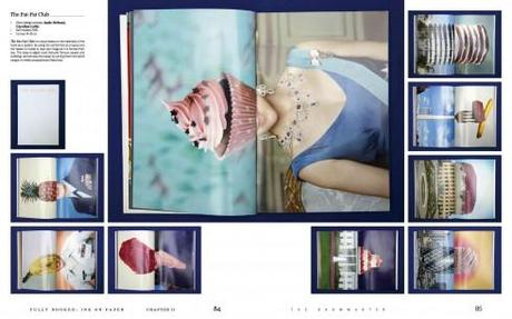
Everyone probably has a book that he tucks away inside the beach bag to read under the umbrella between sips of iced tea and journeys in and out of the water.
It’s summer 2013, I am actually enjoying a beach vacation in Florida, and there is a book that I can’t seem to put down, although it is a bit heavy for the beach bag, and more suitable for the coffee table.
Nonetheless, Fully Booked: Ink on Paper—Design & Concepts for New Publication is the book to have if you like a celebration of everything print, a parade of 280 pages of book covers ranging in topics from a Metropolitan World Atlas, to a Franz Kafka Book Series, and, all the way to, yes, the Bild Buch, about that favorite German newspaper of ours.
As a springboard to ideas, and as a superb teaching tool, Fully Booked can guide the beginner but also the experienced designer.
From effective grid use (Page 1: Great Expectations), to typography (Goalkeeper Forever Orality & Literacy), to color (Design Hotels Book 2011, Neue Genfer Ubersetzung), and use of white space (Zumtobel Annual Report 11/12), examples abound here. And, if you are thinking “pop ups”, turn to page 38 for the book every child should have, 20,000 Leagues Under the Sea.
It’s all about visuals in this book
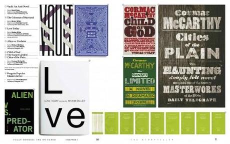
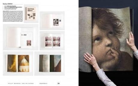
This is a book about visuals, and you will not be disappointed.
Designers will find inspiration on every page with examples from around the globe. Text is minimal, but the introduction, by Andrew Losowsky, books editor of The Huffington Post, is worth getting this book (which sells for about $45).
Andrew, with whom I am meeting in a few weeks in New York City, celebrates print in his informative, thought provoking and entertaining introduction. Here Andrew tells me what led to that introduction:
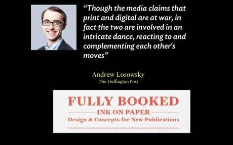
Though the media claims that print and digital are at war, in fact the two are involved in an intricate dance, reacting to and complementing each other’s moves. Fully Booked is a celebration of this fact - so when it came to writing the introduction, I thought it might be interesting to set it in a parallel universe, not far from our own, in which digital was invented first. Once I’d had the idea, the logical progression was easy to follow.
Just enjoy some of that introduction’s highlights here:
It’s easy to forget that when physical books were invented, news websites ignored them, and then laughed at them as a niche pursuit for geeks….
(Print) has changed so many things in our lives that it can be hard to remember a time before print, when everything was digital…..
There remain a few people who say that they wish print could be uninvented.
Print continues to reinvent itself each day, and there is much to celebrate about each of those reinventions. The examples in this book definitely lead us into that celebration.
There is a reference in the book about “great looking stories”. That, in a nutshell, summarizes what’s in store for those engaging with Fully Booked.
Where to get Fully Booked:
Of related interest:
An Interview with Andrew Losowsky
http://plastik.me/fully-booked-an-interview-with-andrew-losowsky/
Pages we like

Another well crafted cover from The Ottawa Citizen, designed for the opening of a BluesFest by our friend and colleague, Dr. Pegie Stark Adam. Pegie’s expertise is color and here we can see how color has been used so effectively to create eye movement around what is,in fact, a poster to celebrate the upcoming festival with singer Björk providing just the ideal subject.
For more information about the festival: http://www.digitallounge.ca
From The Virginian Pilot
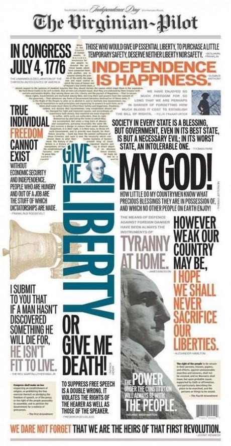
Another example of the front page as poster.
This was the front page of the Fourth of July edition of that always visually surprising newspaper: The Virginian-Pilot out of Norfolk, Va. This is visual storytelling at its best: seductive, well executed and just so appropriate for the Fourth of July. It’s all sans serif type except for the text inside the star (as I see it). Kudos to Sam Hundley and his team there. Bravo performance, guys.

