TAKEAWAY: It is an exciting evolution to take your newspaper or magazine from a pdf only presence in the tablet to a curated tablet edition. We do such a workshop in Slovakia this week for the team of Novy Cas. In two days: you start at zero, then develop your information architecture, then move on to the design
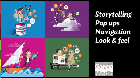
A typical iPad Design Lab deals with four essential topics: storytelling, pop ups, navigation, look & feel/Luis Vazquez illustrations
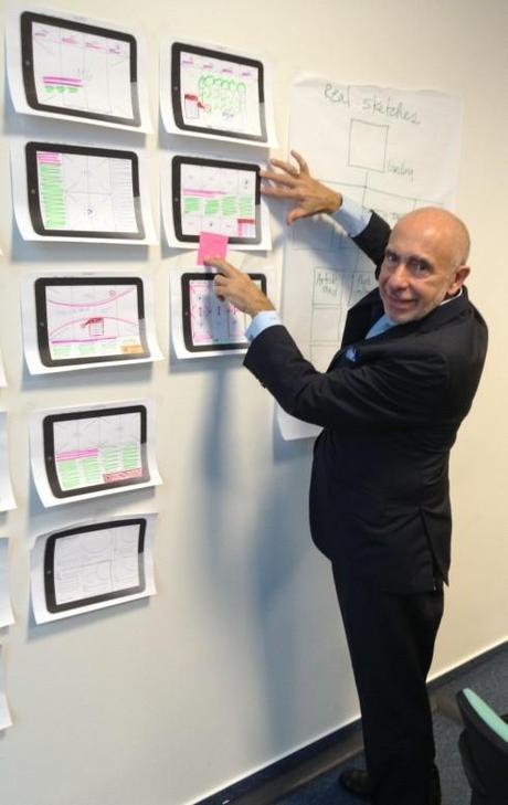
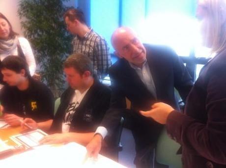
Moments from the Novy Cas iPad design workshop: first conceptualizing how to translate the print product to a tablet curated edition; then sketching information architecture strategy; then developing the look & feel, a process of two days from start to finish.
So the team wants to evolve from a pdf only tablet edition to a curated one. That’s the challenge and the excitement ahead for the editors/designers of Slovakia’s Novy Cas, and we are doing a two-day workshop this week to help them with their goals.
Where does one start the planning of a curated tablet edition?
Let’s go tablet edition
First, the publisher must give the go ahead to such curated edition, which requires the necessary human resources to be executed. There is not too much automatic about a curated edition, which is what makes them so popular with users, who appreciate visual surprises, pop ups and content that has been customized to exploit the potential of the tablet.
Unlike the pdf edition, which is relatively easy to execute, the curated edition requires at least three people in charge: an editor, a photo editor/art director, minimum of one journalist to adapt stories from other platforms to the tablet.
Those important essentials
Second, our workshop covers the essentials: the research of tablet use, storytelling strategies, look and feel, grids and navigation. A special unit of the workshop is devoted to those important and necessary pop up moments—remember, when you design for the tablet, you design for the brain, the eye and the finger. Pop ups play a key role.
Key points:
Research: A review of tablet user habits by age, gender; results of the Poynter Institute EyeTrack Tablet research; various studies from around the globe—-tablet users range in ages from the very young to the 70+ set; tablet users prefer to check news in their tablets in the evening.
Storytelling strategies: Tablet users come to read—long narratives and mini stories; they want to get more than the information in an average print-styled caption; it is important to train the staff to write mini stories, self contained in 10 lines or fewer.
Look & feel: Take the DNA of your existing print publication, but stop the imitations there; create your own look for the tablet, make it special, distinct, seductive, but with subtle reminders of the publication that originates it. Pay special attention to fonts (usually play with three fonts to keep things active); experiment with color (especially for type)
Grids: A first step, just as it is with any type of design: the map to the journey; whether you go two, three or four columns, or mixture of them, establish your grid criteria early. It will affect all you do.
Navigation: Should be as intuitive as possible, simple (based on few clickable elements that define the content of the entire app—and, important, do not try to emulate every section you carry by name in your printed publication. Remember, there are no page numbers for sequencing in a tablet edition. Users jump from here to there: make that skipping easy and painless.
What’s your publication’s DNA?
Third, this is the important part of the workshop: when the editors take their existing publication as it appears in print/online and extract its DNA and other important content elements to make them part of the curated tablet edition.
Start with simple sketches
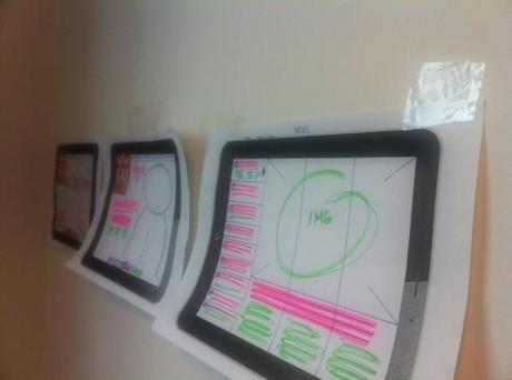
Early sketches begin to present a picture of how content will flow, and elements will fit on the screen
Four, sketching begins—-first with an outline of how content will flow, number of screens per section, typographic components, grid and color palette.
To me, this is a key step in the process, as we put all sketches on the wall, review content flow, ease of navigation, app functionality.
See those first fully designed screens
Once the information architecture has been clearly defined, then it is time to turn to the more design oriented elements, to see how an actual screen looks, defining the look & feel of the tablet app.
Here is where storytelling, typography, grid and color palette come together as a perfect symphony. Or, where one can ask the question: do they?
It all happens in two days, which is the way the world moves today: you start at zero, then develop your information architecture, then move on to the design. That provides the necessary foundation for the tablet edition to become a real tangible part of the media quartet.
Of special interest today:
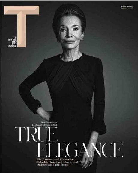
The new cover for the Times’ T Magazine
Li on T: The New Creative Director Speaks: style file: daily fashion, party, and model news
https://mail.google.com/mail/u/0/?shva=1#inbox/13cf35eb2c9604da
Our own take on the new T of Times Magazine:
Keep The Daily Texan daily | The Daily Texan
http://dailytexanonline.com/opinion/2013/02/19/keep-the-daily-texan-daily
Highlight:
The Daily Texan, a 113-year-old campus institution, faces life-or-death financial troubles. The newspaper’s student staff and the Texan’s readers and supporters must step up and take the newspaper’s destiny into their own hands.
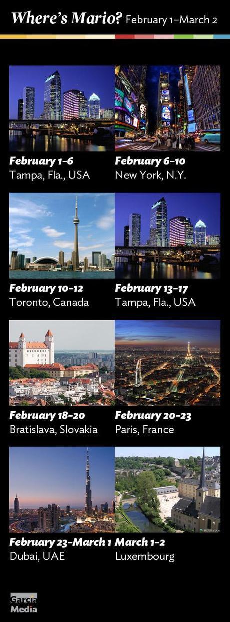
Where’s Mario until March 2, 2013?
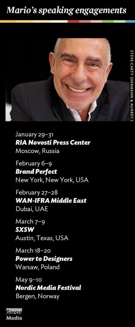
Mario’s upcoming speaking engagements
Take advantage of our iPad Design/Ad Lab workshops
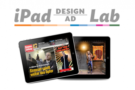
Do you want to take your brand to the next level by creating a tablet edition? Garcia Media can help. We now offer one- to two-day iPad Design Lab workshops on demand to jumpstart your presence on this exciting new platform. We also offer iPad Ad Lab workshops to develop engaging advertising models for your app. Contact us for more information.

Purchase the book on the iBookstore
iPad Design Lab has been given the QED Seal
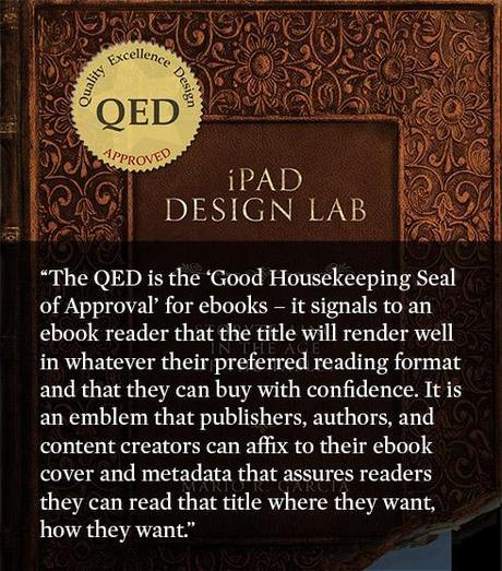
The QED (Quality–Excellence–Design) Seal is bestowed by the judges of the Publishing Innovation Awards after “a thorough, professional 13-point design review with an eye towards readability across multiple devices and in multiple formats.“
Learn more about the QED Seal here.
The EPUB version of book is HERE:
Now available: The EPUB version of iPad Design Lab: Storytelling in the Age of the Tablet, ready for download via Amazon.com for Kindle:
Here is how you can get iPad Design Lab book:
The original version of the book is the multitouch textbook version available on the iBookstore for iPad (iOS 5.0 and up):
https://itunes.apple.com/book/ipad-design-lab/id565672822
This version includes video walkthroughs, audio introductions to each chapter, swipeable slideshows, a glossary and a sophisticated look and feel.
Apple only sells multitouch textbooks in certain countries at this time, unfortunately. Copies are available in at least the following countries: Australia, Austria, Belgium, Canada, Finland, France, Germany, Great Britain, Greece, Italy, Latvia, Luxembourg, The Netherlands, Poland, Portugal, Romania, Slovakia, Spain, and the United States.
For those in other countries and without an iPad, we have made the book available in a basic edition for other platforms. This basic edition includes the full text of the original, along with the images and captions, but lacks the other features such as audio and video. It is available on the following platforms in many countries:
Amazon Kindle:
http://amzn.to/SlPzjZ
Google Books:
http://bit.ly/TYKcew
Take a video tour of iPad Design Lab
“iPad Design Lab” trailer on Vimeo.
Read the Society of Publication Designers’ review of The iPad Design Lab here:
http://www.spd.org/2012/10/must-read-ipad-design-lab.php

Keep up with Mario Garcia Jr.. via Garcia Interactive: helping transform online news since 1995.
http://www.garciainteractive.com

