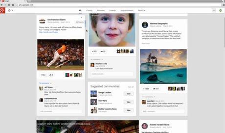
One of the main show-off’s at the Google I/O 2013 key note was their new design for Google+, which received a mix of both love and hate by its’ users. Well, most people don’t like ‘change’. They always react negatively in the beginning until they get used to it. The new Google+ received the same response for its new look and the other 41 new changes. I don’t even know what all those 41 changes are but I found 4 great features that improved my G+ experience. Check them out.
Pinterest-like Interface
New interface gave me a feeling like I’m on Pinterest. Which is now bad but, the narrow posts with limited information made things a bit harder to go through the information without wasting time. Instead of clean, minimalist interface that showed me one full post at a time, now I have to move my eyes in two directions trying to read three posts at once, and to read the full post I have to click on each of these posts to “Read More.” Although, it does help to go through the stream quickly if you have a lot of followers (that’s me).
Showing #hashtags beside the posts is a great improvement and certainly makes it easier to view more related content. However, all these features are not very enjoyable without a high-speed Internet connection. Many users complained about a lag when scrolling through content.
Batch Photos

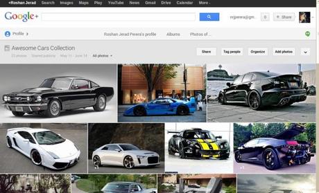
Photo albums now appear as a batch, which makes things easier to browse through photos and find specific photos quicker than before. Another new feature also improves photos quality by automatically enhancing blurry images, highlight high-quality photos and even give the ability to animate then as well.
Animated stuff
Most of the basic features in G+, including the share box that bounces into the middle of the page, the pop-out side bar on the left and many other stuff comes to display with a small animation to give the user a better experience. Beats Facebook, hands down.
Ability to Switch Back
If you don’t like the new look and have trouble reading three posts at once, you can revert back to the old look. Well, sort of. There’s an option in the Accessibility section of Google+ Settings called “Change the presentation of some pages to work better with screen readers and other assistive tools” if you tick that box it will show only one post at a time in your Google+ stream. Posts will appear bigger and will be easier to browse and scroll down. Although, this doesn’t completely revert the design back to the old one.
What do you love/hate about the new Google+? Share some of your thoughts
[Info sources: Google+ Blog]
(All the images, trademarks, logo’s shown on this post are the property of their respective owners)
Roshan Jerad Perera

