This is the weekend edition of TheMarioBlog and will be updated as needed. The next blog post is Monday, October 19.
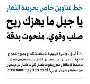
Nadine Chahine, is a type designer specializing in Arabic fonts and the first woman to be type director at Monotype, a 125-year-old global company. She is talented, articulate and with a passion for typography that she translates into the fonts she designs.
That is why I was so happy to have Nadine join us with the design of An Nahar, Lebanon's leading daily newspaper.
When I first was approached by Nayla Tueni, publisher, to redesign An Nahar, I immediately became aware that the newspaper could benefit from a new typographic make over. Enter Nadine, who, by the way, grew up in Beirut, reading An Nahar.
The fact that I was able to attract the very talented Nadine to help us with typographic issues immediately guaranteed the success of this project. That collaboration led to the creation of Gebran2005, which gave the project a dynamic push forward. The Gebran2005 typeface includes two weights, bold and heavy. Both are designed with tight proportions in order to preserve space in An-Nahar headlines. Gebran 2005 was named after Gebran Tueni, An Nahar’s former editor and publisher and a member of parliament, elected to a Beirut constituency in 2005. In December of that year, he was assassinated in a car-bomb explosion.
I remember Nadine telling me at the time that, because she was familiarized with An Nahar and its rich history, she wanted the tone of the typeface to evoke authority, yet to maintain an elegant and contemporary look.
Nadine has recently been promoted to Monotype’s UK Type Director and Legibility Expert and this year two of her typefaces got released: Zapfino Arabic and ITC Handel Gothic Arabic.
I’m quite happy with both. I’m also now working on Avenir Arabic which I’m quite excited about
Take a look at Zapfino Arabic by Nadine Chahine
Nadine discusses good fonts in The New York Times Magazine
What a surprise, as I flipped through the pages of The New York Times Magazine, to find a piece titled How to Design a Font, profiling Nadine Chahine.
Here are the highlights of Nadine's advice:
On the creation of Gebran2005 for An Nahar: ‘‘If it were a person who walked into a room, others would stop and listen.’’
On purpose: "Begin drawing by hand or on a computer. Don’t discount the magnitude of the task. "
On the state of Arabic typefaces: "Sad"
On the design of letters: "Before you start shaping letters, you have to make a few basic style choices. For Latin-based scripts, decide if your font is serif (with small embellishing lines) or sans serif (without). For Arabic, choose between the two central calligraphic styles, kufi (squarish) and naskh (rounded). Then sketch the key letters whose basic shape will inform all the rest. For Latin-derived alphabets, always begin with ‘‘n’’ and ‘‘o.’’ An ‘‘n’’ requires a vertical stroke connected to a curved one. Once your ‘‘n’’ works, mirror it in structurally similar letters like ‘‘m’’ and ‘‘h.’’ As soon as you have sufficient consonants and vowels, string them into words. Then build a full character set (capitalized and lowercase letters, numbers, punctuation marks) and write a few paragraphs. Scrutinize the spaces and shapes between characters. ‘‘The letters can be ugly,’’ Chahine says, ‘‘as long as they make good-looking words.’’


The Gebran2005(TM) typeface was created for An-Nahar, Lebanon's leading Arabic-language daily newspaper. Created by Linotype typeface designer, Nadine Chahine, Gebran2005 is part of a major redesign of the publication.
Of related interest
http://www.creativematch.com/news/customized-typeface-for-lebanon-s/100106/
http://www.businesswire.com/news/home/20110411007222/en/Customized-Typeface-Lebanon’s-An-Nahar-Newspaper-Debuts-Redesign#.VhugM9a8ApI
Previously in the Garcia Media blog about An Nahar
http://garciamedia.com/blog/articles/an_nahar_and_hindustan_one_day_after_launch_of_new_look
http://www.creativematch.com/news/customized-typeface-for-lebanon-s/100106/
Tow Center Conference: Journalism & Silicon Valley


Happy to be part of the Fall 2015 Conference at the Tow Center for Digital Journalism, Columbia University, School of Journalism.
The Conference, titled Journalism & Silicon Valley, will be November 12, from 9:30 to 5:30 pm.
Go here for more details:
http://towcenter.org/fall-2015-conference-journalism-silicon-valley/
SND Creative workshop/conference in Dubai Oct. 23-25
SND Creative Design Conference and workshops in Dubai
Fernando Baptista, the infographics artist from National Geographic Magazine will hold a workshop in Dubai to share his knowledge and experience on Inforgraphics. The workshop is open for all professionals interested to learn the best of informational graphics practices.
In addition, the program includes a Contemporary Arabic calligraphy workshop.
For more information:
http://snd20events.org/

