Our DIY kitchen renovation is unquestionably the largest project we’ve undertaken since buying the house, but I can’t rightly call it finished. There remains one critical eye sore in the room as it stands—the flooring.
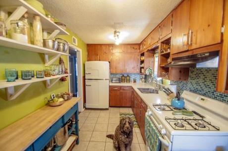
It’s this very unpleasant tiling–beige with brown marbling–that is suppose to have the intended effect of camouflaging dirt. The unfortunate truth is it does the opposite. Even after a deep clean, the floor ALWAYS looks dirty. Mark my words, 2015 will be the year that we finally toss the dingy tiles in favor of something a little more fresh and fun.
But what?
As I recently wrote, for our renovation projects, it is important that we make era-appropriate style choices for upgrading our space. But that leaves me with a lot of questions for what to do about the floors. My first instinct: classic linoleum.
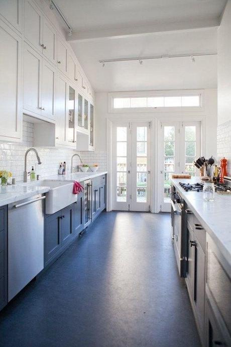
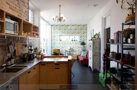
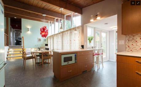
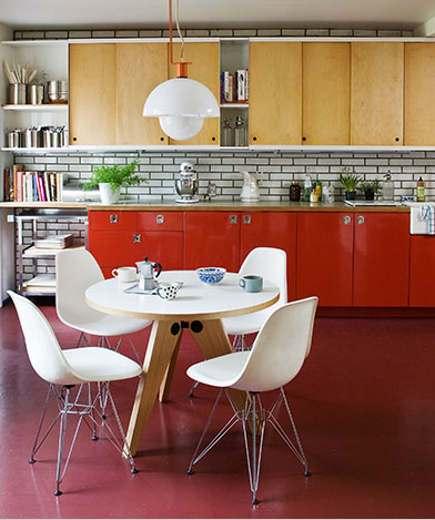
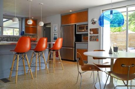
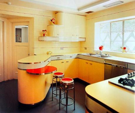
But picking the right shade and texture of flooring to match our eclectic and busy kitchen, would be a challenge. Enter the wonders of photoshop to help point me in the right direction. Right away, two clear winners stood out.
The classic checkerboard:
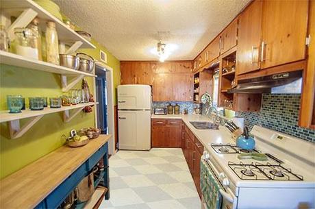
And dark grey:
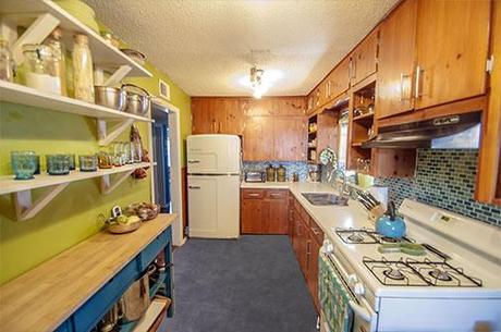
Linoleum definitely fits in with the ’50’s scheme, but the more I thought about durability and style, the more I started to wonder about other contenders. I knew I was a fan of the darker gray color for the floor, but wondered if something a little more sleek would make sense.
Dark gray tiles, perhaps?
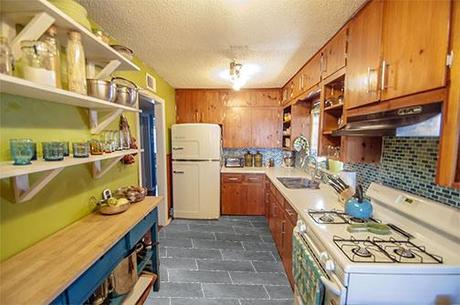
I am definitely a fan of the way the floor tiles sort of mirror the mosaic backplash, but one of the reasons I was drawn to linoleum in the first place was because I wanted to avoid having grout, if at all possible. The kitchen arguably gets more traffic than any other room in the house. And the fewer cracks and crevices in which dirt can collect, the better. Which led me to my final proposition: concrete.
I’ve always loved concrete flooring, but had reservations about how that industrial look would fit in with a mid century vibe. While there is potential for it to clash, I’ve equal reason to believe the contrast could be a refreshing change.
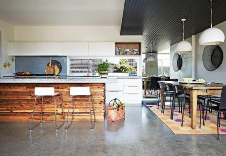
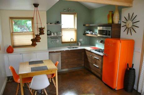
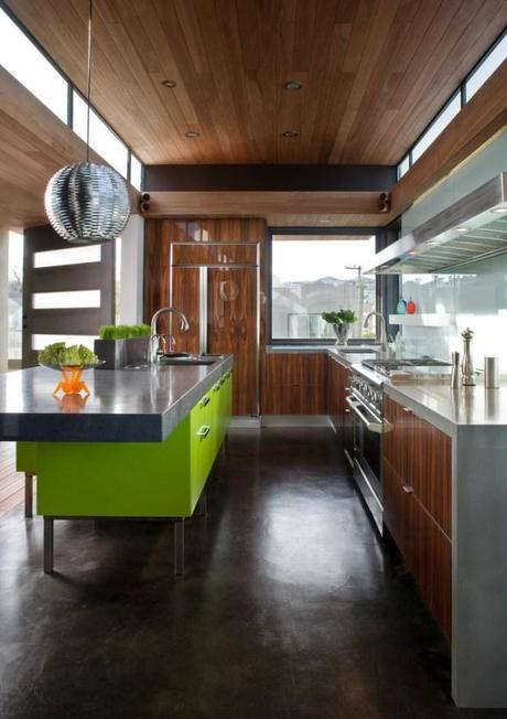
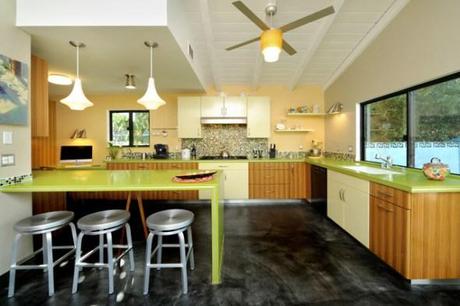
While it’s not an exact science, photoshop confirmed my suspicions. There could be some real potential in demolishing the existing tile and giving the concrete underneath some TLC.
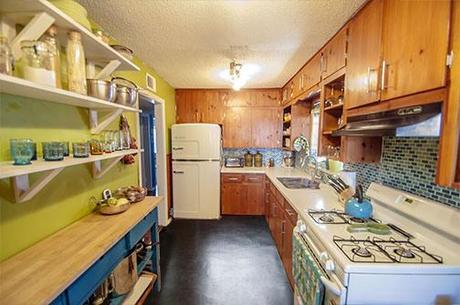
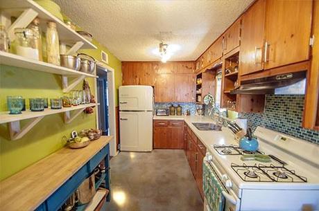
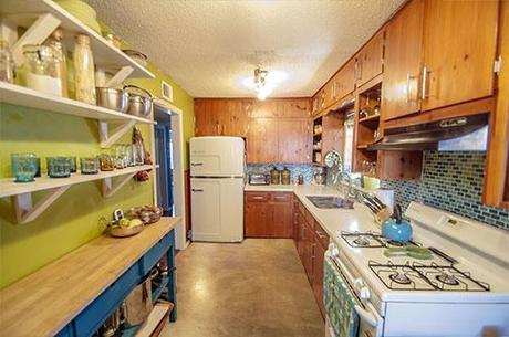
I’m a big fan of how the polished concrete reflects the light (which the small, one-window kitchen definitely needs) and how it would likely make for easy cleaning. What say you Internet? Am I grasping at straws or could there be something to this whole concrete idea? Does the industrial flooring complement or clash with the warm wooden cabinetry? I’m legitimately flummoxed.

