This is the weekend edition of TheMarioBlog and will be updated as needed. The next blog post is Monday, April 8.
TAKEAWAY: It’s a new iPad app for the Financial Times, and a much awaited one at that. The FT was one of the first newspapers worldwide to make an incursion into the tablet, but it has taken three years for it to make the next move.
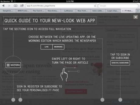
*The FT Guide to use the new web app
*
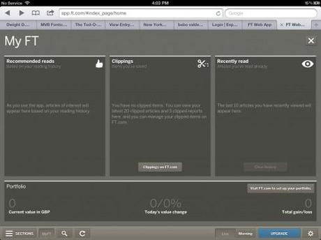
A particularly interesting feature: customization via My FT
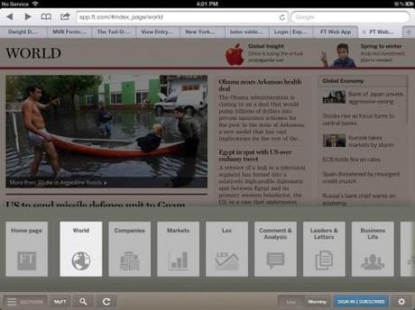
Simple and intuitive navigator
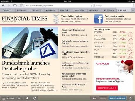
The morning home page
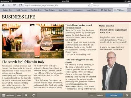
Business Life page
It was worth waiting for this app, as I am sure FT readers are already reporting in their feedback. Newspapers everywhere will be taking a look at how the FT has developed its initiative, pushing forward with a web-based smartphone and tablet experience, and, not less significant: bypassing the Apple Store.
The FT‘s new version of its iPad offering allows readers to move between a live version of the website (for constant updates) and a static view of the printed newspaper’s stories. Users can also clip articles to read later and features a personalized reading history and financial portfolio, all for subscribers, of course.
And, while the app is only for the iPad for now,it will soon be available on other devices like the iPhone, the Chromebook and Android devices.
This is another crown on the jewel of HTML5, and, remember, don’t go shopping for it at the Apple Store. The FT realizes considerable savings by not having to pay Apple the 30% commission. It, however, must work a little harder in marketing the product and making sure that we users find it. Not a major problem, in my view, but one that the FT people are well aware of.
Looking at the new FT app
Here are some first impressions:
—-Aesthetically pleasing, but, like a good pair of pajamas, comfy but not necessarily a fashion statement. Like comfy pajamas, die hard readers of the FT may be contented with the features of functionality and familiarity, although I still think there was room to go a little more aesthetic with the morning edition. Remember, some people may still lean back and linger a little over their cappuccino.
—It’s a big step up from the previous version.
—Navigation is much simpler and intuitive.
—The personalization that My FT allows is definitely a plus here—value added.
If this is the way newspaper tablet editions will go—and it may be so in several regards: the web app concept, not necessarily purchased via the Apple Store and a total HTML5 product, then my hope is that we can strive to be designed more in line with what the tablet is good for and not simply the replica of a news website or a printed newspaper.
HTML5 and aesthetics
Then the important question that I myself keep asking: is the utilization of HTML5 synonymous with design limitations? The answer, fortunately, is NO. It does not have to be.
So I turned to our own Reed Reibstein, art director/project manager for Garcia Media, for his take on the subject. Here is what he tells me:
HTML5, along with its partner technologies CSS3 and JavaScript, is powerful enough to allow almost any design. Traditionally, native apps (i.e., apps built in an operating system’s native language, as opposed to cross-platform HTML) have the advantage of smoother performance, but web apps built on HTML are rapidly catching up as browsers improve.
It appears that one reason why an HTML web app is less likely to be art directed than a native app is designers’ skill sets. More designers are more fluent in designing with InDesign than with HTML and CSS. The more art directed native apps are almost universally designed in InDesign with plug-ins such as Adobe’s Digital Publishing Suite, but the same visual effects could largely be achieved with HTML and CSS. But this leads into the second reason for less art direction: that the FT’s app is highly template-driven.
Reed adds that their templates may be able to be modified to fit different story structures, but their standard is to automatically have the same design for each article. InDesign-driven apps require a designer’s manual intervention to start almost any article, so art direction is easier to incorporate as a default. This is not necessarily a question of web apps vs. native apps; there are many highly templated native apps, such as The New York Times‘. There are also a number of art directed web apps and websites, such as Aside Magazine (http://asidemag.com/), The Bold Italic (http://www.thebolditalic.com/sarahverena/stories/2638-what-to-do-in-sonoma-scribe-winery-pick-up-party), The Great Discontent (http://thegreatdiscontent.com/), and The Verge’s features (http://www.theverge.com/2013/1/16/3740422/the-life-and-death-of-the-american-arcade-for-amusement-only).
The experimental tablet design period continues
The good thing about what we are experiencing today is that three years after the first iPad appeared, we are still in the experimental mode.
The FT brings this phase a long way forward in functionality, customization and editioning. Now we need to see how HTML5 driven apps can accelerate the aesthetics.
Little by little we are getting there, still very much in the iPad Design Lab
Of related interest:
Here is an interesting summary of the FT‘s app history from Nieman Lab’s Encyclo:
http://www.niemanlab.org/encyclo/financial-times/
Highlights:
The FT released an iPad app in May 2010, which requires a web subscription after viewing 10 articles. The following year, the FT released a web-based app available in the Apple store, as a way to avoid being subject to Apple’s revenue restrictions for in-app subscriptions. It was pulled from Apple’s App Store two months later. It was the first mobile news app to use the web language HTML5. In April 2012, the FT announced that its web app had been used by more than 2 million people, far more than had used the App Store version. By early 2013, mobile users accounted for 33% of its traffic.
FT launches second generation web app
http://paidcontent.org/2013/04/03/ft-launches-second-generation-web-app-says-online-payments-will-soon-be-much-easier/
An interview with Steve Pinches
http://mobithinking.com/ft-web-app-interview-steve-pinches
Where’s Mario until April 28, 2013?
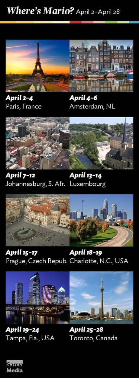
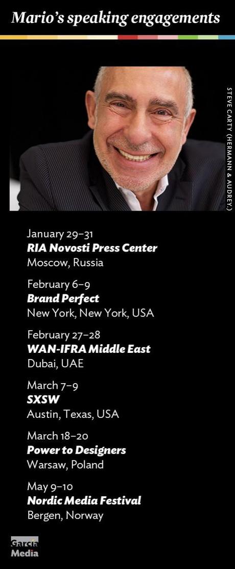
Mario’s upcoming speaking engagements
Take advantage of our iPad Design/Ad Lab workshops
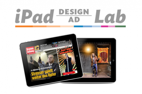
Do you want to take your brand to the next level by creating a tablet edition? Garcia Media can help. We now offer one- to two-day iPad Design Lab workshops on demand to jumpstart your presence on this exciting new platform. We also offer iPad Ad Lab workshops to develop engaging advertising models for your app. Contact us for more information.

Purchase the book on the iBookstore

