TAKEAWAY: Now that the successful Financial Times series, Capitalism in Crisis, is finished, Kevin Wilson, head of design, explains the concept of the “barcode” as a visual foundation to carry the series from one segment to the next.
When creative visual thinking works well
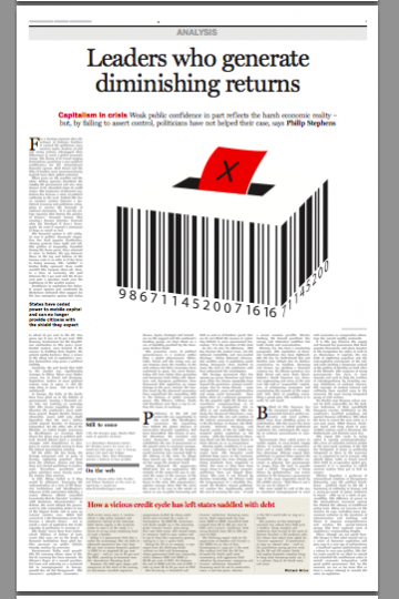
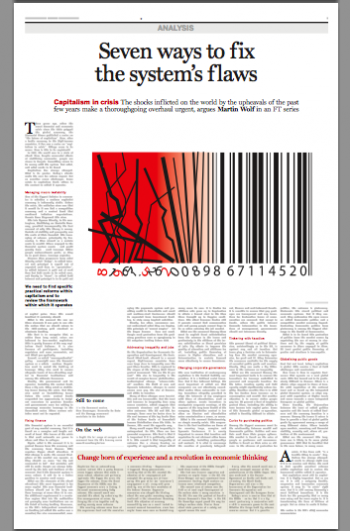
We have been highlighting interesting use of info graphics and visual concepts to tell stories in the blog lately. One recent such post was about the use of a “barcode,“ a familiar symbol, to illustrate a series of articles about the world’s economy in the Financial Times.
This week I have received a mail from Kevin Wilson, head of design at the FT, who was pleased to see my reference to his team’s work and wanted to let me know. In addition, Kevin has sent me the complete set of pages from that series: a wonderful, surprising collection of pages that are the textbook case study of how to treat a story graphically.
I was impressed by the subtle, but direct, use of the barcode as a graphic element that created an instant element of recognition in the series, and told Kevin that. Here is what he had to say:
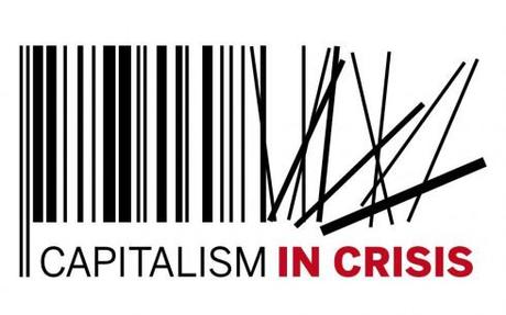
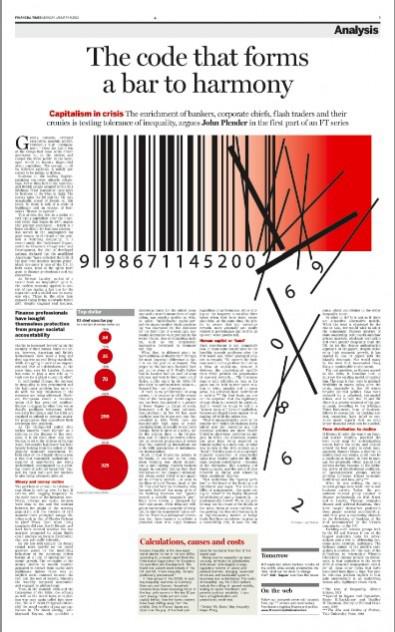
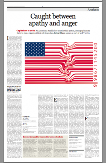
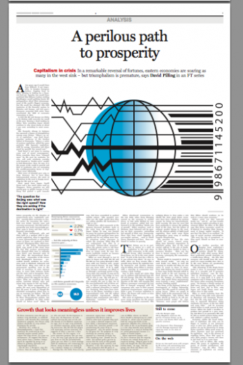
“From the scene-setter (the collapsing barcode), to the US angle, to the contrasting fortunes of western and eastern economies, to the political consequences, to alternative models based on partnership, and finally to possible fixes … the barcode shuffling back into line, the concept began as a straightforward logo but I thought it was a neat way to solve the problem of giving the series a distinct identity - created by in-house graphic artist Lloyd Thatcher.“
For those of us who observe and study graphics and design, the Financial Times examples show us all about the ultimate definition of good visual storytelling:
Creative. Free of decorations. Tells the story at a glance.
Kevin has used an intriguing term in his correspondence with me: distilled story-telling
I asked him to amplify on it:
The distilled story-telling is an approach I try to bring to our big feature pages. Each day we’re confronted with heavyweight analysis, often on subjects that don’t suggest obvious visuals (credit default swaps anyone?). So we try to get to the essence of it with the visuals: does it always have to be told in a long story with one image (sometimes yes, and that’s fine)? But can we break it down into a storyboard of concepts and guide the reader through it that way?
And how does that represent the use of the barcode in that series?
The barcode came out of a discussion of what was the simplest but most widespread image to represent capitalism. In the past it might have been a price label - in a way this was an update. It had to be simple enough to use small as a logo but flexible enough to form the base of full-blown illustrations.

