- color blocking
- neon colors
- baroque
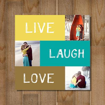
What exactly is color blocking?
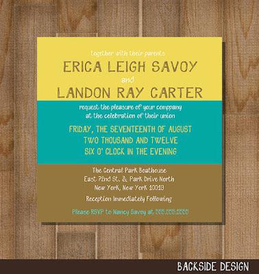
Basically it's taking two or three different colors that can make a bold statement. Think yellow, pink and red or maybe a bright green and darker blue.
These wedding invites from BlueMoonDesigns1 are a great example of color blocking.


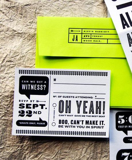
Neon Usage
These wedding RSVPs from wit + delight use a pop of neon color in the envelope to contrast against the black and white lettering of the wedding invitation.

Defining Baroque
The Baroque is a period of artistic style that used exaggerated motion and, easily interpreted detail to produce drama, tension, exuberance, and grandeur in sculpture, painting, architecture, literature, dance, and music. The style started around 1600 in Rome, Italy and spread to most of Europe (Wikipedia).
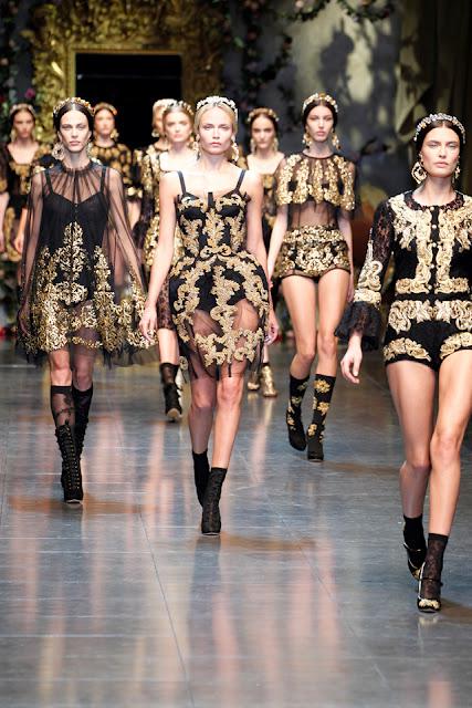
The Baroque style was highly detailed and was typically worn by mostly wealthy individuals. It incorporated high necklines (and sometimes very low), lace, detailed embroidery, and intricate beading.
Baroque doesn't have to mean stuffy, it can also translate in classic and elegant. Fashion week saw the Spring 2012 and Fall/Winter 2013 collections both buzzing with baroque and so can your wedding paper needs if that's what you're feelin'. I've posted a little D&G action to get your creative juices flowing.

Dolce and Gabbana 2013 Fall/Winter collection

