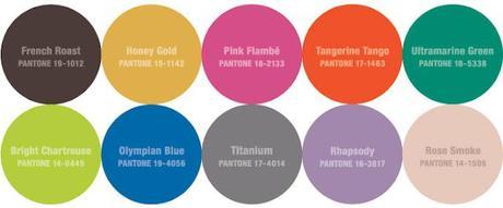
 I hate to say this, but Fall is just around the corner. I'm trying to get myself excited about it, so I've been looking into trends and checking out F/W 2012 lookbooks. I always use color as my starting point, so it goes without saying that I've been referring to Pantone's Fashion Color Report a lot.
I needed a place to collect my "thoughts", so I started a collection on SocialBliss. Here are a few of my favorites:
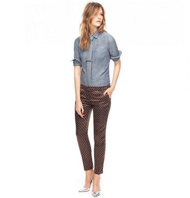 "French Roast" Pantone 19-1012: Polka Dot pants from J.Crew
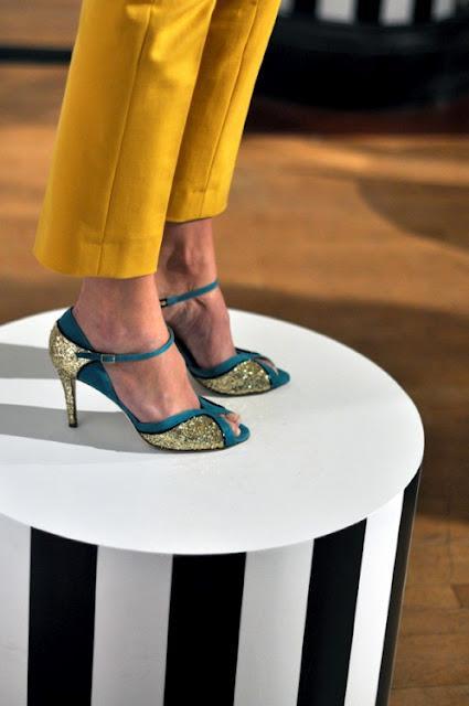 Honey Gold and Ultramarine Green at Kate Spade
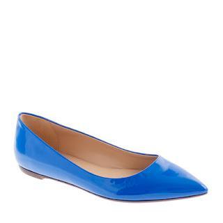
"Olympian Blue" Pantone 19-4056: Viv Patent Flats from J.Crew
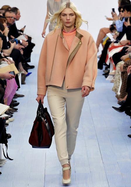 Rose Smoke" Pantone 14-1506: Chloe F/W 2012
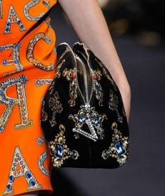 "Tangerine Tango" Pantone 17-1463: As seen at VersaceF/W 2012Note: Tangerine Tango is Pantone's Color of the Year!
Update: Cee brought up a good point in a comment on this post: Are these really Fall colors? They seem too bright. Well, my argument is that, yes, I think these work for Fall. Maybe not all together, and maybe you won't really feel like wearing them till later, but when you get sick of black and brown, these colors will be a nice pick-me-up for your wardrobe. Still having trouble imagining how to wear them? Think mod-meets-cocktail-party, like at Kate Spade in the F/W 2012 collection. Personally, I don't like how the colors look all grouped together, and I'm not a huge fan of Pink Flambe or Rhapsody (the pink and purple circles), but I know, once I've had my fill of navy and burgundy, a shift dress in Tangerine Tango will be just the thing!
For more Fall Color Trend reading:Color Trends: Fall/Winter 2012

