This is the weekend edition of TheMarioBlog and will be updated as needed. The next blog post is Monday, October 5.
It is always a special treat for a visual journalist to meet a type designer. On the occasions when I have had these experiences, I have always emerged wiser about type, and more passionate about the role that type plays in the work we do daily. Also, more convinced that type is the main ingredient in that soup that we cook from scratch everyday.
That is why I enjoyed my evening of conversation with Erik van Blokland, the talented Dutch designer, whose most recent work has included a redrawing of the logo for De Telegraaf, the Netherlands’ largest circulation daily, and one in which we are currently involved as a consultant.
Our conversation journeyed from the creative process (“It’s important to start with a sketch, preferably a hand drawing.”) to type and responsive design (“Type has a responsibility to the space in which it fits.”).
The redrawing of De Telegraaf's logo


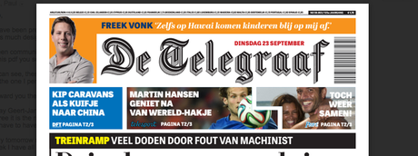


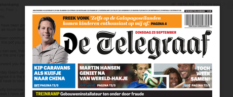

Various versions for De Telegraaf's logo presented by Erik Van Blokland
After the various versions were presented to De Telegraaf editors and management, the decision was to proceed with the more traditional version.

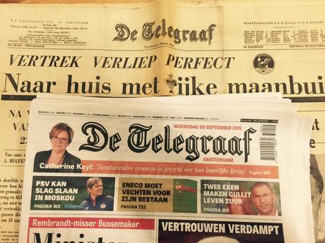
Erik was gracious to bring me a present: a 1969 edition of De Telegraaf for when man landed on the moon. It sits in sharp contrast to today’s De Telegraaf, including its newly redrawn logo.
When De Telegraaf art director, Rig Hehenkamp, and I started planning the changes that would take place in this latest “refreshing” of the design of the newspaper, we immediately thought of an updating of the logo.
Erik van Blokland was the first name that popped into our heads, and we reached him in his office in The Hague. Erik was in Japan at the time, but he immediately showed interest and the process began.
“I first started with the T,” Erik told me, as he showed me his elegant hand drawings where his first ideas took root. There was much work to do, and we were impressed with the variety of concepts Erik showed us.
“The logo had problems with details in the letters. The shading, the inline and the small counters were once drawn for a specific optical size. When you enlarge or decrease the logo, it falls apart. I would seek for a number of versions with increasing details. Moving forward from there, we will find something usable,” Erik wrote us after his initial appraisal.
But, he added, there will be no magical version that works on every size and platform, resolves all the problems and still doesn’t change the current logo.
Typography and mobile platforms
We could not conclude our evening type talk without entering into the subject of type and mobile platforms. I showed Erik how type looks on my Apple Watch when I read such titles as The New York Times, The Guardian and The Washington Post.
I mentioned that I prefer the use of white type on black background and, therefore, I find that The New York Times offers the most legible option so far.
One interesting observation from Erik about type and very small screens:
“We type designers always look at type on a big screen, full of details, then when the type transfer to the small screen, things change. Then, of course, readers can move the reading material closer to their eyes, but the arms are only so long. Scale is important. Most of the mistakes in scale are made in the typography. Good typefaces get used at the wrong size.
“Screen designers tend to be on the far end of the bell curve of vision quality. They’re not average and so they don’t design for the average. And that is a loss for whatever needs to be read: most of the readers will be worse off. In terms of accessibility it is necessary to allow for readers on the other end of the spectrum, of course. But just aiming for the average vision in average readers would already be an improvement.."
Inspiration

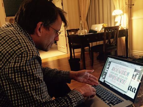
Erik shows me his work during our type talk in Amsterdam.
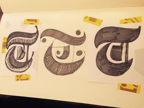


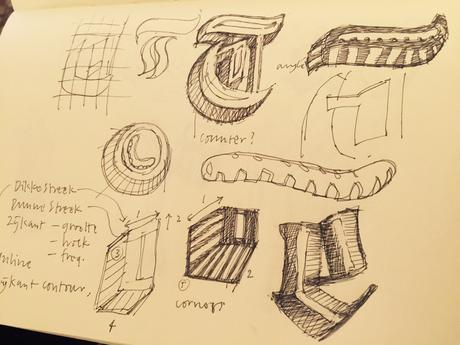
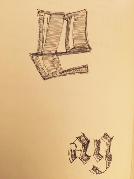

Here is how Erik van Blokland began the sketching process for his new take on De Telegraaf’s logo.
Where does Erik go for inspiration? This is a question that people often ask me, so I am always ready to ask others the same.
“It all begins with a drawing, with a good sketch. Once you see a letter on paper, you begin to get ideas of where you could go with that s, or that t. Drawings lead to the next step. because you can only think about what you see. It’s the only way you can make a choice.
“The moment when you choose, design happens.”
Sketching by hand
I told Erik that I require that my students always do hand sketches before embarking on a project. He agrees.
“One reason to sketch by hand is to see how each version of your work improves upon the last one. As a designer you ask yourself: can I see improvement as my sketches evolve? Or, am I making changes that do not lead to progress?
“But the idea is to use your sketches to make choices. That’s what design is all about, making those choices.”
Highlights of Erik's thinking

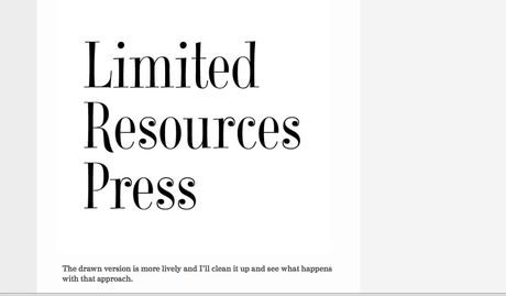

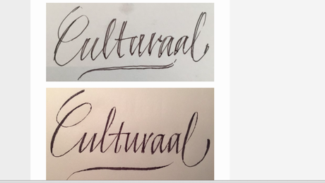

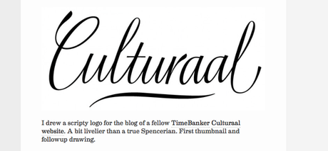
From hand drawing to a more finalized version: a look at Erik’s creative process.
Some highlights of Erik’s thinking, via his own blog:
On Bad Type
Ask people about bad typefaces and you’ll get opinions. Which typefaces are good, bad, evil, holy, done by monsters, published by saints. But when you look into the reasoning behind the arguments, it appears to be a complex issue in which black and white opinions are not helpful. Not all typefaces can do everything. Some typefaces are specialized and do one thing really well. Others are more generic but don’t excel in anything particular. Fortunately this is not a typography specific problem, but rather the way things work in design.
On Design
Design is the process of creating something new. But the term is also used to describe the end result, ‘a good design’. By studying the design process itself, the designer can improve on the odds of making something good. Every now and then reasonable things are made by accident. But if you have to pay the rent, it’s nice to be able to rely on your skills. So let’s look at the things that are involved in the design process as well as the aesthetics.
Oh yeah, the readers
The eyes have it. Readers get used to the typefaces that they read frequently. Whether they’re particularly good or not, the habit is there. Ambitious type designers can try to improve on it but the comfort zone of readers is limited and changes very slowly. A typeface for a newspaper might not be up to modern standards, but change it and readers will com plain. Newspapers are conservative typographers because they know their readers.
Bad typography
Then, even when all fonts are properly licensed, sourced, versioned, prepared, and tweaked, there is the moment when the anxious designer is about to begin specifying a line of text in a specific typeface, on some sort of medium. This is the moment all type designers learned to fear – all sorts of things can go wrong and perfectly reasonable type can go bad. There are almost no limitations to people’s talents to find new ways to screw up:type too small or big
set too tight or too wide
bad color combinations
bad copy writing
inappropriate justification
inappropriate hyphenation
wrong font formats
clueless operators
encoding errors
unnoticed fonts substitution
Read more about Erik
Erik van Blokland , a type designer from The Hague, Netherlands, started the LettError foundry with Just van Rossum in 1989. He studied graphic design at the Royal Academy of Arts in The Hague, and picked up the taste for type design in Gerrit Noordzij’s class. The early experiments in type and code (Beowolf, Trixie, Hands) were published by FontFont. More recently Eames Century Modern at House Industries and lots of work for Photo-Lettering. Tool development became an important part of Erik’s work (see Superpolator). First with Petr van Blokland and Just van Rossum in RoboFog. Later with Tal Leming in the RoboFab and UFO projects and the initial stages of the WOFF specification for web fonts. Van Blokland is a senior lecturer at the TypeMedia course of the Royal Academy of Arts.
Erik on Vimeo
On Responsive Lettering:
http://letterror.com/dev/mathshapes/
And speaking of type......

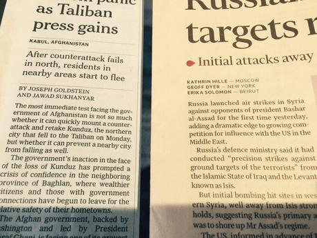
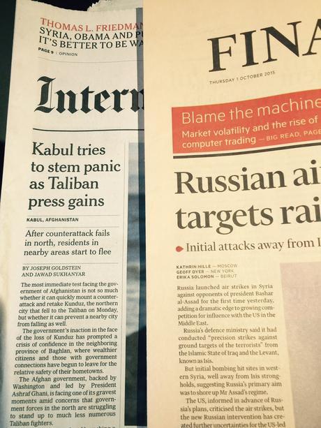


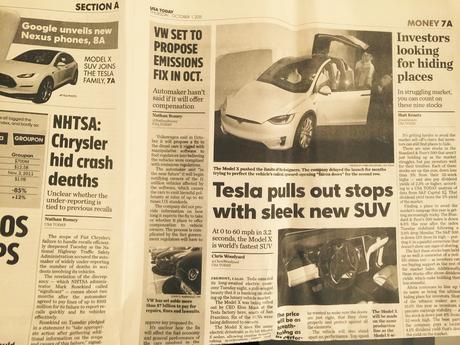

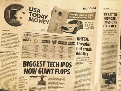
Why, oh, why, is the body type of the Financial Times so absolutely small? Don't they know they have readers like me, in their 60s, for whom reading this tiny text is a torture? I was comparing it to the International New York Times and, using the same column width, the FT carries 16 lines of text to the INYT's 14. Those two likes do make a difference in reading comfort!
Then, there is USA Today and all those bold, black headlines? Should each page shout at the tune of 76 trombones?

