46. West Brom Away
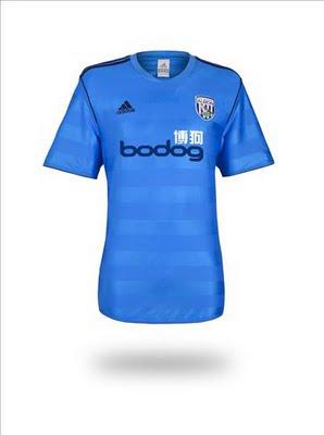
Why it sucks: The material/color scheme. I'm a fan of ghost designs (slightly offsetting colors), but it should be a 'dark-light' thing, not a 'shiny-not shiny' thing.
The upside: ...
45. Wolves Away

Why it sucks: Indulge me for a sec. Take a finger and cover up the sponsor. Not so bad, right? Now uncover it.
The upside: Indulge me for a sec. Take a finger and cover up the sponsor. Not so bad, right?
44. Stoke City Home
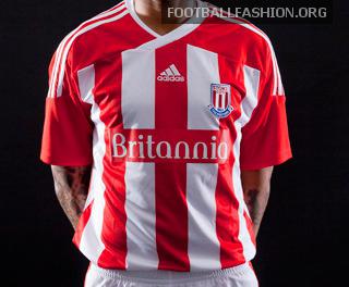
Why it sucks: I'm fairly confident there isn't a tackier shirt in this year's competition.
The upside: It's a virtual carbon copy of the club's crest, if you're into that sort of thing.
43. Swansea Away
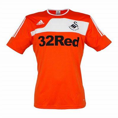
Why it sucks: Generally speaking, I'm a fan of the color orange. But as the University of Tennessee has proven time and time again, the white/orange combination without a third-color buffer doesn't work.
The upside: As far as templates go, this one from Adidas isn't entirely banal.
42. Sunderland Away
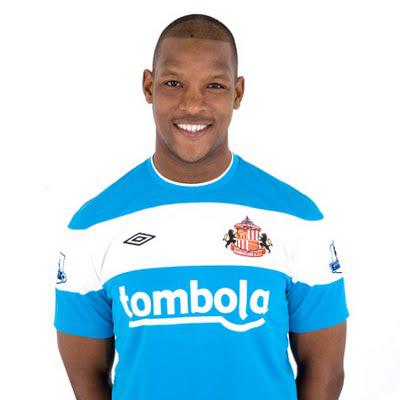
Why it sucks: This color scheme doesn't belong on a professional jersey of any kind. Much like the Swansea kit, there has to be a third trim color to separate the bright-on-white design.
The upside: The color is unique. So there's that.
41. Blackburn Away
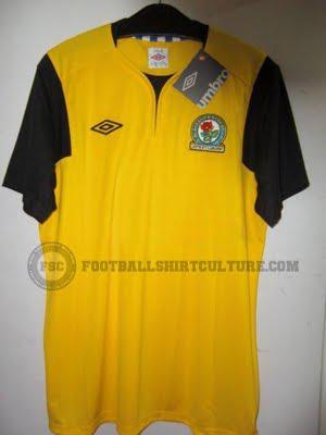
Why it sucks: I'm not sure if I cut the shirt some slack due to poor picture quality, or if the poor picture quality makes this shirt look worse than it actually is. Either way, it belongs in the bottom 10.
The upside: This picture doesn't show the sponsor. And considering the sponsor, this a very, very good thing.
40. Bolton Home
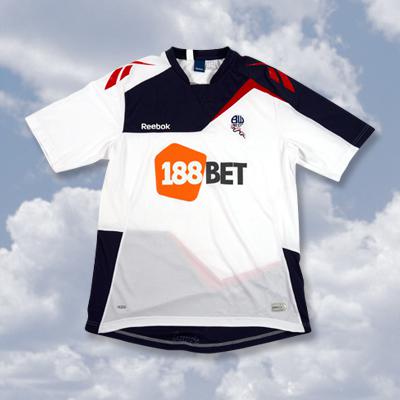
Why it sucks: On first glance, it's very off-putting. Also on second glance.
The upside: Reebok vomited creativity all over this thing. At least they tried.
39. Wigan Athletic Home
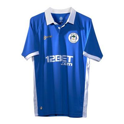
Why it sucks: It looks cheap, and the white trim should have stopped at the sleeves/collar.
The upside: Wigan made the bold jump from stripes to solids. And for that I will be forever grateful.
38. Newcastle Away
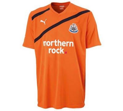
Why it sucks: I'm not a fan of this Puma template, and this rendition is particularly lame. The value in this shirt stops at whatever moisture-wicking, athletic-quality fabric Puma's gotten itself into these days.
The upside: I bet it's comfortable?
37. Manchester City Home
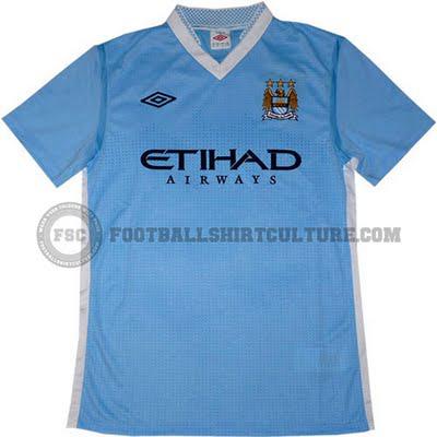
Why it sucks: The checkerboard collar. As small a detail as it is, it has a far-reaching negative effect on the overall look.
The upside: Apparently they've worked the visual sound waves from Blue Moon, the club's anthem, into the body of the shirt, which is relatively cool.. in theory. Also, the Arabic word Etihad translates, literally, to "united". Feel free to place that little tidbit in whichever sucks/upside category you see fit.
--------------------------------------------------
Be sure to check back tomorrow as we continue the countdown to number one, and as always, share your thoughts below.
Speaking of kits, do you enjoy free stuff? I'm getting ahead of myself. Check out The Toast's weekly pick'em contest where you could win a free EPL jersey from onionbag.com. Click here for details.
