This is the weekend edition of TheMarioBlog and will be updated as needed. The next blog post is October 6


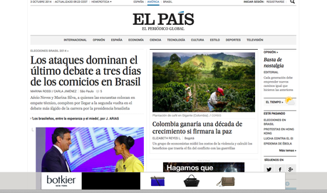
Home page of the new elpais.es: lack of photo hierarchy here determines how we navigate the page visually


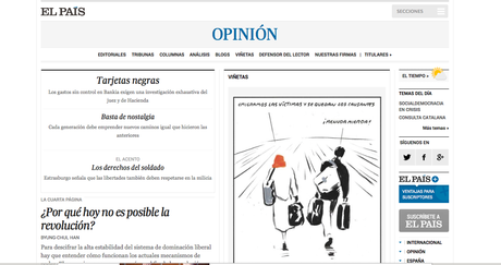
Opinion section: I like the use of italics here and throughout to indicate opinion pieces


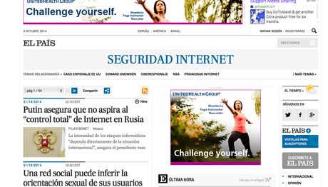
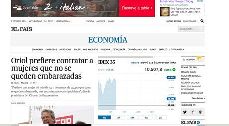
Section headers are visually non distinct (boring comes to mind); notice that sections can open with a lead piece, but also with a straight scroll to other stories
The new design for the website of Spain’s El Pais has premiered.
If the goal is to clear a cleaner environment with better navigation, and one that ties visually to the print edition, this has been accomplished.
If the goal was to introduce a groundbreaking concept for how a news website should appear in late 2014, then we are a bit disappointed.
At first glance, I miss greater hierarchy for the size of photos: there appears to be only two dimensions used for photos, and the bigger one does not carry much impact.
The typography and navigation
I do like the use of typography overall, and especially the consistent use of italics for opinion pieces. Italics are also utilized for quotes which are displayed well throughout.
While on that subject, it is obvious that El Pais’ editors and the designers of this website are keen to promote the newspaper’s robust opinion pieces, which are well displayed and easy to find in this new design.
In what seems to be a clear departure from how most newspapers handle similar situations, elpais.es offers a series of “related news” items by its own editors at the end of articles, but it has an “in other media” basket where a reference to a related story in “another publication” appears. This I like very much. In addition, there is an “And also…” category for more related material. This is well done and should please El Pais readers.
There are 10 sections that a user can navigate too from the home page. I believe I sense TWO different templates for what happens when one clicks on one of the sections:
1. Sometimes the section opens with a lead story, followed by secondary stories.
2. Sometimes there is no lead story and one goes straight into a scroll of similarly sized headlines and photos.
Expectations and reality
Everytime a major publication, such as El Pais, introduces a new look for any of its products, we in the media community raise our antennas and get into attention.
What will those talented people show us that is new? What can I learn from how they have handled situations that we all face in our own work?
El Pais is such a publication, and so I have followed with interest the comments from colleagues via Twitter. Some call the new design of elpais.es as colorless, or sugarless and decaffinated.
Yet, if we take a good look at elpais.es, it is obvious that this is a news website that has undergone some very deep transformations to accommodate better navigation (which it achieves), clean up its typographic use, tie the look of the website back to print more effectively, and, in the process, has added some features that should make reading stories in El Pais more enjoyable.
The disappointment comes in the visual area: why not emphasize better photo hierarchy, for example? Honestly, the home page of the new elpais.es is circa 2000. Why not bring some of the elegance that we see on those article pages to the home page? Even the section headers are visually unappealing, as if they don't seem to go with the rest of the look and feel of this website.
Work in progress
The good thing about designing for digital platforms: they are always work in progress. We can tweak, we can alter things, review what works and what does not and introduce those changes on the run.
There is much that works here and it should not be easy to let this website evolve into something more visually appealing.
We will be watching with keen interest.
How the editors introduced the new look for elpais.es
In the word of the editors
Here is how the editors of elpais.es describe the new website:
“The digital edition of the paper has been remodeled to enhance the ranking of news and make navigation easier.”
“We are bringing the print and online closer via two different products but made with the same rigor.”
“One of the big news comes on the heels of the Science section. El Pais is partnering with Matter , site leader in scientific information in Spanish, to strengthen its coverage of science, environment, health and technology with simplicity, rigor and passion.”

