

Our art director Reed Reibstein has been involved in the Postmedia project, working closely with the project’s creative director, Gayle Grin, design director for the award-winning National Post.
We at Garcia Media are proud of our work with the team of Postmedia as it attempts to give all of its titles a common look and feel, which is also carried out through every platform.
A highlight of the Edmonton Journal’s launch is that it will have a daily insert of 8 to 12 pages from the National Post, which is published in Toronto.
Edmonton Journal editor, Margo Goodhand, reports that reaction has been quite favorable to the new product.
“The ‘new’ Edmonton Journal is a hit with virtually all of our readers: I heard a lot of “wows” last night from civic leaders and our clients,” she wrote me.
She also added that older readers feel the body type is smaller (which it isn’t).
“Our older readers find it difficult to read, and wonder why — knowing print is for an older demographic, and that we consciously revamped each platform for each demographic — we would choose it,” Margo said. “Other than that, the layout and design is clean, colorful, and people have taken to it right away. Which is surprising, of course, because we all know how much readers like change!”
I reminded Margo that I am not surprised by the complaint from older readers. This is usually the case, and, the majority of the time, the type has not only increased in size, but often it did not change at all. In the majority of redesigns, the first reaction from certain readers is a chorus of “I can’t read the text anymore.”
What to do? Usually, the complaints go away.
In fact, we are quite happy with the flexible type palette that has been selected for all of the Postmedia projects.
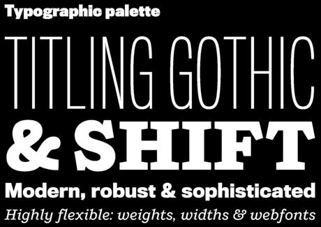
Working with Gayle Grin, we recommended two main type families to lead the Postmedia visual identity in print and digital:
Titling Gothic FB from Font Bureau, an impactful sans-serif with many weights and widths to cover dramatic headlines and clear subheads alike;
Shift from MCKL, a warm slab-serif that acts as an approachable counterpoint to Titling Gothic.
Benton Sans, Chronicle Text, and Georgia are used for captions and body text across different platforms.
Previous Postmedia blog posts
Post media unveils the reimagined Ottawa Citizen
http://www.postmedia.com/2014/05/20/postmedia-unveils-the-reimagined-ottawa-citizen/
Note to readers: a new Gazette coming
http://www.montrealgazette.com/news/local-news/Note+readers+Gazette+coming/10304103/story.html
Calgary Herald: the latest Postmedia relaunch
http://www.garciamedia.com/blog/calgary_herald_the_latest_postmedia_relaunch

