Finally recovered the camera from the in-laws (where we had forgotten it over Xmas for those of you who weren't paying attention in class :)) and I had the best intentions to post earlier this week. At least I finally made it to actually writing the post this week.
I'm still on a creative frenzy over here. Like right before starting this post I had yet another project I was itching to get my hands on but my mature self had to talk my creative self into being responsible and show you this dresser I re-did a few weeks ago, the pics have been prepped and ready for a few days so there really isn't anything to it.
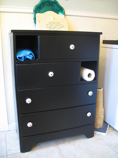
Here's the after. I know the kitty scratch post isn't that esthetically pleasing but I haven't found a better place for it yet. Bear with me, ok? :)
And this is how it's been looking for the better part of last year.
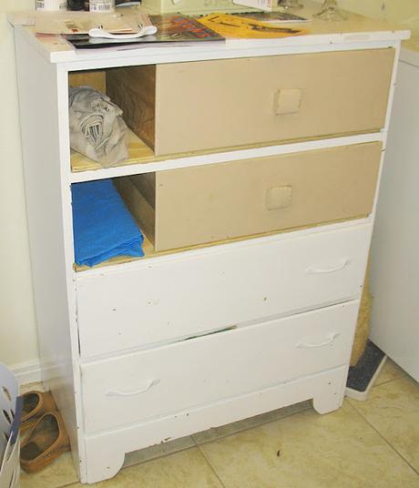
This dresser was a curb-side find and when I found it it was completely missing the two top drawers. So the top two was something I nicked from an old dresser sitting in our garage. The width is wrong but the height was about right, at least right enough to work here. In the before pic you can also see the 1/4 inch plywood I had cut at Lowe's to fit in here to make sure these drawers didn't fall down into the drawer space underneath it.
This dresser lives in our tiny kitchen. I've always liked the idea of a free-standing kitchen (i.e. instead of cabinets being attached to the wall the kitchen is made up of counter-like furniture that are free standing) so I'm sure this thing with a dresser in the kitchen stems from that. Ideally this dresser would have been cut down a couple of inches in height to match the counter tops in here but after some pondering I decided against it. I wasn't sure if I could do a good job of it and the extra work didn't seem all that tempting at the moment.
I took very few pics of the process so I'll talk you through it. The first thing I did with the dresser was take all the drawers out and screw the plywood in place, into the dresser frame. And then I played with the configuration of the top drawers a little before settling on the offset design you see in the after pics. Having them centered would have been more symmetrical but then the cubbies wouldn't have been as useful. And it would have meant more plywood, more L-brackets etc. More work and a higher cost, essentially :)
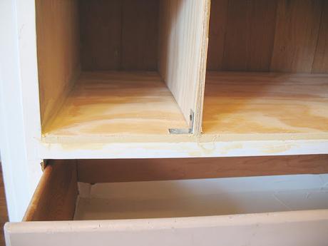 These small "sidewalls" I cut myself from the leftovers of my sheet of plywood. I didn't know what their measurements were going to be before the bottom plywood was in place so I decided against the Lowe's dudes doing it for me. They're attached with L-brackets at the top (not visible in this pic) and bottom out front and also one bracket on the bottom in the very back (very hard to see here) and are there to keep the drawer in it's place and create this little cubby of open storage. I did this for both of the top drawers.
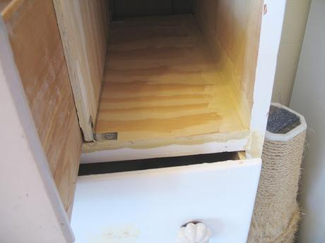
Any gaps or holes in the construction were then filled with wood putty as you can see in the pic above and then it was time to sand. Mostly the rougher plywood but I also went over the whole dresser so my black paint would adhere better.
The painting was tedious, I won't lie. Two coats of black house paint I had on hand and two coats of polycrylic. The lovely knobs I found at Hobby Lobby for half off = two for $3.99.
The afters again.

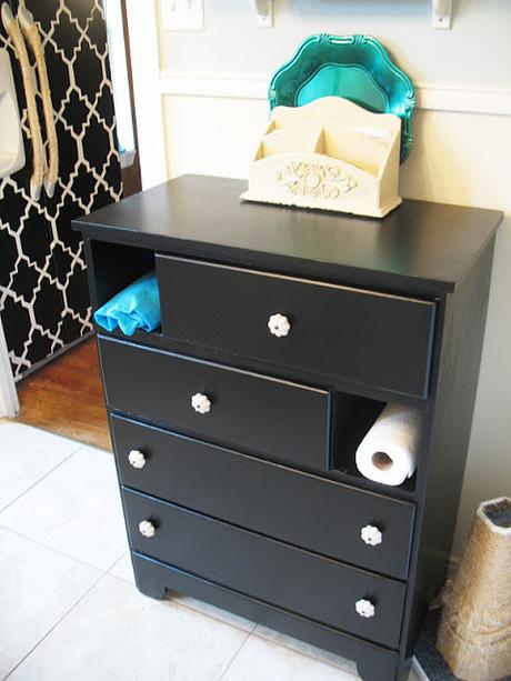
This dresser is set on sliders so if I should need some extra counter space while working in here it can easily be slid closer to the counters on the other side of the kitchen and work as an island of sorts. Normally it lives up against this wall, though. And it provides wonderful extra storage in this tiny kitchen.
The L-brackets are visible if you look closely. But I've noticed that black paint covers a multitude of sins and I use those forgiving abilities to their fullest extent.
I love this dresser's simple and classic look now.
I had so much fun with my husband's first reaction to the transformation. It's like he was really impressed with what I'd been able to do with what he basically considered a heap of trash :) I knew all along that it could look great after some work but it's always fun when those who didn't have my vision before finally see it for what it could truly be.
Oh, and I do realize that the kitty scratch post will have to find another place eventually. When my kitchen is fully transformed I won't want it in here anyway. It just is what it is right now.
Wouldn't you say that it's a great dresser transformation, though? Paint surely does work magic.
Ps. Linking up with
Someday Crafts
Blue Cricket Design
Domestically Speaking

