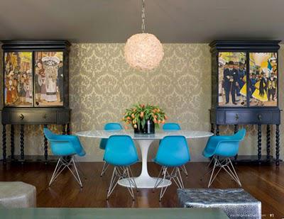
 These blue Eames dining chairs around the iconic Saarinen tulip table look very retro against the 70s fleur de lis style wallpaper. Not sure about the wilted tulips however...
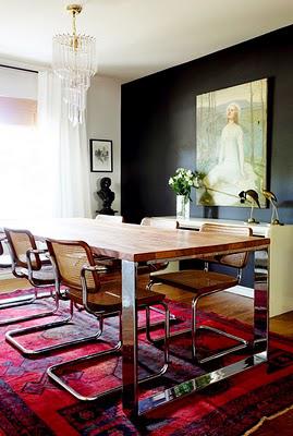 These chairs are what I grew up with - I guess the height of 80s style?
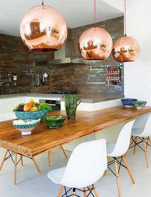 These copper lights look fantastic with the wooden table and wooden legged Eames dining chairs. This kitchen is a real mix of periods.
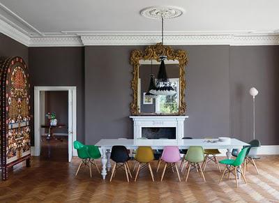 Until I saw this picture from Australian Vogue Living, I had no idea that my favourite chairs also came in my favourite colour green! Originally our intention was to buy the chairs in white, but now we are deciding on colours. Green of course and possibly black, yellow and pink.
 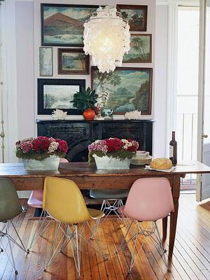 This image shows how well modern design mixes with classic architecture, possibly my favourite look.
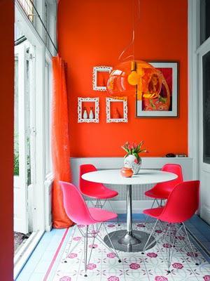 Gorgeous mix of tangerine painted wall with hot pink chairs!
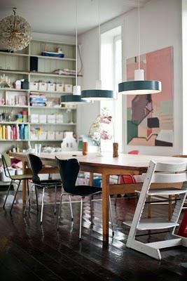 I love this image because it reminds me of my own table, especially because of the Stokke Tripp Trapp at the end. We bought one of these for our first child with the intention of getting another when our second child came along but unfortunately the cost of a second... we just never got around to spending the money. It's a shame really because I like the idea of the girls' being able to use their Tripp Trapp at their desk as they grow older. I love that they fit under the table just like any other chair, I hated the idea of some horrible monstrosity of a high-chair and the Tripp-Trapp is the perfect designer high chair!
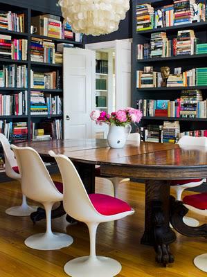 The Saarinen tulip chairs above are a delightful addition to this library / dining room. I love the idea of a dining room being more than just a dining room. Books lining the walls make for a very interesting and ever-changing art installation, don't you think?
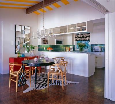 I really like the layout of this kitchen, dining room and the zebra floor rug gives just the right amount of glamour.
Kisses!
Heidi
Sources: Pinterest via

