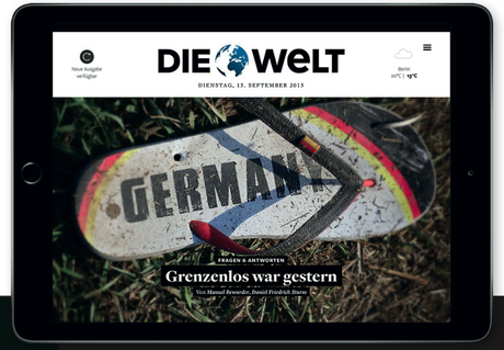






When it comes to taking newspaper content to a higher, more user-friendly and engaging level, Germany’s Die Welt does it splendidly well.
Last week we discussed the state of the tablet here and I feel that any such updated report should include the magnificent work of Die Welt.
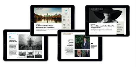
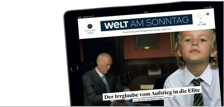
I find myself judging for the WAN IFRA digital media contest, and was happily surprised to discover Die Welt’s tablet edition. The design is clean, classic, crisp and quite pleasing to the eye.
But it is the content that makes Die Welt’s tablet edition special. The editors promise that “our editorial team brings together the best and most intriguing stories of the day.”
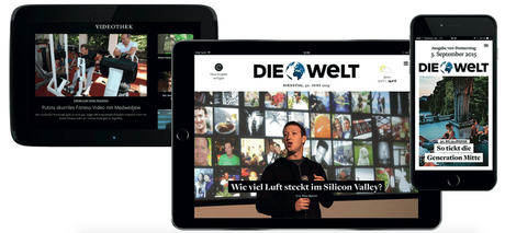
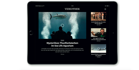
Indeed they do, and I urge you to take a look yourself. A section called „Die Videothek“ presents a selection
of Die Welt's in-house produced documentaries and interviews.
More than 5000 readers come to this tablet edition daily, and part of what they find interesting is the areas of reader engagement, especially for the opinion/commentary section.
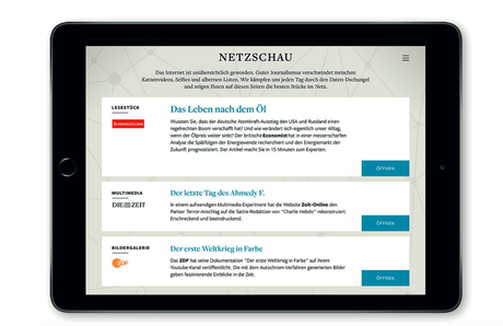
The tablet edition is not all about features and interviews. News is an integral part of it, with the best stories from across the web selected by the editors.
By the way, Die Welt's tablet edition provides full offline availability. It’s available on Android and iOS, tablet and smartphone.
This tablet edition can be described with the three C’s: classic, comprehensive and clean.
Hope you sample it!
Democratic Debate and The Washington Post




Absolutely delighted with the way The Washington Post covers the Presidential Debate live on Twitter via a card system that highlights key quotes from each of the debaters.
The cards are colorful, utilize a key quote and an illustration of the debater. So simple, yet so effective. Take a look.

