TAKEAWAY: It was a fun day of judging at the D&AD event in London yesterday; some reflections about a special day. PLUS: We do a follow up of De Telegraaf’s new Weekend editions AND: Today’s pop up from Bild.
Illustration by Massimo Gentile/Il Secolo XIX
It’s a special edition of TheMarioBlog this Friday as blog post #1000 gets posted! It is almost three years since I have been having this daily conversation with you. Send me a note ( ) to tell me what the blog means to you and I will include selected comments in the Friday blog! See you there.
Judging the D&AD contest in London

Two views from the contest arena Wednesday: left, with fellow judge, designer Erik Spierkermann; holding the famous Yellow Pencil, the coveted D&AD award
From time to time we venture into the world of judging. It is hard work, for sure, and our day of judging with the D&AD was no exception.
Why get involved with judging these contests?
Indeed, it is intensive, hard work. We spent a full day yesterday at London’s Olympic Hall, a cavernous room with very high ceilings and tables lined up with pages, covers, and all sorts of packaging designs. Judges moved from item to item, an iPhone in hand, ready to cast their votes.
My judging group was exclusively devoted to judging magazines and newspapers. My fellow judges were all experienced designers and art directors, coming from a variety of publications and backgrounds.
Our goal, as the day started: to reward work that is distinctive, excellently carried out, and that pushes journalistic design to the next level. By the end of the day, from about 200 entries, FIVE had been nominated as the very best, and one recommended for the coveted Yellow Pencil.
Judging and deliberating
Everytime we stopped our secret voting to gather as a jury and discuss entries was a great moment to discuss the state of the media today, and what this group considered worthy of consideration.
I told my fellow judges that those entries we were looking at fell into three categories: the old good, the new good and the never good.
The old good: Well, there is nothing wrong with taking pleasure in looking at some of the iconic magazines that we have come to love over the years. But our question as a group: Some of these publications have had the same wonderful look and feel for nearly a decade. They have not moved one inch since. The good stays good. The question for the jurors is: do we reward the consistently good? Do we send them a message that perhaps it is time to move to the next level? At the end, we were satisfied with our decisions, rewarding the good, classic designs when they took risks with special editions, for example.
The new good: This was the exciting part of the judging experience for me yesterday. There are many totally unknown publications out there taking risks, not conforming to what is expected, and doing it successfully. True, sometimes the execution may not be as perfect, but, in our discussions we admitted that the reward should be for the spirit of innovation. Several of these new and vibrant publications made it into the D&AD 50th annual book, something we were very proud about.
The never good: Then along came the rest: the mediocre, the pages that should have never even come into the contest; the ones with the cliches, the poor use of typography; the ones that we hope that, by not getting any recognition, will send a signal to their teams that something needs to be done to give them a needed lift.
And how about digital?
All through the day, our judging team came back to the question of the prevalence of digital platforms.
We were not judging those digital platforms. That was a separate group of judges.
However, as I mentioned to the jury foreman, should we be judging printed products in isolation from their digital platforms? The answer is no, and I have encouraged the D&AD contest organizers to think about that for next year.
It would be wonderful to have an entry in these type of contests where we emphasize storytelling across platforms, and see how a visionary team of editors and designers takes the story from one platform to the next.
The shape of contests to come, I guess.
De Telegraaf Weekend: a follow up
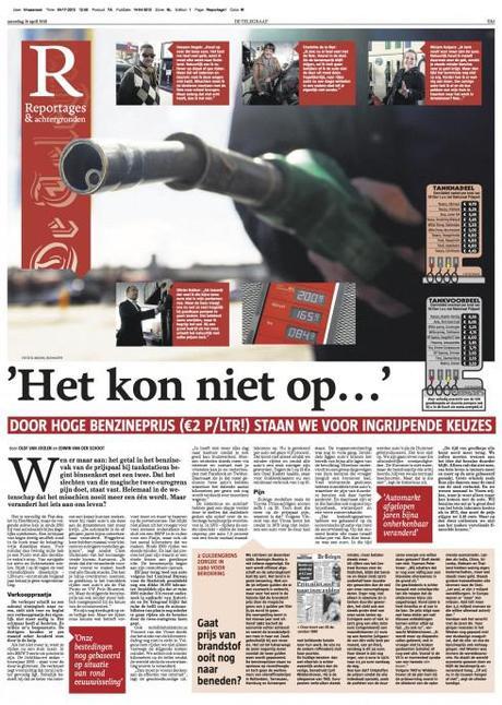
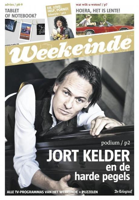
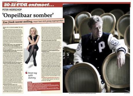
On April 7, De Telegraaf of the Netherlands premiered its new weekend rethinking, creating a new look for Weekend supplement and Reportage and introducing new content.
Now two weeks later, we take a look at what design director Hans Haasnoot describes as a “big success, with very positive reactions from readers.”
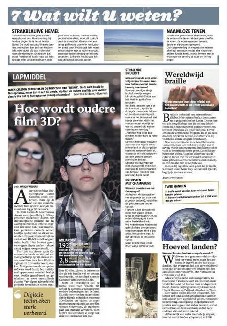
Take a look at this group of pages from the April 14 edition.
Our previous blogposts on De Telegraaf
De Telegraaf’s weekend edition launch (2): a new weekend edition launched
http://garciamedia.com/blog/articles/de_telegraafs_weekend_edition_launch_2_a_new_weekend_edition_launched/
De Telegraaf’s weekend edition launch (1): a conversation with type designer Saku Heinänen
http://garciamedia.com/blog/articles/de_telegraafs_weekend_edition_launch_1_a_conversation_with_type_designer_st/
De Telegraaf of the Netherlands: preparing for a newly designed weekend edition
http://garciamedia.com/blog/articles/de_telegraaf_of_the_netherlands_preparing_for_a_newly_designed_weekend_edit/
Today’s pop up
Today’s pop up from Bild shows us 15 things we need to know about those the famous Simpson family.

