TAKEAWAY: Today we continue our conversation about what makes for the ideal look & feel for a newspaper tablet edition. It is a topic that generates great interest—-as it should. Take a look at Denmark’s Berlingske Tidende
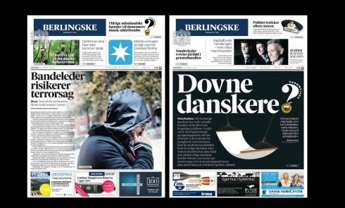
Here are two recent print editions of Denmark’s Berlingske Tidende
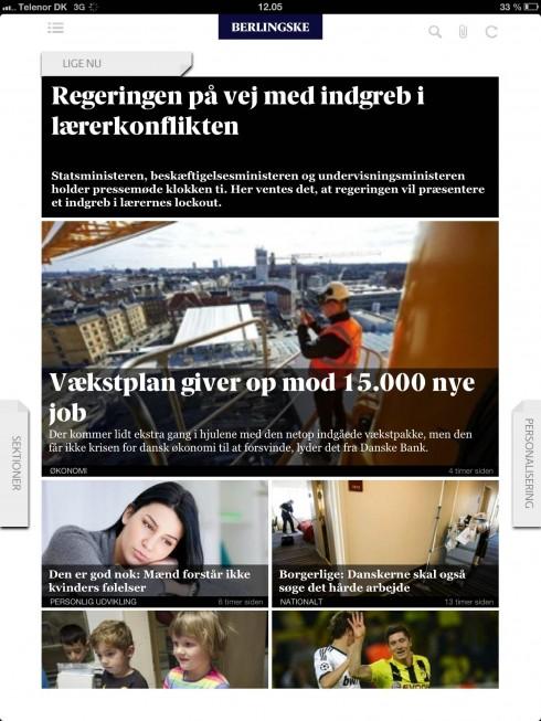
Sample screen from today’s morning edition of the Berlingske Tidende tablet app
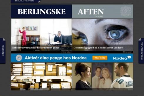
Opening screen for the Berlingske Tidende afternoon edition, published daily at 5 p.m.
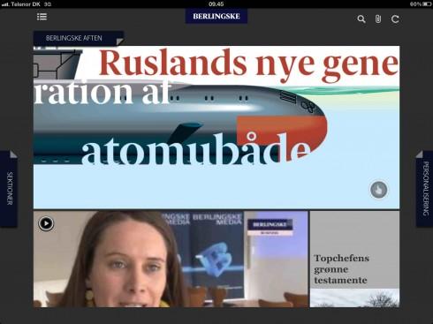
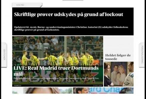
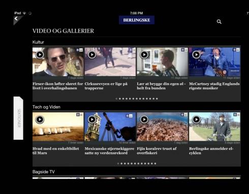
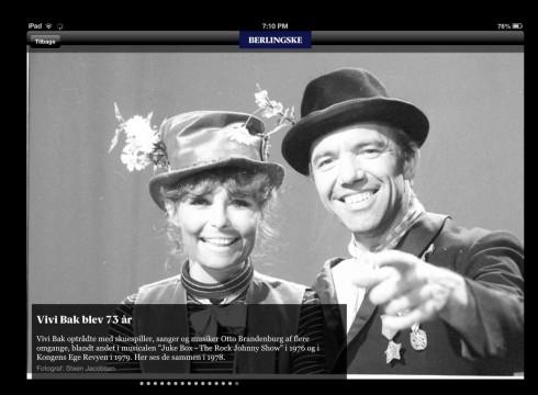

Image courtesy of the Berlingske Tidende
For the past two days we have reviewed the new tablet edition of Canada’s La Presse: I mentioned that while it is visually seductive, with great photos and easy, pictorial navigation, it is not as newsy as it should be, especially for a product delivered at 5:30 each morning, and one which, as management has mentioned, could one day replace the newspaper’s print edition.
We have also shown Wednesday what the options seem to be for those embarking in the creation of a news tablet app: the classic newspaper look, the pop up driven, or the more Flipboard like approach.
Today, we take a look at Denmark’s Berlingske Tidende, which seems to have achieved that balance that I think is key: make it newsy and give it a sense of freshness, while also incorporating the more pictorial and preferred style navigator.
A conversation with Jens Jørgen Madsen
To find out more about Berlingske Tidende’s news app, I had a chat with digital editor Jens Jørgen Madsen
Jens tells me that the evening (Aften) Berlingske Tidende app is totally new, developed two years after the first morning app was introduced to the market. It is published each afternoon at 5 p.m.
“Our evening tablet app includes only unique content and one daily interactive graphic everyday,“ Jens says. “The idea about the evening edition is to give our users a more lean back experience. Something that last all evening. Ready for their commute home or at home. It is compact. Contains about 13 elements - stories, graphics and web-tv…. not too much to overwhelm you - but the right size to give you an excellent reading/watching/graphic experience.“
The morning edition, however,is newsier.
Both tablet editions are part of what subscribers to the Berlingske Tidende get as part of their subscription package.
See the tablet’s interactive graphics here:
http://www.b.dk/grafiskset
Those morning tablet editions
A year ago, the majority of curated newspaper tablet editions were designed to be a good, lean back evening read.
For the past six months we have begun to see more newspaper tablet editions created as morning vehicles for information. This, in my view, changes the dynamics for content and presentation.
Especially if the content will appear simultaneously on tablet and mobile, a sense of immediacy, which is what we seek in that first hour after we wake up each morning, must be evident.
I have said it before: news tablet editions are only in their infancy at the moment. Perhaps moving to the toddler stage, but still works in progress, concepts in the midst of constant change and adaptation.
It is this that makes the subject so challenging and fascinating.
To be continued, for sure.
Of related interest:
http://www.garciamedia.com/blog/articles/pa_news_app_look_feel_and_what_it_says_p

