This is the weekend edition of TheMarioBlog and will be updated as needed. The next blog post is Monday, October 13
Browse through the entire October 10 edition of De Telegraaf here
https://blendle.nl/issue/telegraaf/bnl-telegraaf-20141010
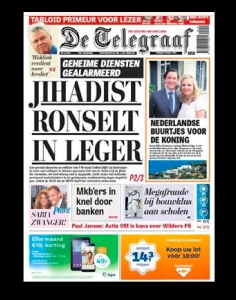

First front page of De Telegraaf in the tabloid format: October 10, 2014
A design project can be compared to a marriage in at least one way: nobody really knows what happens in the intimacy of it, except the people involved.
The thought comes to mind as De Telegraaf unveils its new tabloid format today.
Here it is, folks! This iconic Dutch newspaper, usually the toast of the town for its daring headlines with an attitude (it is the newspaper that used the word “Murdereres” in 350 point bold type when a Malaysian Airlines was shut down from the sky over the Ukraine with more than 80 Dutch nationals), its absolutely over the top circa 1954 make up (nobody dares call it design), and because it does not give a damn what anyone thinks of its look or its headlines.
Healthy, indeed. And, for me, what a joy to be invited, with our Garcia Media senior art director , Christian Fortanet, to be the consultants to the project when the publisher and editors decided to make the transition from broadsheet to tabloid format.
Was it an easy project?
Hell, no. But it wasn’t my hardest project ever of the almost 700 com;pleted to date (that title goes to Germany’s Die Zeit). Second most challenging, The Wall Street Journal.)
Fun has nothing to do with difficulty—or should I say “challenge”? This was fun from the start, when we first converted the Weekend supplement to tabloid two years ago.
Here, however, it was converting the entire newspaper, carrying the whole load of that huge L that is LEGACY on our shoulders.
We Design for the Readers and not for Ourselves

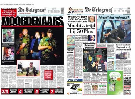
For De Telegraaf attitude starts on Page One; Here two recent front pages covering major breaking news: (L) front page after the downing of the Malaysian Airlines flight; (R) an ordinary news day front page
Today, as the new Telegraaf tabloid appears —it will be distributed by top editors at the Amsterdam Grand Central Station at 7 a.m.— there will undoubtedly those who will take a look, blink and say: nothing changed.
That’s fine. We know differently. The changes here were huge, and what is best, none affects the perception that long time readers have of this newspaper with its rich journalistic history.
De Telegraaf is as much a part of Holland as are canals and bikes. It is part of the landscape, with all its mismatched colors (there was no color palette), uneven columns (king of the dog legs), decorative borders (it could be a printer’s catalog), and everything circa before 1960. They wear it all with pride.
I am proud that I managed NOT to remove all of these jewels off the neck of the old paper. From time to time I did reminded the editors not to wear all of their jewelry to the prom, that there will be another prom next year and the year after that. But old habits are hard to break, so don’t expect for all the jewelry to come off at once.
Don’t expect groundbreaking anything here. However, if true design is that which is functional, fits the product for which it is intended and respects history, then this may be groundbreaking.
More importantly, it is a lesson in not designing for us and our own taste, but for the product, its environment and its audience.
The importance of legacy design elements and De Telegraaf
If you wish to study the new Telegraaf in detail, be on the lookout for these legacy elements of the “new’ design:
1. Systematic chaos—
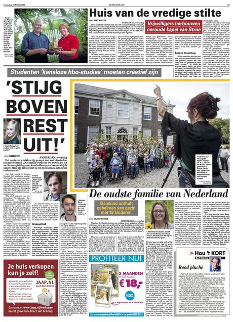

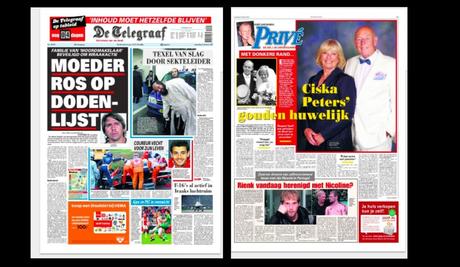
The old: If you look at a typical inside page of the De Telegraaf that existed till yesterday, it is a free for all in terms of movement; there are no modules, so photos and texts that are related may not be within the same unit sometimes. Then see the new inside pages: some of the visual chaos is still there, but regulated somewhat, and slightly more modular.
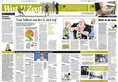

The new: a more organized design all round
2. Dog legs—
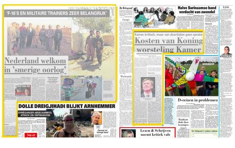

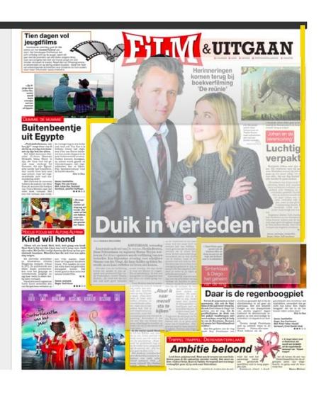

The old: These are the famous dog legs, such an intricate part of the visual look of De Telegraaf
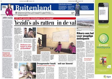


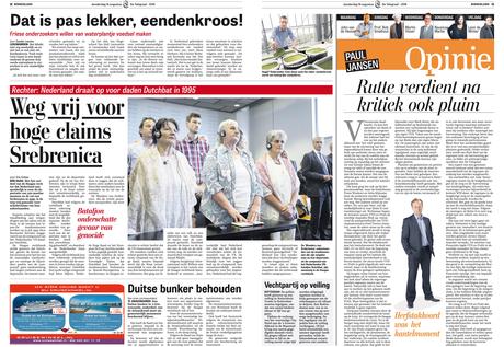
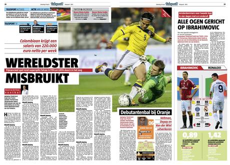
The new: Here are prototype inside pages for the new look of the tabloid Telegraaf: we hint at the dog legs legacy, but without engaging fully into them.
This is a term that designers under 45 years of age do not even recognize. It is a throw back to the days of metal type, when columns of type “cuddled up” to one another, leading to what the great pioneer of newspaper design, Ed Arnold, referred to as “brace make up”. A good term, indeed: I had to brace myself to reenact dog legs in 2014. In the end, I have come to like it. Notice that the dog legs, the cutting into photos, the avoidance of modules, has become a chic moment in the visual presentation of the new Telegraaf. Who would say? I know Professor Arnold smiles somewhere.
3. Mix of bright and muted colors—

The old: There was no color palette in the old Telegraaf. Not that it mattered. Color palettes are meant to create visual unity, something the old Telegraaf was not interested in going shopping for. The new Telegraaf uses color coding, and so you will find deep reds for entertainment, but solid blue for the Financial section (one of the most respected and well read in Holland, by the way).
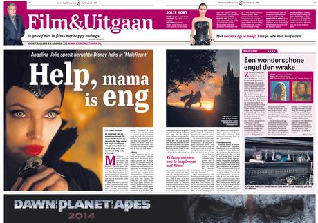

The new: color utilized to navigate sections; a more unified look throughout each page
4. Different section headers for sections

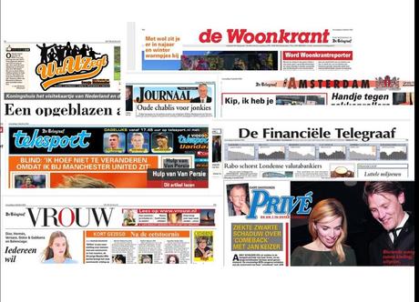
The old: The word continuity has had no place in the visual vocabulary of De Telegraaf. Each page now displays a different header in the existing format (but we have regulated that to a degree), some larger and more colorful than others. Each with a different font. While we have controlled that to a degree, each of the sections will have its own distinct style, so that the news section has its own personality, but Financiele goes the opposite way (this was my therapy: modular, better organized, classic typeface, and, overall, elegant and with gravitas). Meanwhile, the entertainment and gossip section Prive maintains its trademark italic logo, as does Telesport.
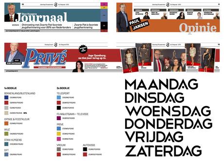

The new De Telegraaf, variety, but with fewer styles in the mix
5. The grid

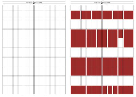
The new: One of the major accomplishments here was the creation of a series of working grids that would create a stable environment for the columns of type. The new design includes four grid configurations, starting with the basic six column grid.
The Typographic Palette

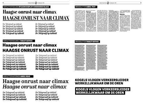
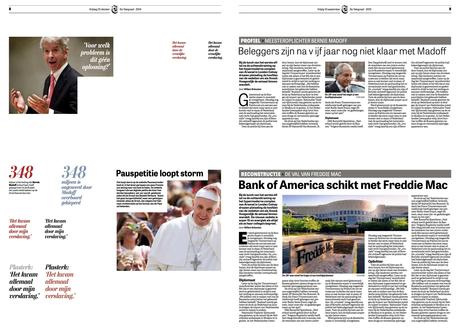

Styleguide shows how various fonts are utilized through different types of story structures
Three fonts constitute the typographic palette for the new De Telegraaf:
Stilson, Tablet Gothic, Abril Head
The Design Process

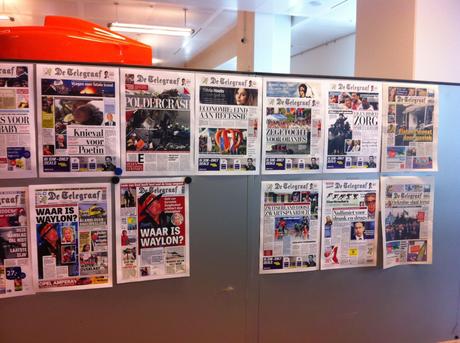
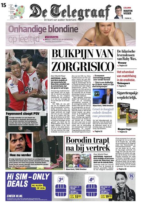


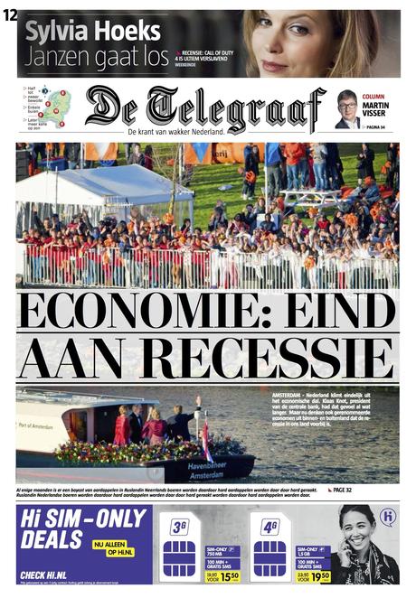
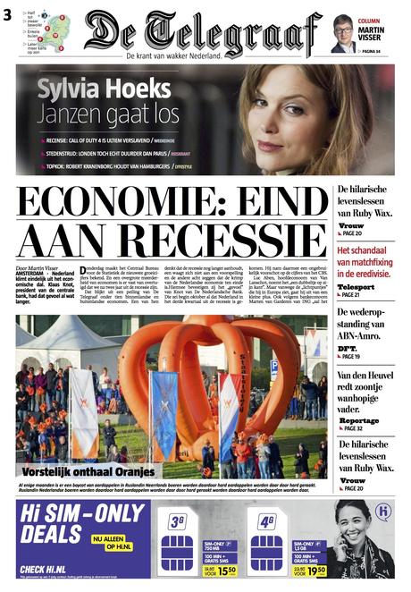

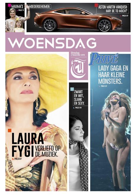


The prototype pages above show our evolution, especially with the front page, which was the most challenging aspect of this project

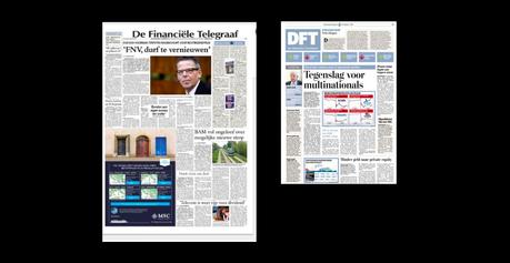
The financial section (one of the best read and most respected) before and after: with the color blue as a unifying visual theme

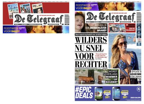
Here we had finally arrived at a front page concept that pleased everyone (well, almost everyone!). Real De Telegraaf DNA!

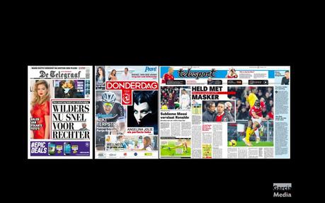
The three section new tabloid De Telegraaf: here is where we ended after 16 months of deliberations.
For about 16 months, we tried a variety of approaches. Working closely with Christian Fortanet, of our Garcia Media team, and Hans Haasnoot and Rig Hehenkamp, we experimented with various approaches to the look and feel of the new De Telegraaf.
This was the normal process of not leaving any idea behind, even though we knew that some of them would not play well with the editors of De Telegraaf.
At first our front pages were "too neat", or "too elegant", or "not the DNA of De Telegraaf". Eventually, our approach became more streamlined, the headlines got bigger and we began to emphasize the key legacy elements that the editors did not wish to abandon.
Take a look at the pages and study the evolution!
In the end.....
I hope readers will like their new, smaller De Telegraaf. I also hope that students of design will judge it not by its look but by the lengths to which we all went to balance legacy, functionality, tradition and creating a printed newspaper for a digital age. In that sense, there are lessons to be learned with the new design of De Telegraaf.
Like in any marriage, the appearances may be misleading and not tell the complete story of what happens behind the scenes.
Like in a marriage, design projects include battles lost and battles won.
As I look at today’s new De Telegraaf I feel proud of the big and the little victories.
The Marketing Campaign
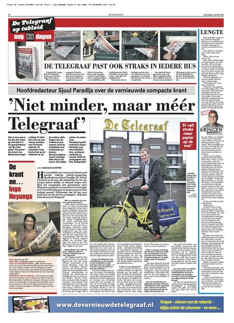

For about two weeks prior to launch of tabloid, De Telegraaf ran a page devoted to the change, with a variety of features.
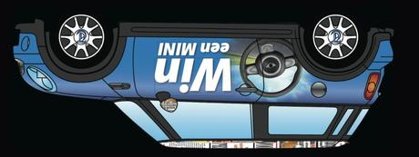

Chance to win a Mini car courtesy of De Telegraaf

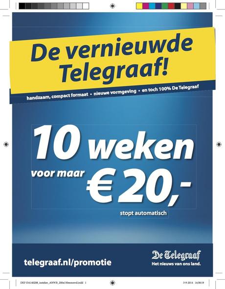
Special offer: 10 weeks for 20 euros

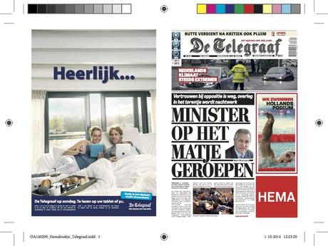
Subscribe now and get two weeks free (plus a mini iPad)!

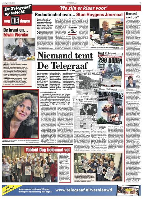
Part of the promotion: De Telegraaf thru history; with landmark front pages that mattered
Here are assorted elements of the marketing campaign to spread the news about the new tabloid format. The successful campaign has added more than 20,000 subscribers as of today, even though the first tabloid edition of De Telegraaf will not appear until today.


De Telegraaf: The Road to Tabloid series
The Road to Tabloid, Part 1
http://www.garciamedia.com/blog/de_telegraaf_the_road_to_tabloid_part_1
The Road to Tabloid, Part 2
http://www.garciamedia.com/blog/de_telegraaf_the_road_to_tabloid_part_2
The Road to Tabloid, Part 3
http://www.garciamedia.com/blog/de_telegraaf_the_road_to_tabloid_part_3

