Radiator for the winter, art all year round. Gone are the days of the boring white box. It is time to start thinking about radiators as opportunities to add beautiful designs to your space for every season.
We all decorate the walls in our home with features that bring us joy and add character to the interior. Gallery walls are a great way to do that! This idea has always inspired our designs and we feel that radiators should enhance that beauty, not disrupt it.
If you are a self confessed interior obsessive, we bet that you have pinned a couple of ‘gallery wall ideas’ to your boards in your time! With that in mind, we wanted to share some of our top tips on how to curate a gallery wall that perfectly displays your personal style and how to incorporate the right radiator to complete the look.
Here’s how to Warhol your heating.
Up your frame game
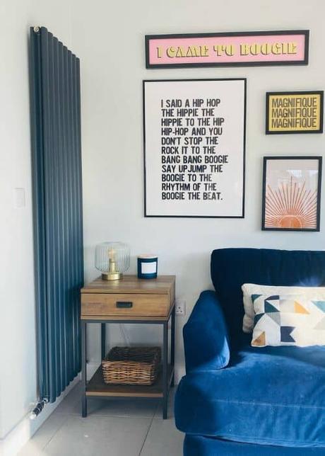
A good gallery wall is made even better with the right frames. We love how @newbuildintheshire have matched our anthracite Aruba with their dark gray frames for a modern monochrome vibe.
All about the aesthetic
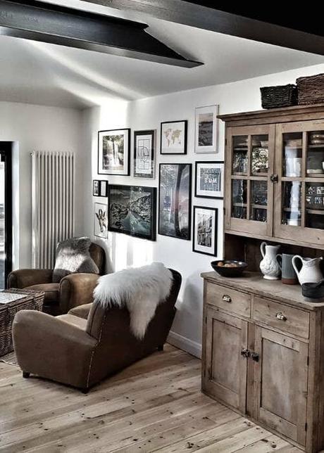
For a gallery wall that has been clearly well curated and considered, it’s important for every element in the space to match the overall aesthetic. @dreambound74 does just that with this rustic, Nordic-inspired aesthetic.
The natural textures, neutral tones and chunky white Windsor columns work together beautifully to achieve the same goal of a cosy cabin aesthetic that invites slow living and hygge moments.
Prints and publications
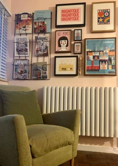
For all you drag race fans out there you will know that reading is what? Fundamental. So when we found this dreamy reading corner fit for a Queen over at @that.span.house we were hooked.
It is such a great idea to position your publications in a handy to reach spot next to the framed prints as part of one stylish, readable gallery.
We couldn’t imagine a prettier spot to pull out your fave design magazine and cosy up next to the warming rad. We also love how the clean lines of the modern white Aruba complement the linear details of the frames and minimal magazine rack.
Sage green dream
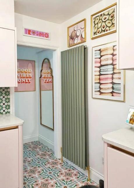
In 2022 the color trend has taken over as more and more of us want to bring joy and brightness into our homes after the bleak pandemic. @pinklondonhome is such a dreamy example of that in her pretty pastel kitchen.
We love how the sage leaf green Milano Aruba radiator complements the soft pastel prints and green accents in the mosaic tiles.What a treat of a color palette! Keep this in mind and consider a coloured radiator when curating your dream gallery wall.
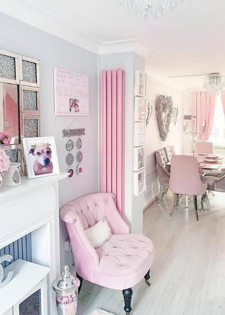
Pop of pink
Speaking of colour, how cute is this powder pink picture over at @jessysdreamhouse. If pink is your thing, why not go all out and match your gallery wall with a beautiful blush radiator and cosy rose furnishings.
Also notice how the narrow pink vertical Aruba radiator fits perfectly in the corner to help save space and bring the gallery together. Think about opting for a vertical radiator if you have a difficult corner like this that would otherwise be unused.
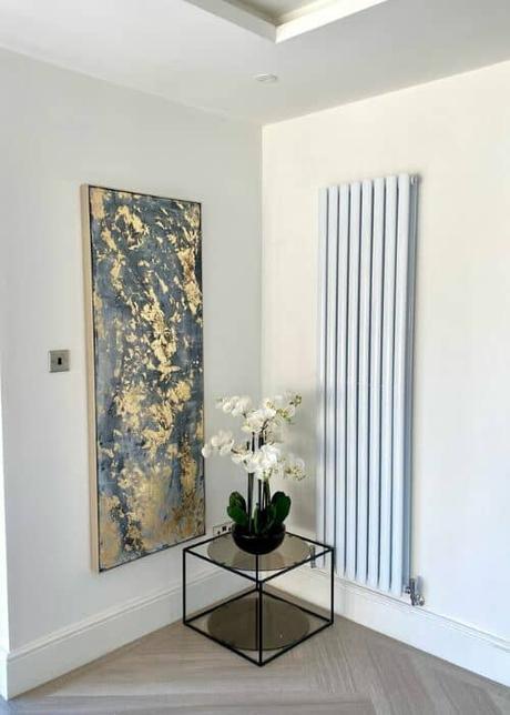
Less is more
For more of a minimal gallery wall that makes a bold statement with an understated aesthetic, hang a single piece of art next to your designer radiator. The key here is to try and match both features in terms of size to create a striking symmetrical look like @athomewiththenortons have done with their vertical white Aruba. Simple yet beautiful.
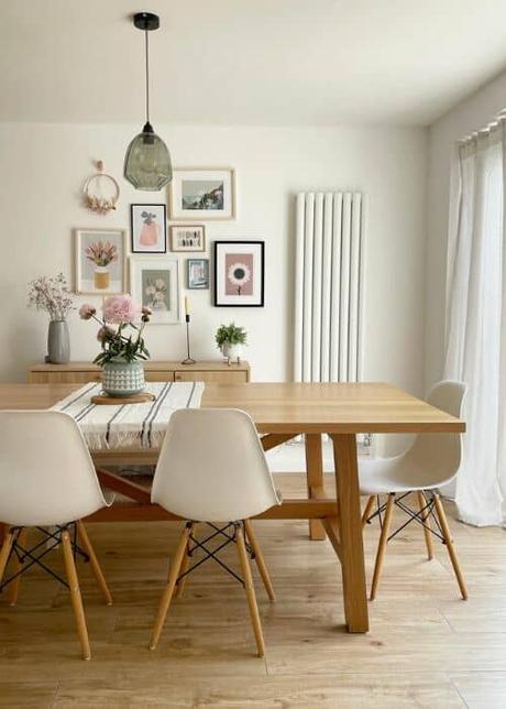
Plan your theme
Whether it’s a surprise party or a pretty gallery, we do love a theme and @our_family_at_tulip_house have curated a beautiful one. Mixing up floral prints in calm muted tones with the soft oval shaped Aruba, this gallery wall is very much on brand for this interior addict. When planning your prints, think about how the theme can match the details of your designer radiator. Will soft curves or clean lines work better with the art you have chosen?
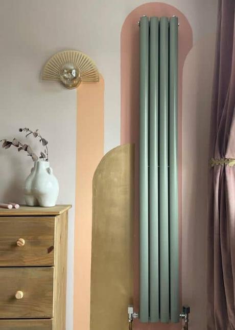
Make a mural
If prints aren’t your thing, you can easily create your own color blocking masterpiece with a simple splash of paint and a stencil. @home_is_where_the_hodge_is has designed a dreamy example by framing the oval shaped, sage green Aruba with smooth arches in earthy tones for a soft geometric look. Talk about curves in all the right places!
Up your shelfie game
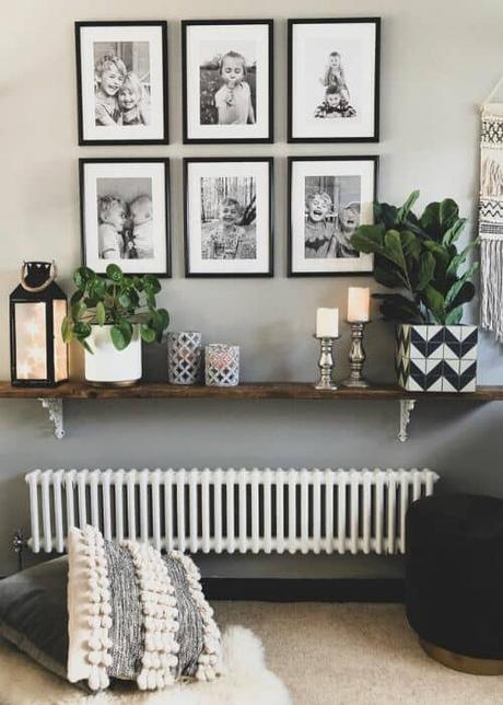
Make your gallery wall even more attractive by adding a styled up shelfie filled with your favorite accessories, candles and lighting like @the_indigo_house. Finish the look with a cosy low level radiator to curate a space that is beautiful from top to bottom. Here Laura has gone for a lovely low level Windsor to match her dreamy scandi decor.
Let's talk texture
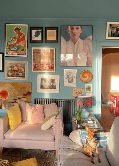
@thehouseupstairs has curated an elegant, vintage-inspired gallery that you can almost feel as you gaze at the different elements. By combining different textures, painting styles, and timeless anthracite Windsor columns, this beautiful gallery invites your eyes to wander around the space and relax as you soak it all in.
Quick recap
So there we have our top gallery goals for you to feast your eyes on! The next time you want to Warhol your heating, think about:
- Are your radiator panels modern or traditional, curved or straight?
- Can your frames complement the panel design?
- Do you want to add a pop of color to your radiator?
- Are you less is more or more the merrier?
- Would planning a theme help to create a considered look?
- What about painting a mural instead of a print?
- How can you add texture with shelfies and accessories?
Ready to start curating
We hope this artistic round up has inspired you to start curating your own gallery wall and thinking about how your radiator can become part of it, if not the star of the show! We love seeing how you style your designer radiators in your beautiful homes. Don’t forget to share your own dreamy living spaces with us over at @bestheatinguk for a chance to be featured on our feed or blog!

