This is our weekend post of TheMarioBlog and will be updated as necessary; next blog post Monday, Dec. 12
TAKEAWAY: The news online edition of now should attract, not intimidate, users. A clean, orderly environment with some white space is the prescription. But only after information architecture has helped to organize the content. Our Mobilista 2 workshop with the team of Austria’s financial daily, WirtschaftsBlatt , allows us to create such a website.


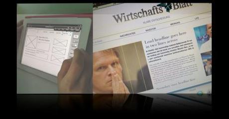
Very early sketches, started with iMockups on the iPad, more finished by the end of the workshop—lots more to do with this work in progress
Last October we had our first Mobilista workshop with the team of WirtschaftsBlatt : our goal was to start rethinking the http://www.wirtshaftsblatt.com online edition, which was last created in 2007. Much has happened since then, most remarkably four important developments:
1. Online editions now fit as second in what I call the media quartet: mobile, online, print and tablet.
2.The arrival of the tablet has changed how online editions are used, and when, forcing online editors to rethink their product.
3.The busy Yahoo-like home page—-the window of the hardware store with mind boggling number of entry points—-is very 15 minutes ago. In comes a cleaner, more welcoming type of home page. Indeed, even white space makes a cameo.
4.Responsive design: creating templates that are adaptable to more than one digital platform, and made notable by The Boston Globe, are a major consideration for those rethinking online editions.
Armed with these four criteria, we now had our second Mobilista workshop in Vienna this week. Since our last workshop, the digital team had paid attention to the important task of studying the site’s information architecture.
Alexis Johann, director of digital operations at the WirtschaftsBlatt , and Mobilista workshop leader, introduced the program by saying:
“The main screen of the next years will be the touch phone, if we want to adress this future we have to rethink our navigations and very likely also our storytelling. With our Mobilista workshops we now make the unthinkable - all the information on a very little screen - more tangible. “
But before we get to the storytelling, we must tap into information architecture, which helps organize content so that we can tell stories better.
It’s all about information architecture first
“I found that we have about 80 plus categories for users to sample now,” said online editor Peter Sempelmann.
I responded that I am sure a good 60% of those perhaps wonderful content entries are not even known to many of the users.
How could we get all of this great content in the online edition of a well read financial newspaper become more prominent and accessible.
Five categories
It is not easy to arrive here, but that is what a workshop about information architecture is all about: editing, condensing, combining related items, thinking like the user.
Peter, the online editor, mentioned the example of Austrian supermarkets.
“One supermarket here allows you to weigh your fruits and vegetables. You place the product on the scale, look at a big screen and then you are faced with a variety of possibilities for every fruit, not easy. But we have another supermarket that simply gives you the name of the product: apples, bananas, oranges—-one category that then goes into subcategories. So much easier to use, so much pleasant to shop there, isn’t that what we wish to accomplish here?”
Indeed, Peter, and I am happy to say that by the end of our Mobilista workshop today we had narrowed the content of the WirtschaftsBlatt to five main categories: news, investor (stocks), opinion, life and tools (service related items). Subcategories followed.
And because we had the information architecture developed 90% of the way, we could then translate that to a first basic sketch(see illustration above) where we begin to see the clarity, cleanliness and order that the new WirtschaftsBlatt online edition could have.
Layers are used for each of the five categories, creating instant hierarchy.
White space is introduced. Visuals (including videos) are part of what the user sees first.
Most importantly, at any given point, the user can retrace his steps and take detours within the five categories that determine the content of this financial daily.
The online edition of the future has arrived. It pleases rather than intimidate.
It makes content visible and easy to access, but it does not hide it in obscure, unreachable corners. The visuals are appealing, the text elegantly presented.
Typography, color, architecture and storytelling—-those are the tools that make it all possible.
Our next Mobilista workshop is set for January, at which time a full prototype should be completed, perhaps with the responsive design concept so that the brand of the WirtschaftsBlatt prevails across its digital platforms.
Earlier Mobilista posts
http://garciamedia.com/blog/articles/news_websites_prepare_for_next_generation_less_is_best/
For more on responsive design
Check the semi-technical article Ethan Marcotte wrote in 2010 (http://www.niemanlab.org/2011/11/more-evidence-that-different-devices-fuel-news-consumption-at-different-times/) or the book he wrote more recently (http://www.abookapart.com/products/responsive-web-design).
Our blog post about The Boston Globe (responsive design)
The new Boston Globe website: innovative, functional, sets the pace
http://garciamedia.com/blog/articles/the_new_boston_globe_website_innovative_functional_sets_the_pace
An interview with Ethan Marcotte
http://garciamedia.com/blog/articles/an_interview/

