I'm currently working with a two different clients that need a face lift on an existing chair. They both want something graphic, but not to "too out there". Conservative but creative-something that brings a bold punch without stealing the show entirely. With one of them I'm also limited to fabric type because of a cat that claws up certain fabrics (this has been a re-occurring theme for me lately with jobs. Does anyone else have this caveat thrown at them?) My thoughts keep going back to this, Nick Olsen designed, inset paneled chair that Patricia posted the other week.
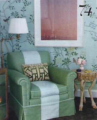 He seems to have a thing for this look as well. I found in my 'Chairs' file, this shot from Domino taken in his apartment (which I LOVED from head to toe)
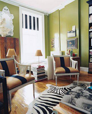 It hits all of my check points - modern yet classic, could be done within a smaller budget and creates a point of interest without seeming like it's from The Island of Misfits.
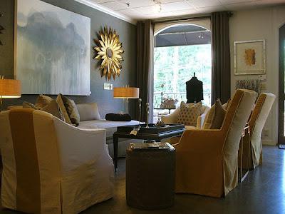
Here's a slipped covered version, which would be even more economical (and probably a bit easier to clean).
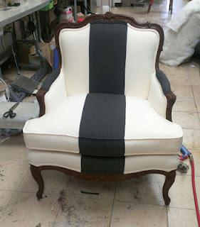
Here's a great example of a nice chair, something easily found at a big box shop like Ballard Design, given a bit more personality just by this simple application. I especially like the classic carvings against the modern black and white punch.
Here's another that I pilfered from Patricia's blog. The room is beautiful, but far too fussy for me. But without those strong stripes (and animal skins and legs), it would feel like you crawled under Marie Antoinette's skirts.
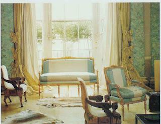
I also like the horizontal stripe, thing.
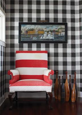
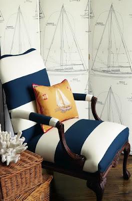
But it tends to look Nautical no matter how you slice it.
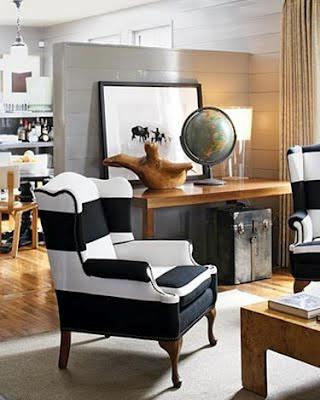
Not a bad thing, it's just a thing. That I'm not looking for here.

This one looks familiar.
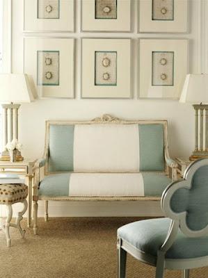
I'm not feeling this one. The stripe is too small in scale. If you're going to do it, go big.
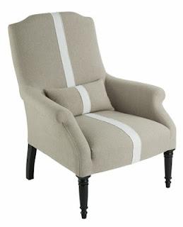
This one is totally different, but it's so great, on so many levels. It's also the sort of thing I see on other people's blogs about how they scored it for $15.00 on ebay or craig's list or found it in the neighbor's trash and just happened to have this cool vintage ("$5.00 at our church's rummage sale!") flannel blanket that had some holes so could really only be used as upholstery. Which they did themselves. Which all told cost them $30.00. Which never happens to people like me.
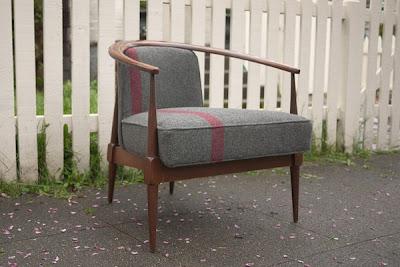
but I digress.
The other thing I like about this whole inset stripe thing ( or what are they calling it now, "Coloring Blocking"? ) is that the options are many- Orange + Chocolate brown, Olive + Pale Celadon, Yellow + White, Gray + Yellow, Navy + White....

