Flower Garden
24 x 30"
Commissions can be daunting because I know that the client has an idea of what they want the finished piece to look like. In their minds are all the paintings they've ever admired and those that they've disliked on sight. They have favorite colours which can vary from loathed colours by a tiny, but significant difference in hue or value, and they know exactly how realistic or stylized they like a work to be. But they can seldom articulate these subtle biases. Like most of us, they know what they like but couldn't specify why.
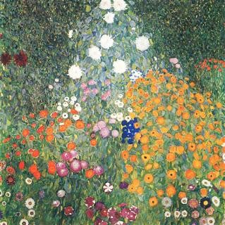
So when this client asked me to create a work based on Klimt's "Flower Garden" but incorporating colours and blooms from my past work, I was nervous. There were a lot of variables of color and composition to get just right.

Gustav Klimt's Flower Garden (recently sold for $59,000,000)
Luckily, this client has an amazing color vocabulary and the ability to convey her mental image clearly in words. She referenced the exact yellows, blues and pinks that she wanted by referring to work that I'd posted on Facebook over the years. It was a trip down memory lane for me as I scrolled back to see some cool yellow pansies, a delft blue piece of fabric, and cool pink mallow flowers.As I followed up on her references, I got an overall feeling that what she was drawn to cool colours over warm, and strong colours over muted. A phone conversation confirmed this impression, and gave me the confidence to agree to tackle the piece.
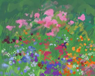
Procreate came in handy as I worked out color placement and composition. We'd decided on a rectangular format rather than Klimt's square, and so his triangular arrangement would have to be modified or scrapped. I offered a circular composition with peonies as the top layer and sent this digital image for us to discuss. The client had a few notes about more blue and less orange, but approved the image overall.

Procreate digital image

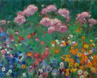
Version 1
This was the first version of the painting at which point I felt that I needed input. I sent a jpg for the client to think about. She came back with precise and useful comments about the relative proportion of red and purple (not favourites), and the desire for more definition in some flowers and more white flowers overall. As well, the peonies leaned too red for her taste.Excellent! I knew exactly what to address and the changes were easy to make. Layering a cool pink over the warmer color in the peonies actually sparked a good glow in that area that wouldn't have been possible if I'd gone straight to the cool pink from the start. I stared at that transformation for a while and vowed to use it again sometime.

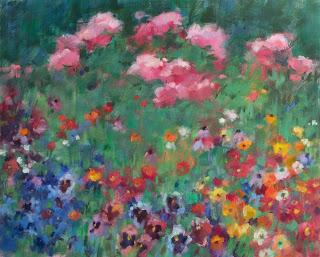
final version
I emailed the revised image and, happily, she loved it. It hangs over her couch in a gold frame - a detail that was also part of the client's original vision.
This commission felt like a real collaboration; I was the brush and the client was the concept. Her ability to explain her vision so precisely made it surprisingly easy for me to render her concept in paint, and I find it satisfying to know that this piece matches the image that she held in her mind.
Happy painting!

