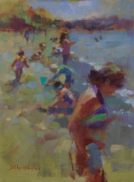
The Shore
16 x 12
It's easy to get caught up in the wonders of the color selection at the art supply store, but I find that my favorite paintings are the ones with the least number of colours in them. I also know that I have a real preference for looking at paintings that have an overall green or blue bias with smaller hits of warm color. I didn't actually put this into words for myself until I visited the Barnes Foundation in Philadelphia last year and found myself gravitating invariably to the paintings with cool color schemes such as Van Gogh's "The Postman" . Unlike earthy, natural schemes, these artificial, stylized color harmonies have amazing visual vibrations. "The Postman" was hung in a little out -of-the-way corner of a room filled with Renoirs and Cezannes, but it still managed to dominate the space.
So, while I don't often set out to impose a color scheme on my work - I find that to be an artificial process that feels too rational for such an intuitive process - I did make a decision to use a lot of green in this piece. Once I had that, and the color of the foreground figure's bikini top, I wove the purple throughout the rest, letting it work as a foil and near-complement to its surroundings. The warm reds, pinks and peach colours relieve the overall coolness, and I hit them hard in the figures' skin tones.
This was a useful color experiment and worth remembering for future paintings. It was a good way to take the messy complexity of a photo reference and impose structure and order on it.
Happy painting!


