During my first year of design school, I was introduced to the concept of color theory. And it totally rocked my world. Before I had taken this class, with a sharp and delightful Aussie instructor, I was totally unaware of the science of color. Ever since, I’ve been a color evangelist.
This theory, which many of us learned in design school, can be easily applied to dressing oneself. If you’re tired of putting together bland, safe-beige outfits, it’s time to start using color theory in your daily dressing routine. And, all it takes is just being a little more bold than you would normally.
So, below is what you need to know for applying color theory to your daily wardrobe. Anybody can do this, whether you’re a seasoned designer or totally new to color theory.
The Color Wheel

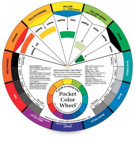
Get a pocket color wheel like this, online from Dick Blick.
Knowing the color wheel is as important to color theory as knowing your times tables was in second grade. Know the primaries (red, blue, yellow), tertiaries (green, violet, orange) and memorize the complementaries (colors directly across from one another).
Quick! What’s complementary to yellow-orange? Blue-violet, of course!
Monochromatic
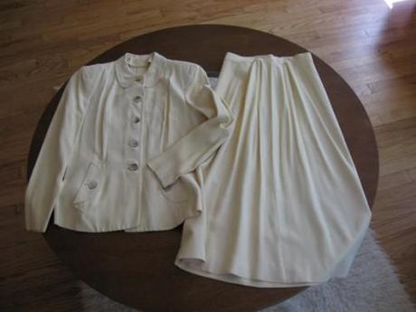
Monochromatic schemes use a range of the same color and can be either vivid or understated chic. A vintage ivory suit can be the perfect solution for a non-traditional bride, and a tailored red suit can be the perfect outfit to communicate confidence and enthusiasm to a new client.

I found this gorgeous ivory suit on Etsy.com - click the photo to take you to the listing.
2-Color Harmonies/Complementaries
The thought of wearing 2 opposing colors may cause you to visualize green and red Christmas sweaters and Lakers basketball jerseys, but it doesn’t have to be like that. Starting with the complementary harmonies it’s smart to think of “neutrals” as colors, to determine where they fall on the color wheel.
For example: tans usually fall into an orange or orange-red category. Pairing a tan leather pencil skirt with a blue blouse would be a complementary harmony.
3-Color Harmonies/Triadic/Split Complementary

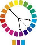
Split Complementary: tan (neutral), violet (warm neutral) and aqua (accent).
Making a triadic or split complementary scheme is like drawing an equalateral or isocoles triangle over the color wheel. If you want to avoid trendy color-blocking (it’s not appropriate every day), make at least one of the colors a more neutral shade.
4-Color Harmonies/Double Complementary
The difference in making a triadic harmony and double complementary harmony is adding one color, making that shape a rectangle.
Again, to avoid looking like a color explosion, make all color but one as neutral as possible. To make blue and green more neutral, find them in shades of gray. To make red and purple more neutral, find them in shades of brown.
Analgous
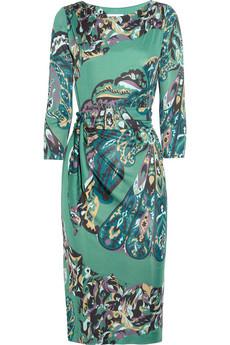
On some occasions, you want to look like a color explosion – like a date or cocktail party. Nothing exemplifies an analgous color scheme in fashion like a Pucci print.

Sigh, Pucci ...
But analgous schemes don’t need to be colorful in the traditional sense. A chic, subdued scheme of federal gray, dusty violet and mauve is analgous – but sophisticated in a different way.
I hope these hints on using color theory in your wardrobe are just what you need to start wearing color more confidently.
Whether you’re putting together a simple analgous scheme or crafting a double complementary, give yourself permission to dress in way which might bring you a little attention.
Don’t worry too much about traditional color rules you learned early in life and just put together color harmonies. Occasional mistakes are to be expected, but those are the times you grow as a wardrobe-builder.

