I illustrated an essay called The Empty-Nest Yard Sale. It was for The Rumpus, which features writers who tackle a wide variety of subjects.
As the title suggests, it was about children growing up and passing out of childhood.
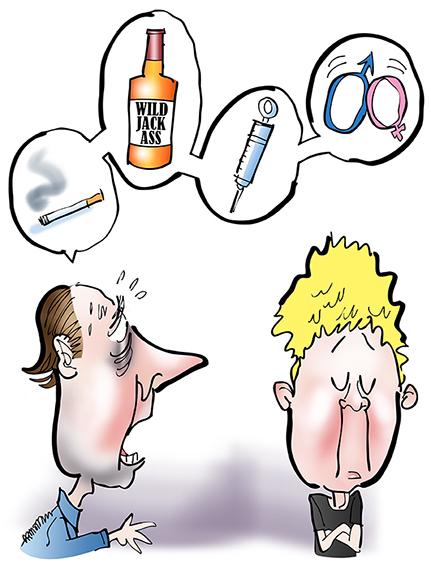
The author was a father faced with a familiar challenge: trying to communicate with his teenage son. At one point he asks his son whether he’s engaging in certain behaviors: smoking, drinking, drugs, sex.
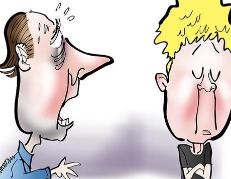
Here’s a close-up. It was a good chance for me to experiment with skin tones and related lighting effects.
You’ll notice the dad’s hair has gradated color indicating reflected light. The son’s hair, however, is solid yellow. Experience has taught me that “gradated yellows” are usually ineffective, and tend to weaken an image. There are exceptions, but I usually leave yellows alone.
It’s also interesting to note that a single simple line makes a very effective pouty lip!
Perhaps the most poignant moment in the essay occurs when the teenage son decides
to have a yard sale and sell his large collection of stuffed animals. It signals that his childhood is at an end. I came up with an image that literally spells out that fact.
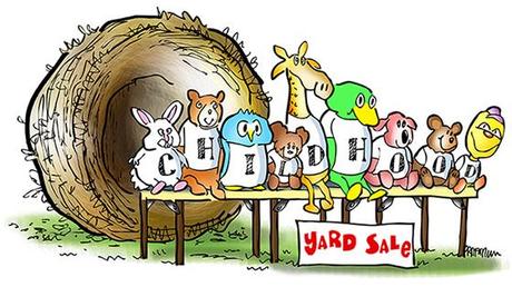
I used a “camel’s hair” Photoshop brush to color the empty nest. It produces a pleasantly streaky line that simulates the woven texture of an actual nest.
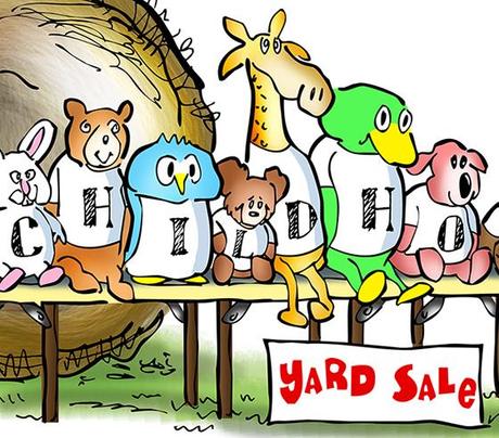
A good illustration makes things easy for the viewer. A key point here is helping the reader see the word CHILDHOOD. It’s trickier than it sounds.
It means keeping the letters uniformly spaced, and in a fairly straight line. Also: a couple of the letters had to be fitted into very small spaces. The final effect seems pretty natural, but in real life, of course, shirt images and text are often obscured by wrinkles.
The essay ends on a hopeful note. The father shows his son how to poach eggs. They talk while they wait for the timer to go off.
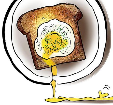
Finally, they butter toast and slide on the eggs. The son stabs his yolk with a fork, and the father, in an inspired moment, does the same.
Male bonding. It can be a messy business. It can also be a beautiful thing.
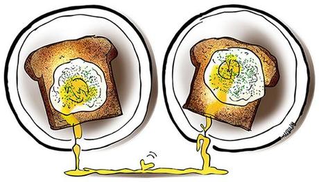
One of the Photoshop brush settings is Dissolve. It applies color in grainy specks, as opposed to a smooth stroke. You can also adjust the Spacing and Scattering settings, and change the brush shape to vary this effect.
I’d never used the Dissolve setting before. I learned it makes great toast!
Have you ever witnessed an event and thought: my little boy or girl is growing up?
Do you stab your poached eggs with a fork, or do you let them “live” till the last possible moment??
Hope you’ll leave a comment.

If you enjoyed this post, please click the Like button below.
If you’d like to share this post with others, please click Tweet or Facebook or one of the other Share buttons.
I also invite you to get updates. Just click the Get Updates button in the sidebar below the Portfolio Thumbnails, or click + Follow in the blog menu bar.


