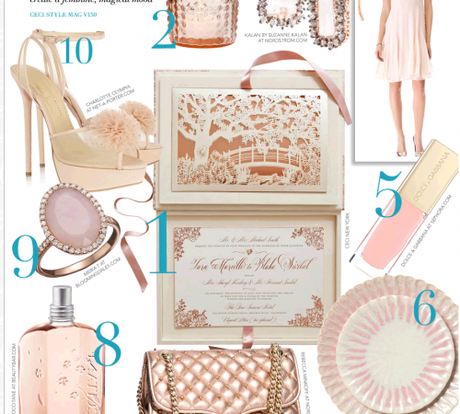
Check out this beautiful wedding invitation from Ceci New York.
After you click on the link, keep scrolling down to see pictures of the pieces at the actual wedding.
Just over the top gorgeous!
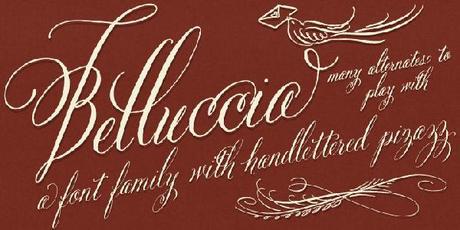
They created a unique brand for this wedding using my Belluccia font on several pieces of the suite.
The pictures below are of the save the date, the invitation and the wedding accessories and include comments of how the pieces were used.
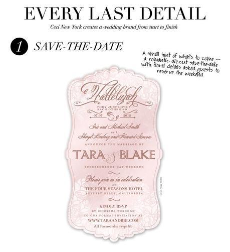
A very creative die-cut piece that conveys all of the information with varying font styles and sizes.
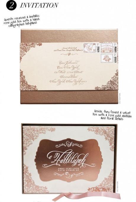
What an imaginative invitation – a box within a box inside a belly-band!
I just love the prominent flourishes on each corner of both pieces. So beautiful!
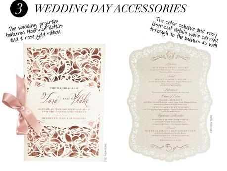
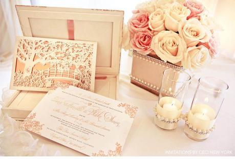
How classy is this? An absolutely gorgeous presentation of the invitation.
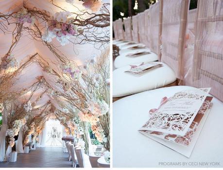
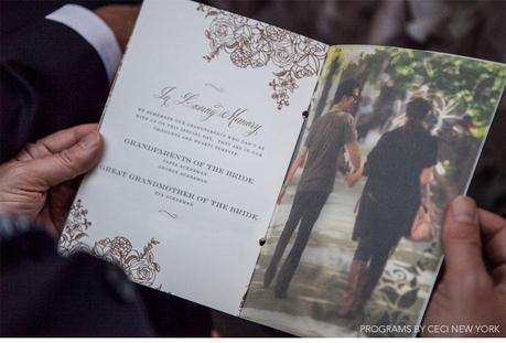
What a wonderful tribute to honor the memory of the grandparents in the program.
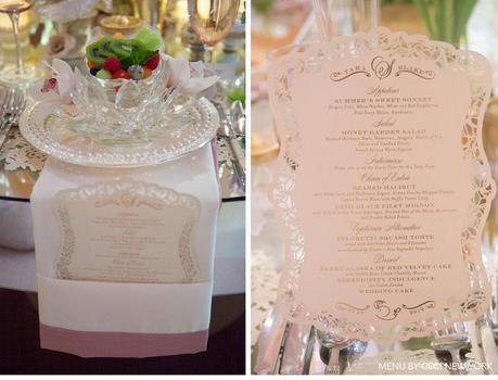
The placement in the cleverly folded napkins is very cool.
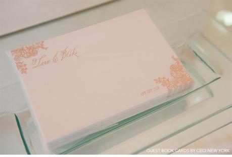
What a very nice twist.
Click hereto see an unbelievable collection of pictures from this wedding. They will blow you away!
I ‘m excited to tell you that the submission of my new Cantoni font was approved!
Happy Dance!!!
I’ll be sharing news of the date it goes “live” on myfonts.com soon.
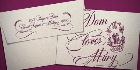
As always, my calligraphy fonts, Dom Loves Mary and Belluccia are available for purchase here.
Have a Tarantella Tuesday

( That’s the name of an Italian dance that is customarily done at celebratory events like Weddings.
So I’m doing it today to celebrate my new font being approved:)
Debi
