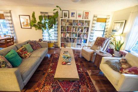
I’m going to interrupt your regularly scheduled international blog series to focus on some domestic affairs: my living room.
A few weeks ago Apartment Therapy posted this little gem to Instagram…
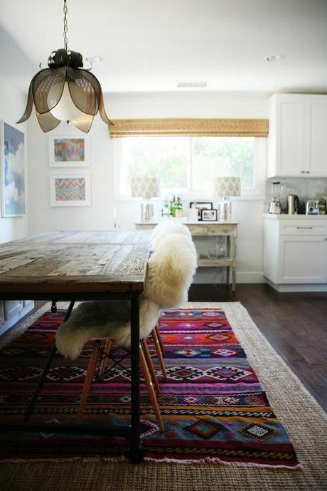
…and it really got me thinking about how much I love the contrast of an oriental rug paired with sleek modern design. It’s totally in step with the whole “modern eclectic” vibe I’m going for. So, immediately I went in search of more inspiration to satiate my appetite. The internets did not disappoint. Designers seem to be loving the whole modern-meets-traditional vibe that this pairing provides.
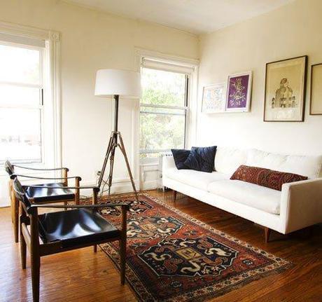
Home Edit
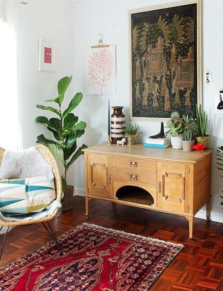
Lou Lou & Oscar
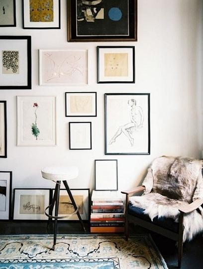
Apartment Therapy
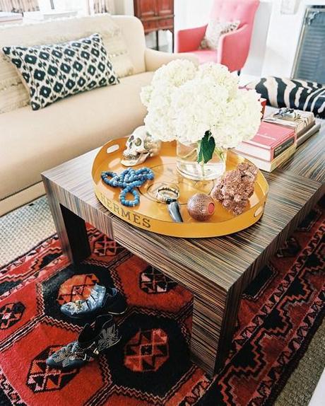
Gattox
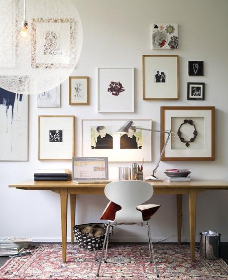
Patric Johansson
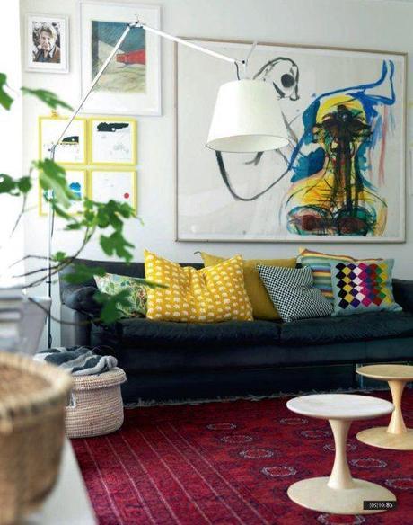
Petra Bindel
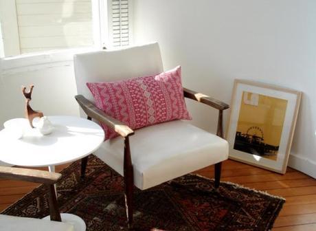
Apartment Therapy
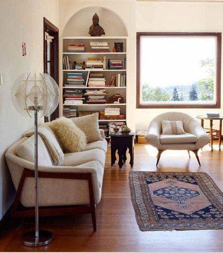
Caitlin Wilson
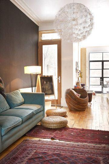
The Marion House Book
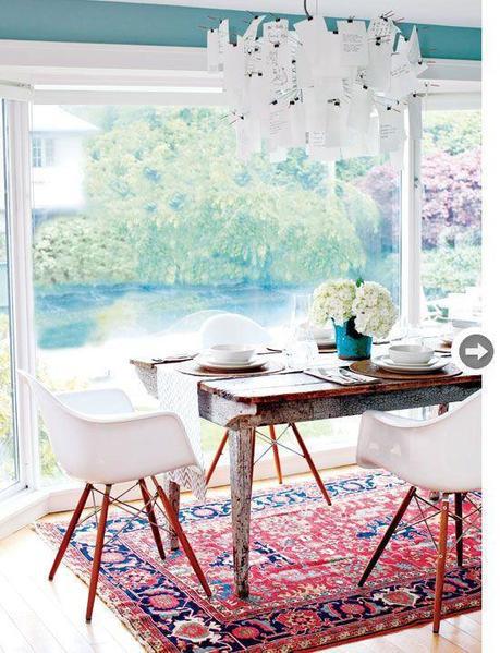
Style At Home Magazine
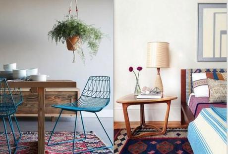
Design Lovers
Clearly its not a new concept, but nevertheless, it struck a chord with me. And, as his holiness The Dude professed unto his disciples, the power to tie a room together belongs to that of the truly great rug.
Naturally, I went out in search of one of my own. A couple of tryout rugs later (thanks to Kaskas very convenient try-before-you-buy policy) I ended up with a winner, and it led to a complete transformation of our living room.
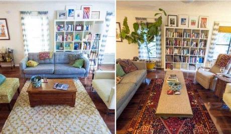
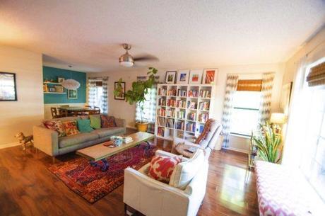
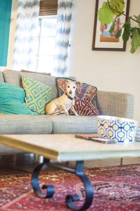
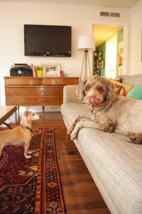
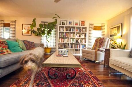
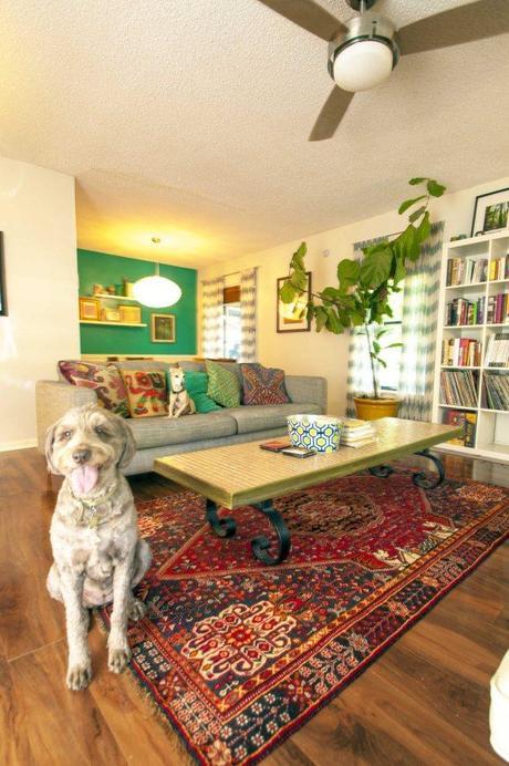
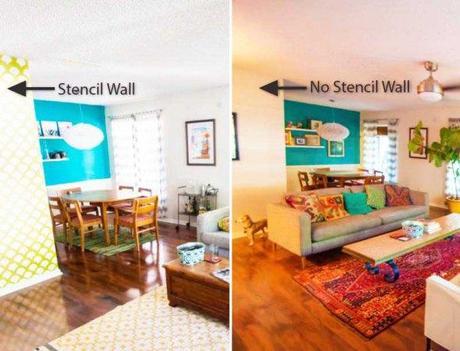
While it was with a bit of a heavy heart that I painted over the old Stecie, I remain convinced it was the right call. One can only take so much attention-seeking behavior in one room. (Though I will say, the wall does demand some kind of artistic treatment beyond plane white. I’ve just yet to determine what will be the best fit for this new style.) Along with the stencil wall, I also big adieu to the green accent wall. That wall too felt a little funny painting over. I remember coming in the night we closed on the house to get it painted up before we moved in. How interesting to discover how my styles and preferences have shifted over these 3 years.
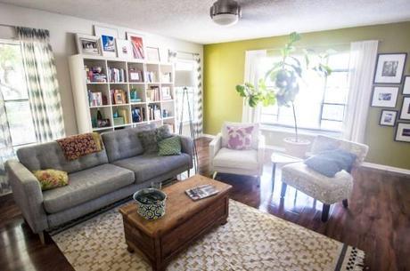
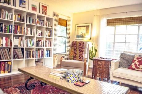
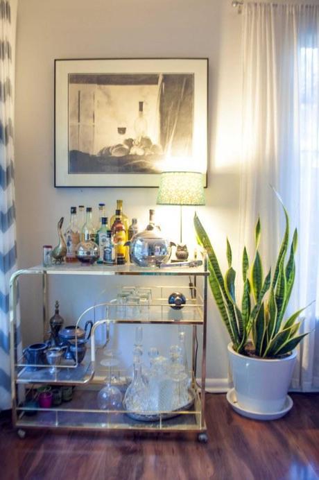
But I’ve not regretted making the change away from our vibrant walls. I loved our little green room while we had it, and as I loved that, I’m also loving this next design progression.
