TAKEAWAY: He is one of the most prolific, talented and—-I must add—-nicest people in our business. Meet Bob Newman, who after a glorious career as design director to the most celebrated magazine titles, has now become Creative Director for Reader’s Digest. With Newman we have the inspirational example of a design director who sees visual storytelling as the key, regardless of platform.
A one-minute interview with Bob Newman
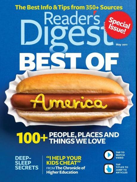
Cover hot dog: “That’s the cover page from our May 2011 iPad issue. The design is by Dean Abatemarco. The hot dog was animated with stop action, accompanied to the theme song from the movie The Sting.“
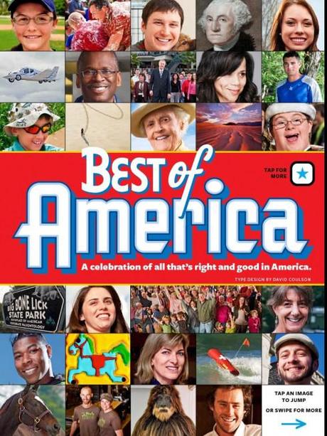
Best of America: “That’s the title page to the May 2011 iPad Best of America section. The design is by Linda Rubes (who attended your Poynter iPad seminar!). Typography is by David Coulson. Each of those images is a hot link to a page on the iPad. It’s a collection of 30 different pages, each with an image and text, and many with videos and links to additional websites and resources. The Best of America cover and section were adapted for the Reader’s Digest app that was bundled with the release of the PlayBook.“
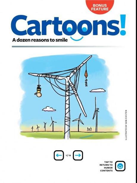
Cartoons: Interesting about this Cartoons app page. It was my daughter Lillian’s idea! (She’s 11). She was reading the app and said, “Daddy, you need to run more cartoons; there aren’t enough. How about a page that is just cartoons?“ So we did!
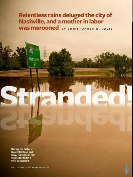
Stranded: A feature page from the April 2011 iPad app. Design by Dean Abatemarco.
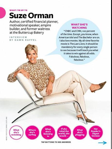
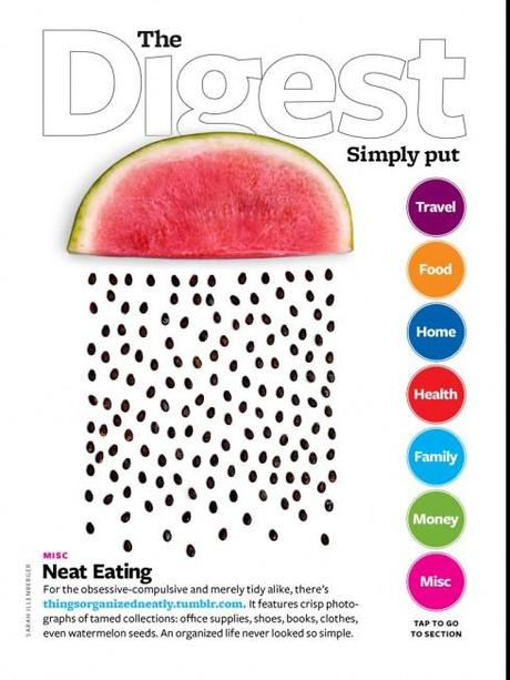
Mario: What made you take the plunge and go for this job after your time as a successful freelancer?
Bob:
I’ve been working as a freelancer/consultant since 2007, when I left Fortune. These days magazine consulting is a tough business. I’ve been lucky to have a wide variety of work experiences, and some places like Cottage Living, AARP, and Reader’s Digest, where they brought me in as their on-site creative director. The appeal of Reader’s Digest is two-fold. First, it gives me a chance to work in a wide range of platforms. I’ve already worked on their iPad and PlayBook apps, and they have a lot more in the works, plus books, special issues, email newsletters, the website, and more. It’s a chance to dig in deep to all kinds of branding and really learn a lot. Secondly, Reader’s Digest is a great magazine and a great brand, and I like the idea of being able to throw myself completely into its creation. It’s a big brand, but not a huge company and operation, compared to Time Inc. or Hearst, and that means I can get my hands on a lot of work and make a big impact. There’s something very seductive to me about being able to put all my energy and passion into one magazine.
Mario: You are a man who has been one of the great names in design of printed magazines, how do you see your role now and in the next five years.
Bob:
I feel like there’s still so much to learn, both in the print and digital worlds. Everytime we do an new app we learn so many lessons. And in terms of print, one thing I’m looking forward to at Reader’s Digest is doing more hands-on work. It’s not really a stand-back-and-supervise kind of place. The staff is lean and mean and everyone has to get their hands dirty. I plan on revving up my technical skills, especially with Illustrator and Photoshop, where I have to admit I’m pretty weak. That means my role is going to be both as a creative spirit and a hands-on art director and app and page designer. There’s a great edit, art and photo team at Reader’s Digest, and they’re already doing amazing work, so my role will just be to add to that. I think the next five years will be about learning to work in a wide range of platforms, and also figuring out how best to make the print product as engaging and essential to as many people as possible. Reader’s Digest has been through some tough times business-wise over the past few years, and it’s great to be working there as they come out of that and emerge as a very vital and contemporary magazine.
Mario: Often, people tell me: are you being disloyal to print by getting so immersed into tablet and digital publishing. Do you get the same reaction? (By the way, this is a topic on which I will expand in tomorrow’s blog).
Bob:
I think we’ve come through that “death of print” moment, and people realize that now it’s all about the content and the wide variety of platforms. Hopefully print will use this historical moment to strengthen the actual product, to make itself better and highly relevant. Functionality and useablity aren’t just terms for digital products anymore; they are also essential to the print product. The moment is coming very soon where we’re going to hit the point where print is no longer the central product that the other platforms revolve around. Very soon we’re going to see unique products and content specifically designed for each platform. We’re not there yet, but that’s the big dynamic for the next five years. In terms of some kind of disloyalty, I don’t see print being so loyal to all the people I know who have lost their jobs over the past few years. And if print is such a great medium, why is there so much printed garbage out there? Look, music survived the death of the LP and movies survived the end of VHS tapes. There’s no primacy of print; it’s just a mechanism for delivering content and design and visual pleasure. I don’t really care what format I work in as long as the product and the message is honest and has integrity, both in terms of content and design.
Bob’s special thanks to his talented team
I’m lucky to be working with an incredibly talented visual crew at Reader’s Digest. These folks have been responsible for all the visual brilliance on both the app and the print versions of the magazine: Dean Abatemarco, Bill Black, Marti Golon, Linda Hall, Emilie Harjes, Jennifer Klein, and Tara Knight.
Recent Bob Newman presentations, available on video here:
This is a 35-minute (including Q+A) presentation Bob gave last week at an Adobe conference on how his team puts the Reader’s Digest app together.
http://events.digitallyspeaking.com/adobe/cem-ny-jun11/player.html?xml=adobe-cemny11-1100_1309270436217IMND.xml
This is a movie (short) that Adobe made about the Reader’s Digest app, featuring a few appearances by Bob about halfway through:
http://tv.adobe.com/watch/digital-publishing/readers-digest-multiplatform-digital-publishing-on-tablet-devices/
The Bob Newman essentials:
Grew up in Buffalo, worked as a printer, political organizer, and magazine editor before becoming an art director. He was the design director of: The Village Voice, Guitar World, Entertainment Weekly, New York, Details, Vibe, Fortune, Real Simple. He left Fortune in 2007 to freelance and consult. He worked as consulting creative and design director for Cottage Living, AARP, O, Southern Living, and Reader’s Digest, did the TV Guide redesign last year, and also worked as creative director for JCK, the trade jewelry retail magazine. Bob is also very accessible at Facebook page, Newmanology, and Twitter, @newmanology!
Of special interest
Condé Nast’s Scott Dadich on reinventing mags for the iPad and why partnering with Apple matters
Highlights:
—The magazine cover may be ascendant once again thanks in part to the debut of Apple’s Newsstand for iPad and iPhone
—“It’s not that far-fetched to imagine 20 to 25 percent of magazines’ readership existing in a digital platform three to four years from now,” Scott Dadich said.
--Dadich discusses the “design fidelity spectrum,” a concept that slides from rigid faithfulness to the original product on one end to a completely new and unique look on the other.
—Condé’s digital editions now have a progressive download, which allows subscribers to read part of an issue as the rest downloads),
Also of interest
- USA: Rural papers doing better than their city counterparts
http://www.hcn.org/hcn/articles/rural-papers-doing-better-than-their-city-counterparts
- USA: New York Times has a lot of angry iPad subscribers after latest gaffe
http://www.networkworld.com/community/node/75887
- USA: Why newspapers can’t stop the presses
http://newsosaur.blogspot.com/2011/07/why-newspapers-cant-stop-presses.html

