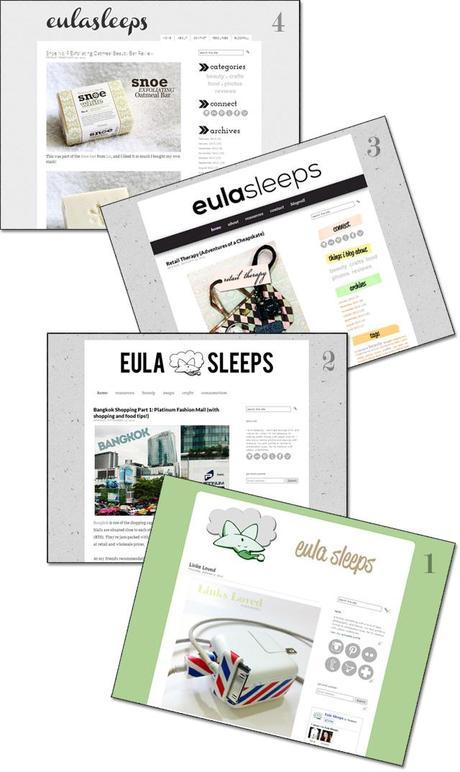
In its months-long lifetime, this blog has gone through 4-5 layout changes. I think I've finally settled on the one that will last for some time. Even though my header font is already starting to irritate me. :p

I'm a big fan of minimalism and white space, which is obvious with each blog makeover. I started out by playing with Pugly Pixel's Strawberry Shortcake template. But the plain green background was clashing with my photos, so I switched to a neutral gray. That second layout I really liked. It started my love affair with neutral textured backgrounds. The third layout should have remained in beta testing haha. And finally we get to the latest, current layout.
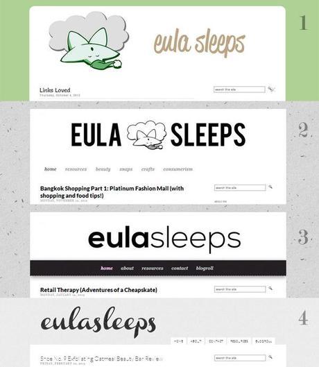
Header: the face of your blog

I spend a significant amount of time on headers because I get tired of them so quickly. It's the first thing you see on a website, and becomes sort of its trademark after a time. With my first, the font was too informal and the color was all wrong. The second one was great -- plain, simple font; non-innocuous logo. The third was too plain. With the latest, I experimented with adding a subtle pattern overlay. It's so subtle that not many will realize it's there, but it's fun. (Same goes for my background, by the way.)
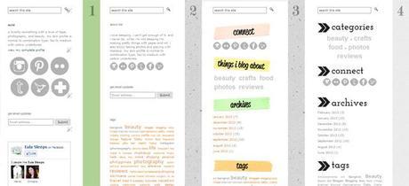
Sidebar: the supporting character
Most blogs employ a two-column layout, with content on one side and a navigation sidebar on the right. When it comes to blogs, the key to an aesthetically pleasing layout is the appearance of organization. (This doesn't apply to static websites -- many have a sense of chaos yet still look great.) And the trick to appearing organized is to emphasize your content by not letting your sidebar get out of hand.
I always appreciate a search function in blogs, and I always have to have one in mine. To me, search boxes belong at the top of the page, where they're easily seen and you don't have to scroll down to find them.
My first and second sidebars were pretty similar. After a time I realized my social media buttons were enormous and scaled them down a bit. I wanted a bit of color in my third sidebar but I went too far with the handwritten font and crooked colored tape labels. They drew attention away from the text and clashed with the photos. I'm happiest with my latest sidebar. I tweaked the code so all text and links appear a neutral gray, and the labels are prominent without being intrusive. I also increased the white space. This way it emphasizes the content while still being functional.
Experimenting
My layout is a very "safe"one, with simple fonts and and a monochromatic color scheme. Monochromes aren't a must though. For example, Allie's blog The Four-Eyed Wonder effectively mixes neutrals with flashes of bold color.Magazine-style layouts with "Features" and entries displayed by category also work well, such as that employed by Alex The Reluctant Stylista and Lia of Geek Girl Manila. This displays your major posts and caters more to the first-time reader who has never visited your page before. There are Blogger templates that are similar to these, but I don't know the code to fiddle with them so I stick my simple, humble layout. :)
Thus ends this navel-gazing into my layouts. I still think there are too many fonts on my blog (five, including the header), and that's something I'm working on.
Further Reading
- 10 Blog Layout Tips - must-read for beginners. Katrina takes a messy layout and transforms it into an elegant blog.
- DIY Blog Redesign: Design Tips - echoes many of the previous link's sentiments and provides several examples.

