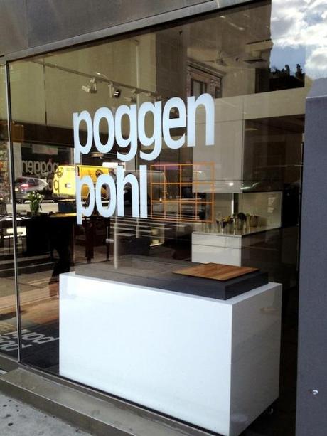
In my last two posts, I discussed two of the three sponsors present at the media breakfast I enjoyed on my first day on the #BlogtourNYC, which took place in the showroom of our third sponsor: Poggenpohl. Poggenpohl is a German kitchen design company that has been truly revolutionary in the past 120 years – they’re even responsible for introducing the concept of the kitchen island, proving they are driven by innovation.
Poggenpohl now offers the largest range of color and material choices with an emphasis on natural walnut and ash heartwood cabinet fronts. Blending these wooden fronts with their new neutrals in colors of white, sand and gray creates a new modern aesthetic proving that modern design can be interesting, warm and inviting.
Recently, Poggenpohl partnered with Hearst Publishing’s Designer Visions Showhouse to create unique kitchens that were designed to reflect the styles of three well-known design magazines: Elle Decor, Veranda, and House Beautiful. With the help of two other #BlogTourNYC sponsors, Jenn-Air and Silestone, and designers Matthew Patrick Smyth, Antony Todd and David Rockwell, they were able to create three truly dreamy kitchens. My favorite tile source Ann Sacks were also a partnered in this Showhouse.
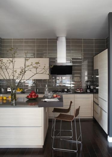
In the Elle Decor kitchen, light sand-colored Poggenpohl cabinetry with contemporary pulls contrasts against a large, stormy Ann Sacks tile backsplash and rich gray Silestone countertops. The effect is modern, sleek, and delicate mixture of masculine and feminine aesthetics.
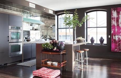
In the Veranda kitchen, the presence of two large windows flooded the kitchen with light, allowing the designer to choose Poggenpohl cabinets in a moody gray with beautiful violet undertones. Mirrored tile (one of my favorites) from Ann Sacks reflect the light from the windows, helping to create a brighter, larger-looking kitchen.
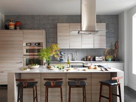
The House Beautiful kitchen has a lot of energy in its design, largely a result of the distinct horizontal grain in the Poggenpohl cabinetry chosen. A mid-tone gray tile covers the back wall, while a light neutral Silestone countertop works with the light tones of the cabinets to create an airy and cheerful kitchen space.
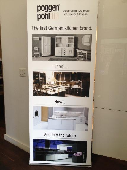
Last year, Poggenpohl celebrated its 120th anniversary, making it the oldest kitchen innovator in the world. They continue their legacy with cutting-edge design and an eye to the future, an approach that is bound to lead them through another successful 120 years! I want to thank them for their sponsorship at this wonderful event, and I look forward to seeing more innovative design from them!
Many thanks to the #BlogTourNYC Sponsors Poggenpohl, Silestone and Jenn Air.
Stay Inspired!
Photo credits:
1.) Quintessence
2.) Elle Decor
3.) Veranda
4.) House Beautiful
5.) Lori Gilder

