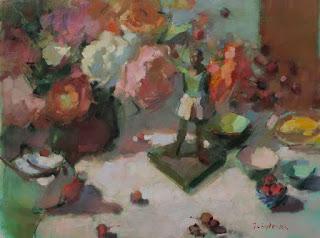
Dancer and Bouquet
30 x 40
The seemingly simplest colours are the trickiest to paint. Black, white, and gray may seem straightforward but, if their temperature is wrong, they refuse to integrate into a painting. You can buy any number of blacks, whites, and greys, but I find they all need modification to fit into a painting.
This still life has the full tonal range from light to dark, including a very large expanse of white cloth. I use titanium white by M. Graham which is, despite it's name, a mixed white of titanium and zinc (PW 6 and PW 4 on the label).
Most titanium whites in art stores are actually mixtures, possibly because the opacity and coldness of pure titanium is so hard to work with, or because it's expensive. Gamblin's titanium is an exception: it's just PW6 - titanium, and is incredibly bright and cold.
White should never be used straight from the tube. It can be - there are no paint police - but I wouldn't do it; it's bland, cold, and uninteresting. I prefer to sacrifice some of the light value of tube white and add tiny amounts of the colours that I've used in other parts of the painting. This harmonizes the work, and, where warm and cool whites are roughly layered, creates a visual vibration that can't be achieved with just one color application. I find it simulates the complex effect of a white cloth, affected by the color of the spotlight, studio walls, objects, and window light.

lots of layers on an initial pthalo green toning
Tube blacks tend toward coolness, but you can mix any temperature that you need by adding a touch of another color to them. This black is actually a very dark, warmish green through the addition of a touch of cad yellow to mars black. I use mars because, unlike ivory black, it dries relatively quickly. It's easy to mix your own, lively blacks from colours like ultra. blue + cad red light, or pthalo green + alizarin, but, for convenience, I sometimes have tube black on my palette and just modify it.I could have warmed this black even more with a touch of cad red light, or cooled it further by adding some ultramarine or cerulean blue. Experiment with the temperatures of black and you'll find one that works better than another. In general, though, I find that warm darks give a sense of recession or depth.

mars black + cad yellow
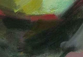
Grey is a color that is entirely dependent on a modifying temperature. There is nothing more uninteresting in a painting than a perfectly neutral gray. I always mix my greys from 3 primaries plus white, allowing one to dominate so that all greys are nameable: blue grey, reddish grey, yellow gray etc.This detail shows the layering of warm and cool greys. Just as in the whites, these greys become livelier when they're layered than if just one gray was used.

warm, reddish gray over cool green grey
This layering and modifying is something that makes a painting seem right in my eyes. I admire the simplicity of a single, clear choice for a patch of paint, but it doesn't work for me. When I look at a still life set up, I see many conflicting hints of color and temperature in every element, and I don't feel the piece is done until I've tried to capture some of them. I try show the viewer the amazing complexity of the simple things that I'm painting.Happy painting!

