I always look forward to Benjamin Moore’s Color Trends report and absolutely love the 2014 edition. Each of the 23 colors were selected to work together. Coined the “new neutrals,” the collection is softer and lighter than years past and there is a definite shift toward pastels. However, you won’t find any overly candy-coated hues. Instead, you’ll notice tints of lavender, blue, pink, and green. The whimsical shades are grounded with darker colors, such as Super Nova 1414, a deep purple, and the dramatic Black Satin 2131-10.
The brand’s color of the year, Breath of Fresh Air 806, is truly representative of the collection. The soothing, pale blue works with a large variety of accent colors and can suit any style. Here are some examples of this year’s color selections in action:
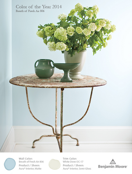
Photo via Benjamin Moore.
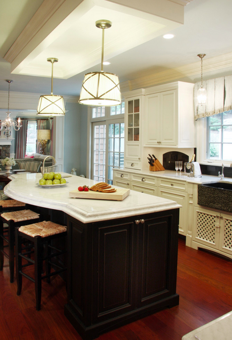
Photo via Sharon’s Style Portfolio. Designed by Sharon McCormick Design LLC.
Breath of Fresh Air 806
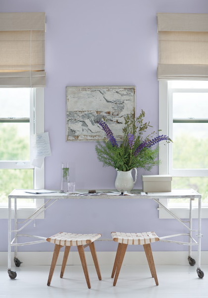
Photo via Benjamin Moore via Houzz.
Lavender Mist 2070-60
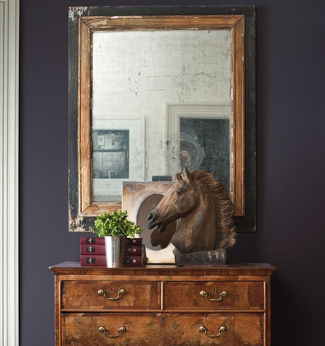
Photo via Benjamin Moore via Pinterest.
Super Nova 1414
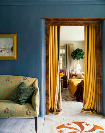
Photo via House Beautiful.
Van Deusen Blue HC-156
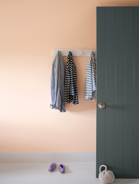
Photo via Benjamin Moore.
Peach Parfait 2175-70
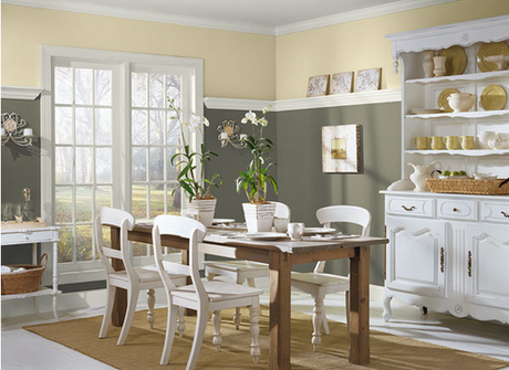
Photo via Benjamin Moore.
Sparrow AF-720
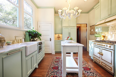
Photo via Garrison Hullinger Interior Design Inc.
Van Alen Green HC-120
Which of these paint colors could you see in your home?
In need of a color consultation? Contact me to integrate the latest color trends into your design.

