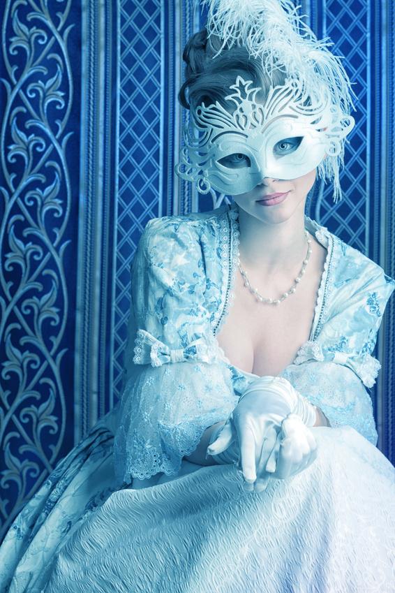
Photo: Fotolia.
I’m really REALLY pleased with how my new book covers have turned out and although I was a bit resistant to following the current trend for photo cover art, I’m glad that I took the plunge. I’ve had a lot of questions about the covers and how I did them and thought that showing you all the original stock photo and the final finished result would help some of you and also provide a bit of amusement.
The picture above is listed on Fotolia (which is EXCELLENT by the way) as ‘Art portrait of a beautiful female model in a snowy mask. Christmas’. so I think the first lesson here is that you REALLY need to experiment with keyword searches when looking for a suitable picture. Never EVER assume that stock photographers will have ANY grasp of history or art or architecture so if you want something a bit Rococo French (as I did) be prepared to search through ‘Medieval’, ‘Renaissance’, ‘bygone’, ‘old fashioned’ and so so on.

Cover for The Secret Diary of a Princess: a novel of Marie Antoinette.
The good thing about Fotolia is that you can play with the pictures before buying them so I was able to cut it down on the site and see how it would look once I’d removed the obvious blue eyeshadow on the model and so on. I’ve now got a couple of hundred pictures saved on the site, which I think will be suitable for future cover projects, most of which will need to be hugely cut down before they are useable.
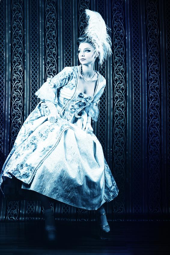
Photo: Fotolia.
I loved this photograph, entitled ‘Run’, as soon as I found it and considered using it for The Secret Diary but then realised that it didn’t really fit with the mood of the book but would be excellent for Blood Sisters as it has a really opulent look with hints of danger and suspense. In short – plenty of POSH DOOM.

The finished cover to Blood Sisters, which looks rather different to the original. I’ve had quite a few people ask me why I followed the tiresome current trend for ‘headless’ ladies on my covers and the answer, rather prosaically, is simply that I just couldn’t be doing with the terrible make up that the model is wearing in these photographs – really shiny lipgloss and heavy pale blue eyeshadow and eyeliner. It absolutely HAD to go so I chopped her head off.
Never underestimate the power of a Good Cover though. Before I changed the covers of my books a few months ago, Secret Diary was BY FAR my biggest seller and my sales in the US were massively exceeding those in the UK. However, since the change, Blood Sisters is now my biggest seller and my UK sales are far higher than those in the US – which suits me just fine as getting hold of my revenue is much easier that way!
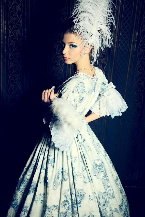
Photo: Fotolia.
Just to follow up on an earlier point, this photograph is called ‘Picture of the elegant woman in Medieval dress’. YOU SEE WHAT I MEAN? NEVER trust photographers to put a suitable description on their work when they upload it to a stock site. It’s a lovely set of pictures though so I forgive them.
In case you are interested, here is a full list of the keywords that would variously bring you to this picture – ‘antique, aristocrat, art, attractive, background, ball, baroque, beautiful, carnival, christmas, clothes, dress, elegant, europe, european, fairy, fan, fancy-dress, fantasy, fashion, feathers, female, festive, girl, hair, hairstyle, holiday, indoor, lady, make-up, masquerade, medieval, people, person, princess, queen, renaissance, retro, romantic, royal, snow, snowy, studio, stylish, vintage, white, winter, woman, young, xmas, vintage, hairstyle, baroque, ball, fairy, antique, aristocrat, art, attractive, background, beautiful, carnival, christmas, clothes, dress, elegant, europe, european, fan, fancy-dress, fantasy, fashion, feathers, female, festive, girl, hair, holiday, indoor, lady, make-up, masquerade, medieval, people, person, princess‘. You see what I mean about getting creative with search terms on stock photography sites in order to find what you want?
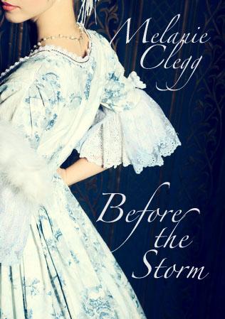
The finished cover for Before the Storm.
A bit of snipping has completely changed the rather flirtatious look of the original photograph into something that I fondly think is a bit wistful and romantic, which totally suits the mood of the book.
Of course, this wasn’t the first cover that I made for Before the Storm. Ho no.
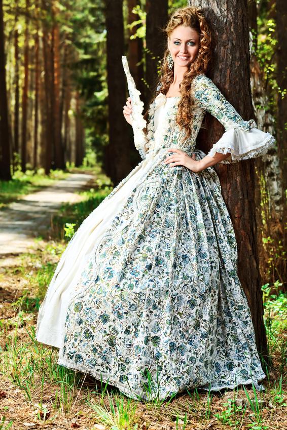
Photo: Fotolia.
This photograph (entitled ‘Beautiful young woman in medieval era dress on a sunny day outdoor’) is the one that I originally selected for the cover as I wanted this book to have a rather different look to the other two. The novel is based on The Buccaneers by Edith Wharton and is about a group of rather frolicsome English young ladies from the new monied classes trying to nab themselves suitably wealthy AND titled husbands first in the upper echelons of Georgian London society and then, when that all goes wrong, at 1780s Versailles where all things English are still very much the rage and the bankrupted aristocracy can be a bit less fussy about the pedigree of their brides.
All together, this photograph isn’t all that great – she’s got a face load of slap for a start, but I really liked the pattern of the dress and also the outdoor setting. Both of which would ironically prove to be my undoing when it came to designing the actual cover.
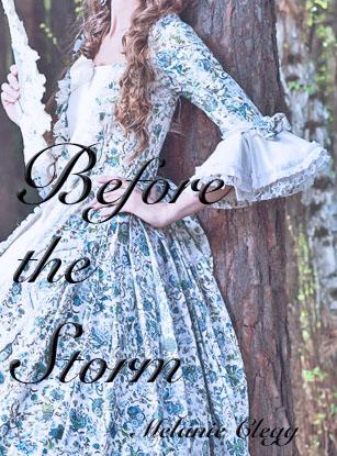
Oh dear. I struggled, I really did, but it just wasn’t to be.
In a nutshell then:
1. Don’t trust stock photographers to put suitable keywords on their work so be prepared to HUNT.
2. Don’t just look at the entire picture – expect to cut it down.
3. There’s an easy solution for the Too Much Make Up. That’s right – off with her head!
4. A decent cover can have an amazing effect on flagging sales. If your book seems to be drifting, seriously consider a cover change.
5. Try to think about the mood of your book when making a cover. I fell in love with a picture that wasn’t suitable for one book but turned out to be eminently perfect for another.
6. Fonts are THE VERY DEVIL.
7. You can’t please everyone. There’s always someone somewhere who’ll criticise your work so don’t worry about them, just concentrate on doing your VERY BEST and ignore the miserable sods.
8. Think about where you will put the font before you purchase the picture.
9. There’s a LOT of fun to be had on stock photo sites. Serious MADNESS and terrible photography ABOUND.
10. HAVE FUN. Yes, I COULD always pay someone to do it for me but where’s the fun in that?
