This is the weekend edition of TheMarioBlog and will be updated as needed. The next blog post is Monday, February 18
TAKEAWAY: Last month, The New York Times introduced a redesign of its weekly feature sections. We chat with two of the designers involved in that project, Kelly Doe and Miguel Buckenmeyer
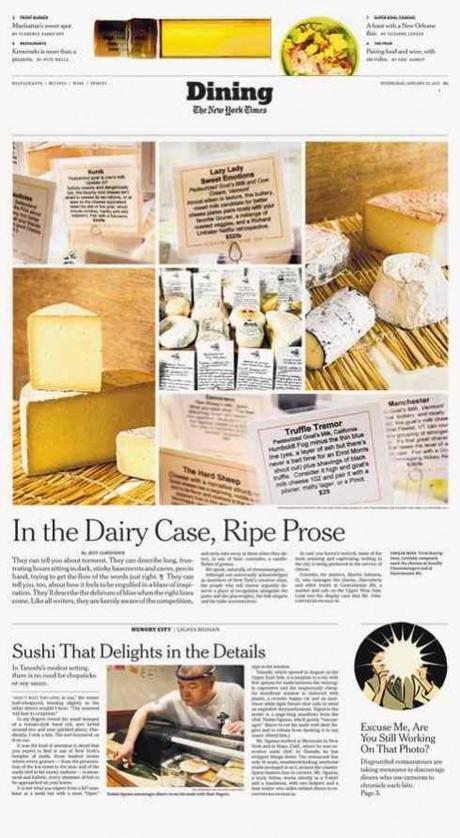
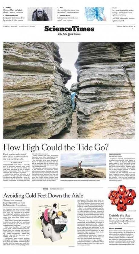
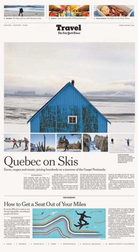
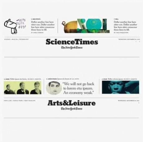
Without a doubt, The New York Times is one of the best designed newspapers in the world, but it is one which rarely makes a big splash with the launch of a “new” look. At the Times, they have gotten us used to evolutionary design changes. A section here, a different type treatment there. Never an extravaganza, and sometimes changes that go into far obscure corners of a section. In fact, the feature sections, which were introduced in the 1970s, have evolved slowly thru the years, reacting to new editors, technology and reader habits and taste.
In the words of Tom Bodkin, Assistant Managing Editor and Design Director:
Change can be difficult, particularly in a product that you’ve become comfortable with and built habits around. This redesign was in no way meant to change those habits or cause discomfort. None of the individual changes are that dramatic. Some of the differences merely regularize what we already do. In total, I believe the redesign is a significant improvement, but it may be hard for some to identify individual changes. For those particularly sensitive to change, I hope they give these sections a few weeks, after which I’m sure the new treatments will feel totally familiar.
Whether the changes are immediately noticed remains to be seen. However, the January 22 launch of the first of the weekly feature sections got a lot of attention from both the media and the readers.
We like very much the subtle touches introduced and decided to talk to Kelly Doe and Miguel Buckenmeyer about the protect. Kelly is a Times art director, while Miguel worked on this project on a freelance basis from his base in Madrid.
For designers, here is what to look for, as explained in further detail below by Kelly and Miguel:
-There is a new grid (four regular columns, one narrow one)
-There is more intelligent use of white space
-Stronger use of storytelling forms, separating narratives from other forms of storytelling.
-Typographically, a Matthew Carter refined Karnak
Here are highlights of my conversation with Kelly and Miguel:
What was the Times’ redesign project?
The redesign of The New York Times weekly feature sections was introduced on January 22 with the “Science Times,” and rolled out with each day’s feature section, from Wednesday’s “Dining” to Sunday’s “Arts & Leisure.” The full-section redesign was limited to the nine weekly feature sections, but other non-feature sections such as Weekend Arts, Sports and Sunday Business received the same masts. The Book Review, Sunday Business and special sections are to be fully redesigned in a second phase.
Why redesign these sections?
Since their creation in the 1970’s, the weekly section design and content evolved based on individual editors’ personalities and needs, and over time lost a strong sense of relationship to one another. The redesign aims to reshape the sections, building them into a lively, consistent and strongly identifiable whole as New York Times “weekly magazines”.
The new design creates a more coherent visual unity between sections by limiting the use of font choices and approaching the display of images and text in more consistent ways. There is a more defined grid, stronger visual contrast between narrative and non-narrative forms of content and bigger images that take full advantage of the broadsheet size. At a time where print subscribers are paying a premium, and resources are increasingly devoted to digital projects, the redesign also restates the papers commitment to print readers.
As the New York Times expands its reach online and in print, strengthening the visual brand is a constant objective. After the Feature sections redesign, the web site is due to re-launch in 2013 and video branding is also being assessed. The need to create a contemporary visual language and yet respect the tradition and history of the New York Times visual vocabulary remains a constant conversation among the design teams, whether in print or online.
How did the design team go about diving into this project?
The Features sections are operated as independent magazines, each having their own editors, art director and photo editor. The copydesk and pagination teams are unified for the most part, and as the pages and deadlines resolve during the week, a careful workflow allows for deadlines to be efficiently, if not always easily, met.
The creative work was approached from the ground up by analyzing typography, grid, space, and graphic elements. All were adjusted to play an integrated role in achieving greater visual unity as well as a more defined visual separation between content types, allowing heightened reader awareness of the differences as well as bringing out more of the the personality of each section.
The design team met with each key member of the section staff —editor, art director, photo editor—and ideas for changes from workflow to content and image type were re-imagined, documented and fed into the design process. Copy flow, pagination and technical ideas were discussed with their respective managers and are still under gradual implementation.
The new Grid
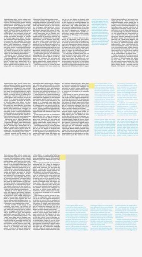
Check out the 4 and 1 grid for the weekly sections
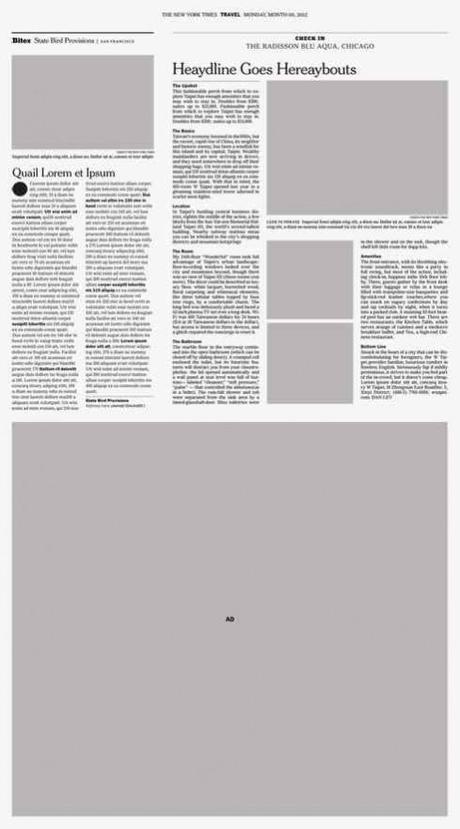
How stories fit into the new 4 and 1 grid (see sidebar treatment)
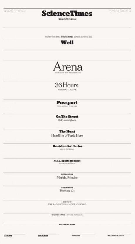
Creating hierarchy for everything from kickers to other story forms
The starting point was creating a grid common to all the sections.
The main grid consists of 4 equal columns plus one narrow one that is used for all longer form, narrative stories. The existing six column grid was maintained for ad placement but also expanded for use in sections with collected, non-narrative short reports. It accentuates the nature of the non-narrative content and sets up an alternate rhythm that provides a visual tie-in to the layout of the hard news sections.
The new grid, by the way is the favorite part of the redesign for Tom Bodkin, Assistant Managing Editor and Design Director:
What we call the 4 and 1 grid; 4 equal columns plus one narrow that can be used to separate elements, provide a specific place for marginalia, and bring energy to the page. It’s like a rhythm with an offbeat. This grid provides a strong, structural consistency while allowing for great variety and an inherently dynamic look.
Type and Branding
The Times uses the Cheltenham, Karnak and Franklin Gothic families and the redesign maintained this typographic palette. Matthew Carter, who initially redrew the Cheltenham family and recently refined the Franklin Gothics for New York Times use, went back into the Karnak, refining it for display and opening the counters enabling its use at smaller sizes.
The heavy slab-serif Karnak anchors each mast and a number of sub-section headers. The dominant headline fonts are the light and extra light versions of Cheltenham, chosen to increase the overall elegance of the features sections and distinguish them from the harder news sections, which heavier weights of Cheltenham and smaller headline sizes. The Cheltenham Bold Extra Condensed, long used on the A1 front page, was selectively reintroduced to reference that page and infuse the shorter collected reports with a more urgent news personality.
The nine sections previously had different styles for kickers, headlines, pull quotes and other elements. Consistency was created by developing a common type palette and hierarchies that were common to all sections. Rules governing headlines and two different body text styles as well as alternative caption styles were developed. After the basic across-all-section vocabulary was settled, unique-to-section elements were developed.
Images, Visual Forms and White Space
In the era of the ‘device’ and small screen viewing, another goal was to maximize the broadsheet visually.
To increase the boldness and drama of the photography on the page, image use was redefined. Headlines are no longer placed on images and larger, more dominant photography was implemented on the front pages as well as in the interior. Fewer and larger images require more careful editing, and there is an ongoing dialog concerning section-specific feel. What is a portrait for Science as opposed to a portrait for Style? The editor/art director creative collaboration is a main focus as well: how can cover stories be packaged earlier for more successful or conceptual headline/image juxtapositions?
Prior to the redesign, column widths and headline sizes were created each week to accommodate the content. Now, the unified grid allows for a more thoughtful, rational and consistent use of white space across the sections. The design uses no less white space than before but its more strategic use makes it more apparent and it contributes to a page dynamic without altering the consistency of the grid.
Once this chaotic white space was organized, another kind of energy was needed, but one that carefully built on the personality while also serving a function. A graphic language of price tags, arrows, speech bubbles and functional sidebar elements such as twitter quotes are interspersed throughout the pages to bring ideas and ‘voice’ to the surface as well as add to the visual personality of the paper.
Take a look at the Tool Kit for the feature sections
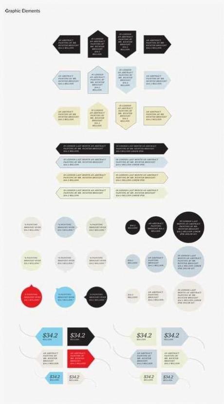
The various elements that can be pulled out of the tool kit to enhance storytelling
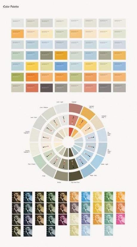
Color palette for the new Times’ weekly sections
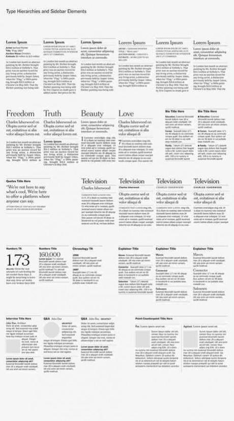
Story structures as part of the tool kit: templates facilitate use of various story forms.
Efficiency
Making things easier and faster is always a consideration in a resource constrained environment.
A range of sidebars (a ‘toolkit’) comprised of templates for common approaches to supporting content such as brief stats, timelines, biographical information or color and photographic palettes is under development.
This vast array of at-ready, pre-formatted items, each with variants that adapt to the different grid configurations and possibilities, is a useful tool for editors and art directors when deciding story shape and content. The ‘kit’ also facilitates creative decision-making and encourages an enhanced reading palette for the reader.
Increasing the number of more uniform, templated sections and word counts frees the editors and art directors to focus more on cover and main stories and their images, sidebars and layout—so the full pages become more dramatic: both information-rich and dynamic.
What happens if all these tremendously important changes are not recognized by the readers?
Bodkin is not faced by it:
The best publication design does not bring inordinate attention to itself. There’s nothing in this redesign that was done to attract
The Team
Working under the guidance of the Times’ Assistant Managing Editor and Design Director, Tom Bodkin, the project was spearheaded by Kelly Doe, an Art Director at the New York Times. Miguel Buckenmeyer, an art director based in Madrid, worked closely with Kelly on the redesign. Catherine Gilmore Barnes provided additional design support and Matt Tanzer played a critical role in adapting the changes to the Times production workflow and systems.
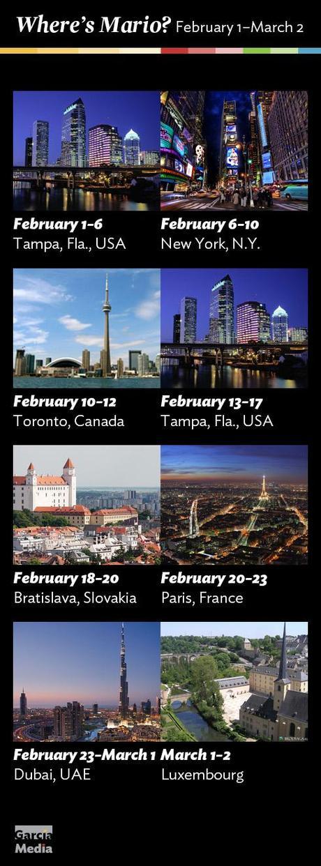
Where’s Mario until March 2, 2013?
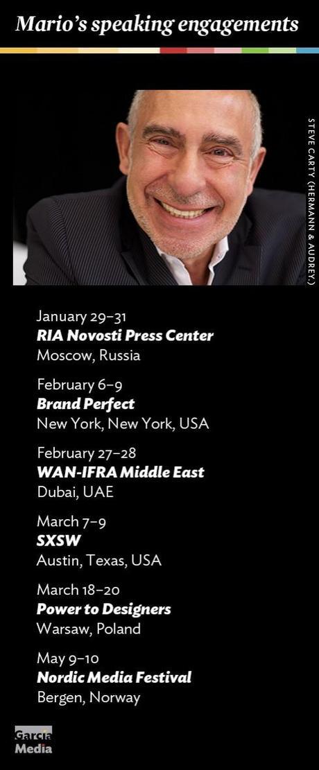
Mario’s upcoming speaking engagements
Take advantage of our iPad Design/Ad Lab workshops
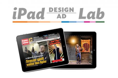
Do you want to take your brand to the next level by creating a tablet edition? Garcia Media can help. We now offer one- to two-day iPad Design Lab workshops on demand to jumpstart your presence on this exciting new platform. We also offer iPad Ad Lab workshops to develop engaging advertising models for your app. Contact us for more information.

Purchase the book on the iBookstore
iPad Design Lab has been given the QED Seal
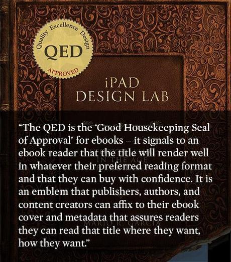
The QED (Quality–Excellence–Design) Seal is bestowed by the judges of the Publishing Innovation Awards after “a thorough, professional 13-point design review with an eye towards readability across multiple devices and in multiple formats.“
Learn more about the QED Seal here.
The EPUB version of book is HERE:
Now available: The EPUB version of iPad Design Lab: Storytelling in the Age of the Tablet, ready for download via Amazon.com for Kindle:
Here is how you can get iPad Design Lab book:
The original version of the book is the multitouch textbook version available on the iBookstore for iPad (iOS 5.0 and up):
https://itunes.apple.com/book/ipad-design-lab/id565672822
This version includes video walkthroughs, audio introductions to each chapter, swipeable slideshows, a glossary and a sophisticated look and feel.
Apple only sells multitouch textbooks in certain countries at this time, unfortunately. Copies are available in at least the following countries: Australia, Austria, Belgium, Canada, Finland, France, Germany, Great Britain, Greece, Italy, Latvia, Luxembourg, The Netherlands, Poland, Portugal, Romania, Slovakia, Spain, and the United States.
For those in other countries and without an iPad, we have made the book available in a basic edition for other platforms. This basic edition includes the full text of the original, along with the images and captions, but lacks the other features such as audio and video. It is available on the following platforms in many countries:
Amazon Kindle:
http://amzn.to/SlPzjZ
Google Books:
http://bit.ly/TYKcew
Take a video tour of iPad Design Lab
“iPad Design Lab” trailer on Vimeo.
Read the Society of Publication Designers’ review of The iPad Design Lab here:
http://www.spd.org/2012/10/must-read-ipad-design-lab.php

Keep up with Mario Garcia Jr.. via Garcia Interactive: helping transform online news since 1995.
http://www.garciainteractive.com

