Update #3: Paris, France; Wednesday, 12:21


I have spent the past two weeks wrestling with the subject of digital innovation, crafting a digital philosophy and urging print-oriented teams to imagine, for a day or so, that there is no printed product. All with the goal of facilitating creative thinking about digital storytelling.
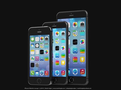
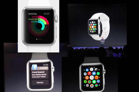
The Apple announcement excites me: I want the bigger iPhone—let’s call it a phablet! I definitely will trade my Patek Philippe for an Apple Watch, knowing that it will make me a more disciplined and well informed runner, among other things.
But it also sends shivers up my spine. Technology is moving faster than the folks in most newsrooms.
Yet, the optimist in me sees possibilities.
Shortly after the Apple announcement, I was interviewed for a Poynter.org piece about the new products. Would the tablet lose impact because of the larger iPhone 6 screens?
I barely had time to think much about it, but my answer was:
“The larger-screen phone will probably lead editors and designers to prepare more curated editions for newspapers and magazines, and, as a result, may lead back to tablet editions that are more evening-oriented.”
What this Apple announcement does is to speed up processes in the newsroom.
We have known for a long time that smartphones are, indeed, the protagonist in the media quartet. Most of us wake up with our phone in one hand, and we don’t let go the rest of the day. People of all ages do so. This is likely to continue.
Tablets have moved from an evening lean-back platform to trying to compete with the smartphone for lean-forward attention during the day.
I still think tablets will have a role, but perhaps it will be more for evening consumption.
Also, more news organizations will go with responsive design, allowing for greater flexibility across devices.
What's the buzz about the new Apple products?
Joe Zeff: "Publishers need to start moving their newspapers and magazines to responsive HTML formats"

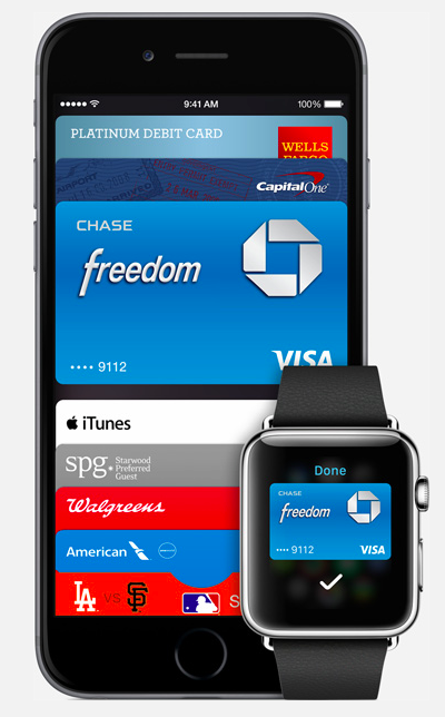
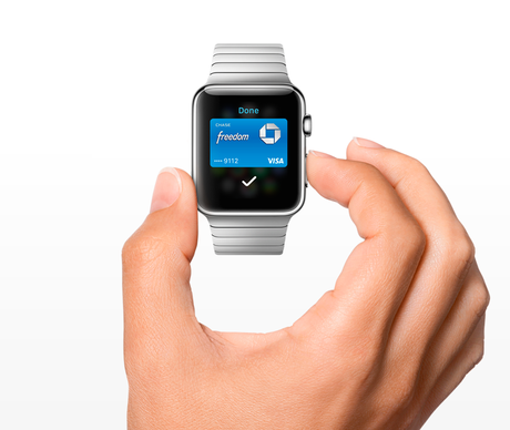

Time for publishers to study ways to leverage Apple Pay to enable e-commerce in their apps (Images courtesy of .com)
I have asked some friends in the industry:
From Joe Zeff, VP/Executive Creative Director, ScrollMotion Inc., and a man who has designed dozens of successful tablet apps:
"The line between between phones and tablets is all but erased when it comes to news presentation. Publishers will have to think harder about moving their newspapers and magazines to responsive HTML formats. Apps will continue to the best way to target specific devices and specific use cases, but flexible content may be the only reliable way to deliver newspapers and magazines.
“Publishers should be looking for ways to leverage Apple Pay to enable e-commerce in their apps, and Apple Watch to deliver alerts and time- and location-based content. It’s important that content and utility work together. That’s how publishing brands become relevant again. Apple rolled out two new devices that people will carry with them at all times. Publishers need to be part of that.”
Andrew Losowsky: “It's still a lean-forward/lean-back question”
Andrew Losowsky is a Journalist/Editor and a John S. Knight Fellow, Stanford University:
I don't believe that the larger screen size won't make much of a difference for whether to publish on the iPhone or the iPad, because it's still a lean-forward/lean-back question. The new landscape mode on the larger iPhone might give iPad publishers flashbacks to the whole 'portrait/landscape/both' question, but I think most resolved that (in most cases, it's best to choose one or other, not both).
However, people are already moving away from iPad publishing, especially the newsstand. I think this blog puts it well (except I'd put Social in place of Search) http://battellemedia.com/archives/2014/09/lessons-mobile-deep-dive-quickening-is-nigh.php ;
News/publishing will be focusing more on the question of the watch, I think. How do you create meaningful, location-based information that can be viewed on a tiny screen with a dial? The fact that Apple teamed up with Pinterest for location-based watch guides, rather than any publisher, is telling.
For more information

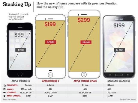
Price comparison (courtesy of the Wall Street Journal)
http://time.com/3311481/apple-iphone-6-plus/
Apple, the World's Biggest Fashion Company
http://www.bloombergview.com/articles/2014-09-09/apple-the-world-s-biggest-fashion-company
Highlight:
Today, Apple established itself as the world's biggest fashion company by releasing a smartwatch that is more about beauty and variety than about technology.
Apple Introduces iPhone 6 and iPhone 6 Plus
Highlight
Apple on Tuesday announced two new iPhone models during an event in Cupertino, Calif. The long-rumored iPhone 6 and iPhone 6 Plus will come in two sizes, one with a 4.7-inch screen and the other with a 5.5-inch display.
CEO Tim Cook said the new devices were “the biggest advancement in the history of iPhone.”
The larger iPhones are an acknowledgement that the tastes of mobile users have changed since Steve Jobs first unveiled his disruptive smartphone in 2007. So-called phablets—devices that straddle the capabilities of smartphones and tablets—have grown more popular.
Apple’s iPhone Plus doesn’t spell doom for tablet design
http://www.poynter.org/latest-news/mediawire/268421/apples-rumored-iphone-doesnt-spell-doom-for-tablet-design/
View a video about the iPhone 6 and 6 Plus:
Pages We like

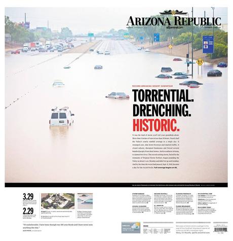
Front and back pages (wrap around) of The Arizona Republic for Tuesday, Sept. 9.
Doing print happily means taking into account that readers like printed newspapers that they can collect as keepsakes. When a deluge fell on Arizona, which is desert territory, the folks at The Arizona Republic knew that they had to do something uniquely different to highlight the wet and momentous occasion: so why not a wrap around front page.
Tracy Collins, director of Gannett’s Phoenix Design Studio, which is run out of The Arizona Republic’s newsroom, tells me how the process went leading to this treatment for Page One (and Last Page):
“The deluge hit very early in the morning. It received intense, full-court-press coverage from the TV stations (including our own) as well as our website, azcentral.com. By the time we were making decisions on the print product, there were sunny skies overhead. And long before work on the edition closed, even this patch of highway had been reopened. But this great shoot by Michael Chow had gone viral all day online, so we knew it also would translate well in print.
“Nicole Carroll, executive editor of the paper, didn’t hesitate on the decision, and Suzy Palma did a thoughtful job on the design, even placing the car in the middle of the picture right on the fold to encourage readers to open it up!”
Great job and one edition I am sure the readers of The Republic appreciated and will keep as a souvenir.

