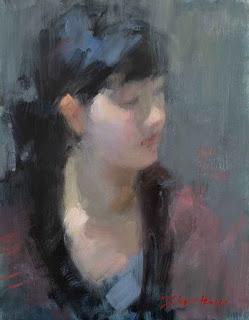
Ivory and Ink
18 x 14
(In case you're wondering, the usual 6 are: cad red light, alizarin permanent, ultramarine blue, pthalo blue, cad yellow, and cad yellow light + white)
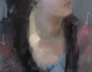
This piece was done on a cool-toned support using a low chroma palette of Indian red, yellow ochre, and a blue-black made from ivory black mixed with ultramarine blue. Toward the end, I added a smidge of cad red light to achieve those warm pieces in the clothing and to liven up the lip color.
I'm a fan of the limited palette, but if I need a certain effect, I won't hesitate to drop another pigment in to achieve it. Indian red is a very cool, dark, bluish red and can't make those warm notes in the shoulder fabric. I could have warmed the red with the yellow ochre, but the resulting murky orange wasn't what I was after, so I did what you're always told not to do: introduced a new color - cad red light - in the final stages of a painting. Rules, shmules. And I apologize to those painters that I've quoted that rule to.

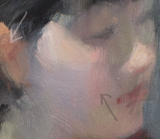
I really enjoyed this palette. It had everything to make a cool, tonal painting. I could get beautiful dull greens by mixing the blue-black with yellow ochre, and that purple on her cheek makes me happy every time I look at it. It's dull, but not lifeless and really pops the bit of yellow ochre in the light on her cheek and nose.
You can see the character of the Indian red in the warmer front plane of the cheek and what it looks like when mixed with yellow ochre in the ear. It's a pretty uninspiring color at first glance - which is why the tube has been sitting unused in my studio for years - but it holds subtle charms.

I wonder how many other colours are waiting for me to discover their magic? I'm going to grab the pliers to remove their seized-up caps, and give some of them a try.
Happy painting!
**If you'd like to receive my blog in your inbox, please enter your particulars in the "follow by email" box on the right.

